Table of Contents >> Show >> Hide
- Why timeless Christmas color schemes always work
- 1. Classic red, green, and gold
- 2. Red and white
- 3. Blue and white
- 4. Green and gold
- 5. Silver, gold, and champagne metallics
- 6. Burgundy, forest green, and navy
- 7. Cream, white, and natural wood
- How to choose the best Christmas color scheme for your home
- Mistakes that can make a timeless palette feel less timeless
- Real-life decorating experiences with timeless Christmas color schemes
- Conclusion
Every holiday season, someone declares that this is the year red and green are out, chartreuse is in, and your tree should apparently look like a fashion editor’s mood board. And yet, year after year, the most beautiful Christmas homes all share one thing: a color palette that feels intentional, warm, and delightfully unfussy.
That is the real secret behind timeless Christmas decorating. It is not about chasing trends or buying seventeen new throw pillows with reindeer in sunglasses. It is about choosing a holiday color scheme that works with your home, your traditions, and your tolerance for glitter fallout.
Below are seven Christmas color schemes that never go out of style. Some are classic, some are a little unexpected, and all of them have staying power. Whether your style leans cozy farmhouse, polished traditional, modern minimal, or “my ornaments were collected over 20 years and I love every weird one of them,” these ideas can help you decorate with confidence.
Why timeless Christmas color schemes always work
A timeless holiday palette does three things well. First, it creates instant visual harmony, so your tree, mantel, table, and porch look like they belong to the same cheerful universe. Second, it layers beautifully with evergreen branches, candlelight, wood tones, metallic finishes, and sentimental ornaments. Third, it survives the trend cycle. In other words, it still looks good next year, which is great news for your storage bins and your wallet.
When choosing a Christmas color scheme, think beyond ornaments alone. Consider wrapping paper, ribbon, stockings, table linens, wreaths, and even the glow of your lights. The best holiday color palettes feel cohesive because they show up in small, repeated ways throughout the home.
1. Classic red, green, and gold
If Christmas had an official uniform, this would be it. Red, green, and gold is the color trio that practically sings carols on sight. It is traditional, cozy, and rich without feeling stiff. And unlike some “timeless” ideas that are really just beige wearing a Santa hat, this palette has genuine personality.
Why it never goes out of style
Red and green bring the unmistakable spirit of Christmas, while gold softens the contrast and adds warmth. Together, they balance energy and elegance. This scheme works especially well in traditional homes, colonial interiors, farmhouse spaces, and any room with warm wood furniture.
How to use it well
Start with green as your foundation through garlands, wreaths, or the tree itself. Add red in stockings, ornaments, ribbon, and berries. Use gold for bells, candleholders, stars, and trimmed details so the room sparkles instead of shouting. Plaid throws and velvet ribbon fit beautifully here, too.
Best for: family rooms, formal dining rooms, classic mantels, and anyone who wants their house to feel like December in the best possible way.
2. Red and white
Think candy canes, peppermint swirls, snowy porches, and mugs of hot cocoa that somehow disappear the second you set them down. Red and white is cheerful, crisp, and unmistakably festive. It is a classic Christmas color scheme with a cleaner, lighter look than traditional red and green.
Why it feels timeless
High-contrast color combinations tend to stay visually strong, and red with white always reads fresh. It can lean Scandinavian, cottage, vintage, or playful depending on the patterns and materials you choose.
How to decorate with it
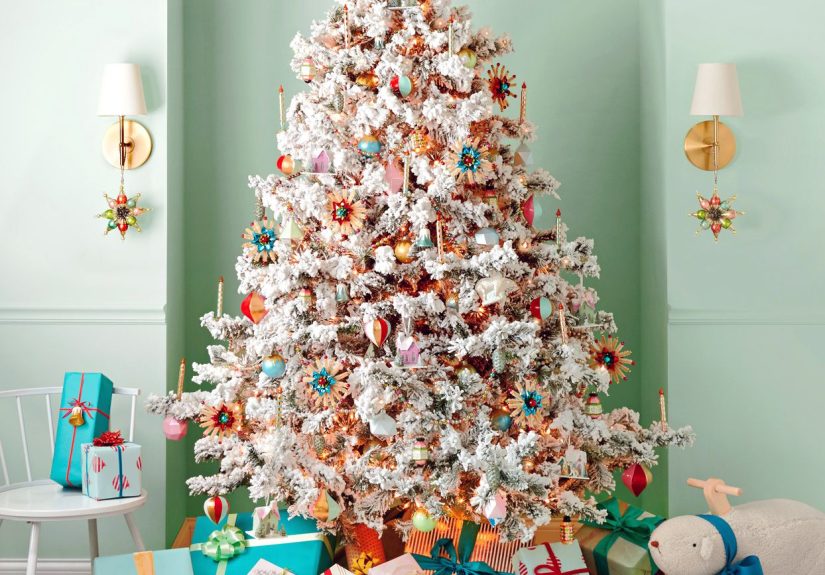
Use white as the snowy backdrop: white candles, white ceramic houses, white tree collars, white ribbon, or even a flocked tree. Then layer in bright red ornaments, striped gift wrap, knit stockings, or berry wreaths. For extra texture, add natural greenery so the room does not feel too sugary sweet.
Best for: small spaces, kitchens, entryways, and homes that want a merry look without a lot of visual heaviness.
3. Blue and white
Blue and white is the quiet overachiever of Christmas color schemes. It looks polished, serene, and a little magical, like the decorating equivalent of fresh snow before anybody steps in it. This palette can feel coastal, traditional, or slightly vintage depending on the shade of blue you choose.
Why it lasts
Blue and white already have a long history in home decor, from porcelain to textiles to classic table settings. During the holidays, the combination feels wintery rather than trendy. It is especially appealing in homes with neutral walls, blue accents, or a more tailored design style.
How to make it cozy
The trick is to keep blue and white from feeling too chilly. Add warm light, natural greenery, brass accents, woven textures, velvet ribbon, or wood details. Navy ornaments on a green tree feel dramatic and grounded. Softer blues paired with white paper stars or ceramic village pieces feel airy and elegant.
Best for: coastal interiors, chinoiserie lovers, dining rooms, and anyone who wants a sophisticated Christmas look without defaulting to red.
4. Green and gold
Green and gold is what happens when Christmas puts on a tailored coat and decides to look expensive. It is lush, natural, and elegant, yet it still feels welcoming. If you love understated holiday decorating, this palette deserves a standing ovation.
Why it stays relevant
Green is already built into holiday decorating through trees, cedar, pine, fir, and magnolia leaves. Gold adds warmth and glow without stealing the show. Because both colors are easy to repeat in subtle ways, the overall effect feels refined rather than overdone.
Where it shines
This palette looks beautiful on stair railings, mantels, and tablescapes. Use layered greenery as the base, then add gold candlesticks, champagne ornaments, brass bells, or satin ribbon. Cream and white also work well here as supporting neutrals.
Best for: elegant living rooms, minimalist homes, grown-up holiday tables, and decorators who want festive without cartoonish.
5. Silver, gold, and champagne metallics
Mixed metallics are proof that Christmas can absolutely be glamorous without turning your living room into a disco ball convention. Silver, gold, and champagne tones create a luminous holiday palette that feels classy, layered, and special.
Why it never looks dated
Metallics reflect light beautifully, which makes them natural partners for candlelight, string lights, and winter evenings. A restrained metallic palette also works across many design styles, from traditional to contemporary to quiet luxury.
How to keep it tasteful
The key word is layered, not blinding. Mix matte, brushed, antique, and shiny finishes so the look has depth. Pair metallic ornaments with glass, linen, evergreen sprigs, and white lights. If you want the room to feel less formal, sneak in touches of red berries or cedar branches for contrast.
Best for: formal entertaining spaces, New Year’s-adjacent decorating, and homes that look fantastic by candlelight.
6. Burgundy, forest green, and navy
This is the moody, library-by-the-fireplace cousin of the classic Christmas palette. Burgundy, forest green, and navy feel rich, collected, and deeply cozy. It is the kind of scheme that makes you want to wear a wool sweater and say things like “let’s open another bottle.”
Why it feels enduring
These deep tones are rooted in traditional interiors, tartans, velvet, heirloom ornaments, and winter textiles. They carry holiday warmth without relying on bright, high-contrast color. The result is dramatic but still timeless.
How to use it at home
Choose one of the three shades as your lead. Forest green often works best as the anchor. Then add burgundy through ribbon, throw pillows, or glass ornaments, and bring in navy through wrapping paper, table linens, or accent decor. Brass, wood, and candlelight help this palette glow instead of brood.
Best for: older homes, traditional studies, masculine-leaning spaces, and anyone secretly hoping their Christmas decor resembles a Ralph Lauren ad in the best possible way.
7. Cream, white, and natural wood
Minimalists, this one is your holiday love language. Cream, white, and natural wood create a Christmas palette that feels calm, textured, and quietly beautiful. It is less “look at my tree” and more “my entire home smells like cedar and good decisions.”
Why it endures
Neutral holiday decor works because it leans on material and texture rather than novelty. Linen, wool, paper, ceramic, wood beads, dried oranges, and soft lighting all become part of the palette. This creates a look that feels seasonal, not theme-park seasonal.
How to make it feel warm
Use warm whites instead of stark bright white. Add texture through chunky knits, paper stars, wood ornaments, woven baskets, and natural greenery. Finish with soft gold or brass accents if the room needs a little glow. This scheme also pairs beautifully with Scandinavian, Japandi, and modern farmhouse interiors.
Best for: apartments, small homes, minimalist spaces, and anyone who wants Christmas decor that blends with their everyday style.
How to choose the best Christmas color scheme for your home
The easiest way to pick a timeless Christmas color palette is to start with your existing decor. If your home already features navy upholstery, blue-and-white accents, or cool neutrals, forcing bright red everywhere may feel awkward. If your rooms are full of warm wood, brass, and traditional furniture, classic red and green will probably feel right at home.
Also think about the mood you want. Do you want cheerful and playful? Try red and white. Cozy and traditional? Go red, green, and gold. Elegant and understated? Choose green and gold or mixed metallics. Calm and modern? Cream, white, and natural wood may be your winner.
And remember: you do not need to use a color scheme with military precision. This is decorating, not a hostage negotiation. A few intentional repeated colors can create harmony without making your home look overly matched.
Mistakes that can make a timeless palette feel less timeless
Using too many competing accent colors
Pick a main palette and let it lead. Too many side characters can turn a polished room into ornament karaoke.
Ignoring texture
Even the best holiday color scheme can look flat without variation. Mix glass, velvet, metal, paper, wood, greenery, and soft textiles for dimension.
Forgetting the lights
Warm white lights flatter almost every palette. They soften bold colors, warm up cool ones, and make metallics sparkle.
Buying everything new
Timeless Christmas decorating often looks best when it feels collected. Mix heirlooms, handmade pieces, natural elements, and a few new additions instead of starting from scratch every year.
Real-life decorating experiences with timeless Christmas color schemes
One of the funniest things about holiday decorating is that a color palette can look absolutely perfect in your head and then, once it hits your living room, behave like it has its own opinion. That is why timeless Christmas color schemes matter so much in real life. They are forgiving. They let you improvise. They still look good when your tree leans slightly left and one strand of lights mysteriously refuses to cooperate out of spite.
In homes with kids, pets, or both, classic palettes tend to hold up best because they can absorb a little chaos. Red, green, and gold is especially good at this. Mismatched ornaments, school crafts, sentimental decorations from relatives, and even those slightly crooked candy canes somehow all blend in. The palette creates enough structure that the room still feels intentional, even when the lower third of the tree has been redecorated by a toddler with very strong creative convictions.
Red and white has a different kind of magic. In smaller homes and apartments, it often makes the whole space feel brighter and more open. A little red ribbon on a wreath, a white throw blanket, a bowl of ornaments on the coffee table, and suddenly the room feels festive without being overcrowded. People who feel overwhelmed by too much holiday decor often do well with this scheme because it gives them that cheerful Christmas hit without visual clutter.
Blue and white tends to surprise people the most. It can sound cold on paper, but in practice it often feels peaceful and elegant, especially in homes that already use blue in everyday decor. Once you add candlelight, greenery, and warm metallic accents, it stops feeling icy and starts feeling intentional. It also photographs beautifully, which, let us be honest, has become a modern decorating requirement right up there with “survives the cat.”
Green and gold is often the favorite of people who want their holiday decor to feel grown-up but not boring. It works wonderfully when you are hosting dinner because it carries from the tree to the table with almost no effort. A garland, brass candlesticks, linen napkins, and a few gold ornaments can make a room feel special fast. It is also one of the easiest palettes to refresh from year to year because your greenery does most of the heavy lifting.
Neutral palettes like cream, white, and natural wood are often underestimated until you see them in person. Then suddenly everyone understands the appeal. They make a room feel calm during what is usually a very not-calm season. They also work beautifully for people who decorate early and leave things up well past Christmas, because they transition naturally into winter decor without screaming “December 25 or bust.”
The biggest real-life lesson is this: the best Christmas color scheme is the one you can actually live with, decorate with, and enjoy. Timeless palettes are not memorable because they are flashy. They are memorable because they make your home feel warm, personal, and inviting year after year. And that, frankly, is much better than a trend that peaks on social media and looks tired by the time you pack away the stockings.
Conclusion
The best Christmas color schemes never go out of style because they are rooted in mood, balance, and tradition rather than hype. Whether you love classic red and green, airy blue and white, elegant green and gold, or soft neutrals with natural texture, a timeless palette makes holiday decorating easier and more beautiful.
Choose colors that work with your home, repeat them in thoughtful ways, and let texture and lighting do the rest. A great holiday palette should feel festive, yes, but also personal. Because the most unforgettable Christmas homes are not the ones that look the trendiest. They are the ones that look loved.