Table of Contents >> Show >> Hide
- What Exactly Is “Millennial Pink” (and Why Does It Look Like a Fancy Bandage)?
- Pink Wasn’t Always “for Girls” (Gendered Color Is a Marketing Plot Twist)
- The 2010s Were Ripe for a “New Neutral”
- Social Media Turned It Into a Lifestyle Shortcut
- Brands Did What Brands Do: They Packaged a Feeling and Sold It Back to Us
- Pantone, Rose Quartz, and the Mainstreaming of “Soft Power”
- So Why Did It Feel Gender-Neutral Specifically in the 2010s?
- The Backlash: When a Neutral Becomes a Cliché
- What Millennial Pink Taught Us (Beyond “Yes, You Can Wear Blush Sneakers”)
- Conclusion: What Millennial Pink Really Did
There are colors that show up, do their job, and politely leave. And then there’s Millennial Pinkthe dusty, desaturated blush that sauntered into the 2010s, ordered a frosé, and somehow became everyone’s “neutral.” Not beige. Not gray. Not “greige” (a word that sounds like a cough). A soft pink that said, “I’m chill. I’m modern. I’m not here to argue with your gender identity.”
This story isn’t just about pigment. It’s about the internet’s taste machine, brand psychology, a decade obsessed with “aesthetic,” and a generation that treated rigid categories the way you treat a pre-installed phone app: delete immediately.
What Exactly Is “Millennial Pink” (and Why Does It Look Like a Fancy Bandage)?
“Millennial Pink” isn’t one precise swatchit’s a range. Think rose quartz, blush, salmon, muted coral, and that skin-toned pink that makes everything feel a little more flattering under bathroom lighting. It’s pink after it’s been through a minimalist cleanse: less bubblegum, more “Scandi apartment with one succulent and strong opinions about pour-over coffee.”
What made it powerful was its ambiguity. It didn’t scream “princess.” It didn’t shout “power suit.” It just… existed. Soft enough to feel approachable, modern enough to feel intentional, and neutral enough to show up everywhere from sneaker drops to startup logos to bathroom tile.
Millennial Pink’s secret superpower: it behaves like a neutral
Traditional neutrals (white, beige, black, gray) often signal restraint. Millennial Pink signaled restraint with a pulse. It read like warmth without the commitment of “I painted my whole living room red and now I live in a ketchup packet.” Brands and consumers could use it as a background tone, a packaging cue, or a lifestyle shorthand.
Pink Wasn’t Always “for Girls” (Gendered Color Is a Marketing Plot Twist)
The idea that pink is inherently feminine feels ancient, but culturally it’s relatively recentand historically messy. In the early 20th century, pink could be recommended for boys (often framed as a stronger, more “decisive” version of red), while blue could be linked to girls. Then the mid-century era locked in the modern stereotype: pink for girls, blue for boys.
By the time the 2010s rolled around, many millennials had grown up in a world where pink was aggressively marketed as feminine sometimes to the point where it felt like a trap. So the comeback wasn’t just aesthetic; it was a reframe. A muted, “grown-up” pink let people participate in the color without swallowing the old baggage whole.
Reclaiming vs. reframing
Some people embraced Millennial Pink as a reclamation“I can like pink without being put in a box.” Others treated it as a reframing“This isn’t girl pink; this is design pink.” Either way, the effect was similar: pink slipped out of its narrow lane and started driving in the wide-open freeway of mainstream style.
The 2010s Were Ripe for a “New Neutral”
Trends don’t appear in a vacuum. The 2010s were shaped by the hangover of the Great Recession, the dominance of clean-lined minimalism, and an online culture that rewarded “calm” visuals. Millennial Pink landed perfectly in that moment: soft, optimistic, and easy on the eyesespecially on screens.
It also fit the decade’s emotional soundtrack: anxiety with a side of self-care. You could argue the color’s popularity tracks with the rise of wellness aestheticsserene bathrooms, gentle branding, and products promising to organize not just your desk, but your entire personality.
Why it felt modern
- It’s desaturated: less “look at me,” more “I’m curated.”
- It’s flattering: it plays well with skin tones and soft lighting.
- It’s adaptable: it works in fashion, tech hardware, interiors, beauty, and packaging.
- It’s emotionally coded: warm, calm, friendlylike a brand that wants to be your roommate.
Social Media Turned It Into a Lifestyle Shortcut
If the 2000s made trends through magazines and mall displays, the 2010s made them through feeds. Millennial Pink spread via Instagram flat-lays, Pinterest boards, Tumblr “soft grunge” moods, and the rise of the photo-first internet where everything had to look good before it could be interesting.
The color photographed beautifully: it warmed up whites, softened harsh shadows, and made everyday objects feel “designed.” A plain notebook became a lifestyle statement. A basic latte became content. A corner wall became a brand asset.
Culture helped: the decade’s “pink mood”
The 2010s had plenty of visual cues that made this pink feel inevitable: pastel-heavy design trends, whimsical cinematic palettes, and the rise of “Instagrammable” spaces (cafés, boutiques, coworking lounges) built to be photographed as much as visited. Millennial Pink wasn’t just a color; it was a filter you could buy.
Brands Did What Brands Do: They Packaged a Feeling and Sold It Back to Us
Millennial Pink exploded partly because brands discovered it could communicate multiple messages at once: premium-but-friendly, feminine-but-not-too-feminine, trendy-but-not-trying-too-hard. It was a shortcut to “cool” that didn’t require explaining your values in a 700-word manifesto. (Though, to be fair, the 2010s still wrote the manifesto.)
Direct-to-consumer (DTC) made the color unavoidable
The 2010s saw a surge of DTC brands that built their identities online first. They needed visuals that popped in a scroll and felt cohesive across packaging, web design, and user-generated content. A soft pink that looked great in photos and implied “modern intimacy” was basically a cheat code.
Case studies: where you couldn’t escape it
- Beauty: Brands like Glossier leaned into pink packaging and minimal design, turning “getting ready” into a soft, shareable aesthetic.
- Fashion: Retail and luxury alike treated the shade as a fresh accenton shopping bags, knitwear, sneakers, and accessories that felt “gender-neutral” compared to earlier loud pink eras.
- Tech: Rose-gold devices blurred the line between gadget and accessory, letting consumers signal taste as much as functionality.
- Food & drink: Rosé culture, frosé, pink lattes, and “aesthetic” snacks made the color ediblebecause nothing says modern adulthood like drinking something that matches your phone.
Pantone, Rose Quartz, and the Mainstreaming of “Soft Power”
A trend becomes a movement when an authority figure shows up and says, “Yes, this matters.” In 2016, Pantone named Rose Quartz (a gentle pink) and Serenity (a soft blue) as its Colors of the Yearexplicitly tying the pairing to cultural shifts around gender and expression. Suddenly, this wasn’t just a cute shade on your sneakers; it was a “reflection of the times.”
That moment helped turn Millennial Pink into something bigger than taste. It became a social signal: open-minded, contemporary, emotionally intelligent, lightly ironic, and allergic to old binaries.
Why the “gender-neutral pink” idea actually worked
Millennial Pink didn’t try to erase genderit sidestepped gendered expectations by changing the tone. It wasn’t the hyper-feminine hot pink of early-2000s pop culture. It was closer to skin, clay, sunset, or the inside of a seashell. Those associations are more universal, less coded, and easier for anyone to claim without feeling like they’re borrowing someone else’s costume.
So Why Did It Feel Gender-Neutral Specifically in the 2010s?
This is where culture and color psychology high-five. The 2010s mainstreamed conversations about gender fluidity, inclusivity, and the limits of binary thinkingespecially online. At the same time, consumer culture was shifting away from overtly gendered marketing (the classic “shrink it and pink it” era started to look embarrassingly outdated).
Millennial Pink became a visual compromise: it let people enjoy softness without being forced into “girly” stereotypes. It gave brands a way to signal modern values without rewriting every product line. And it gave consumers a way to say, “I’m not performing gender the way you expectand I’d like my couch to support me.”
It also matched the decade’s version of cool
The 2010s prized “effortless” aesthetics: natural makeup, minimalist wardrobes, clean packaging, friendly typography, and calm spaces. Millennial Pink fit that vibe. It didn’t dominate; it harmonized. It was the color equivalent of saying, “Oh this old thing?” while clearly having planned the photo for 20 minutes.
The Backlash: When a Neutral Becomes a Cliché
No trend stays pure. Once Millennial Pink became a marketing default, it started to lose its edge. Critics mocked it as “Instagram bait,” a symbol of startup sameness, or a shorthand for a certain kind of affluent, minimalist lifestyle that sometimes felt more curated than inclusive.
And like all overused aesthetics, it got labeled “over.” Other generational colors were proposed (hello, Gen Z yellow), and louder pinks later returned in waves tied to pop culture moments. But Millennial Pink never fully disappearedit just moved from “trend” to “tool.” Designers kept using it because it still worked.
What Millennial Pink Taught Us (Beyond “Yes, You Can Wear Blush Sneakers”)
Millennial Pink’s dominance revealed something bigger than taste: color is a language, and the 2010s were rewriting the dictionary. The decade proved that:
- Gender coding is flexible: if culture shifts, color meaning shifts with it.
- Platforms pick winners: if it photographs well, it spreads faster.
- Brands chase emotional shortcuts: consumers don’t just buy productsthey buy the feeling a palette promises.
- “Neutral” is political: what we treat as default often reflects who gets centered.
In other words, Millennial Pink wasn’t just a color. It was a cultural negotiationabout softness, modernity, inclusivity, irony, and what it meant to be “unboxed” in a decade obsessed with categories.
Conclusion: What Millennial Pink Really Did
Millennial Pink became the gender-neutral hue of the 2010s because it sat at the perfect intersection of internet aesthetics, brand strategy, and cultural change. It was soft but modern, warm but minimal, playful but “adult,” andmost importantlyopen to being claimed by anyone.
The shade didn’t erase pink’s history; it remixed it. It took a color long treated as a gendered instruction manual and turned it into a broadly usable design language. A new neutral for a decade that wanted fewer rules, better lighting, and a little hope that identity could be more self-authored than assigned.
A 500-Word Experience Addendum: Where Millennial Pink Lived in Real Life
If you were online in the mid-2010s, Millennial Pink didn’t feel like a trendyou experienced it like weather. It showed up in your feed so often that you stopped noticing it… until you walked into a café and realized the walls matched your phone case. The menu was printed on thick paper that looked like it had feelings. Someone handed you a latte with foam art shaped like a leaf, and you thought, “This is a safe place to have opinions about oat milk.”
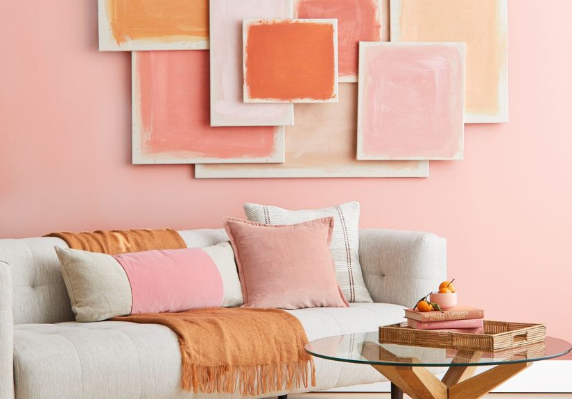
In apartments, it appeared as “just an accent” and then quietly multiplied. A blush throw pillow became two. A rose-toned candle arrived because it was “minimal.” A framed print with a pale pink circle went on the wall because the living room needed “warmth.” Before long, you had a home that felt calm and curatedlike it could host a brunch, a breakup, or a rebrand, depending on the day.
In fashion, it was the easiest way to signal you were in on the moment without looking like you were trying too hard. You could wear a dusty pink hoodie and it read as “streetwear-adjacent,” not “middle school Valentine’s Day.” You could carry a soft pink tote and it didn’t announce a gender; it announced taste. It said, “I know what Acne Studios is,” even if you pronounced it wrong the first time (and honestly, who among us hasn’t?).
In officesespecially the new breed of bright, plant-filled coworking spacesMillennial Pink felt like an HR-approved personality. It softened the sharp edges of hustle culture. Pink chairs, pink signage, pink little decorative objects that suggested the space was “inclusive,” “friendly,” and “creative,” even if you were still answering emails at 11 p.m. It was the visual equivalent of a Slack emoji reaction: supportive, noncommittal, and everywhere.
In marketing, the experience was almost physical. A product wrapped in Millennial Pink packaging felt gentler to open. The unboxing looked better. The photo looked better. And because it looked better, it felt more valuable. Millennial Pink taught consumers to treat aesthetics as proofnot proof of quality, necessarily, but proof of belonging. If your skincare bottle looked like it belonged on a neatly arranged shelfie, you felt like you belonged in that world too.
That’s the real legacy: Millennial Pink wasn’t just seenit was lived. It colored rooms, timelines, products, and small moments of identity. It made softness feel modern, and modernity feel accessible. And even when people declared it “over,” the experience lingeredbecause once a color becomes a shorthand for a whole era, it never really leaves. It just fades into the background, like a good neutral does.