Table of Contents >> Show >> Hide
- 1. Start With How You Want the Room to Feel
- 2. Learn the Basics of Color Theory (Without Getting Bored)
- 3. Create a Whole-Home Color Palette
- 4. Use What You Already Own As a Color Cheat Sheet
- 5. Consider Light, Orientation, and Architecture
- 6. Sample Like a Designer: Test Before You Commit
- 7. Neutrals, Bold Colors, and Trends: Getting the Mix Right
- 8. Foolproof Color-Scheme Formulas You Can Steal
- 9. Room-by-Room Color Tips
- Real-Life Experiences: Lessons From Choosing Color Schemes
- Final Thoughts
If choosing interior paint colors makes you want to move instead of remodel, you’re not alone. Staring at a fan deck of 1,200 slightly different whites is basically a psychological thriller for homeowners. The good news? Creating an interior color scheme you’ll actually love (and live with) is way more about strategy than about magic “designer genes.” Once you understand a few simple rules of color, light, and flow, picking paint becomes a fun creative project instead of a stressful guessing game.
In this guide, we’ll walk through how to choose interior color schemes step by step: from defining the mood you want to set, to using the color wheel without needing a design degree, to testing samples like the pros. We’ll also cover real-world examples, room-by-room tips, and a few pitfalls to avoidso you can build a home palette that feels cohesive, personal, and timeless.
1. Start With How You Want the Room to Feel
Before you even look at a paint chip, ask yourself one simple question: “What do I want this room to feel like?” Your answer will do half the work of choosing an interior color scheme.
- Calm and restful: Soft blues, blue-greens, grays, and muted neutrals tend to create a tranquil effect. They’re great for bedrooms, bathrooms, and reading nooks.
- Cozy and cocooning: Warm colors like terracotta, camel, taupe, deep greens, and ink blues wrap a space in a snug, enveloping moodperfect for living rooms and dens.
- Fresh and energetic: Brighter whites, clear blues, sunny yellows, and cheerful greens can make kitchens, entries, and home offices feel lively and awake.
- Elegant and sophisticated: Complex neutrals (think greige, mushroom, stone, or warm charcoal) paired with rich accent tones like aubergine, espresso, or deep teal bring a tailored, grown-up look.
This is color psychology in action: cool hues generally soothe; warm hues tend to energize. The purpose of the room (sleeping vs. entertaining vs. working) should heavily influence your palette. That’s why designers rarely recommend fiery red for a bedroom but love it as an accent in a dining room where you want a bit of drama and conversation.
2. Learn the Basics of Color Theory (Without Getting Bored)
You don’t need to become an artist to use the color wheel; you just need the basics to build a balanced interior color scheme.
Key Color Wheel Terms
- Warm colors: Reds, oranges, yellows. These advance visually and feel cozy and inviting.
- Cool colors: Blues, greens, blue-violets. These recede visually and can make spaces feel calm and more expansive.
- Neutrals: Whites, off-whites, beiges, grays, browns, and black. Neutrals are the backbone that hold your bolder colors together.
Popular Color Scheme Types for Interiors
- Monochromatic: One base color in different tints and shades (for example, soft sage, mid-tone sage, and deep olive). This creates a very soothing, cohesive palette that’s hard to mess up.
- Analogous: Colors that sit next to each other on the wheel, such as blue–blue-green–green. These feel harmonious and natural, like a gradient in nature.
- Complementary: Colors opposite each other on the wheel, like blue and orange, or red and green. High contrast, high dramabest used when one is dominant and the other is an accent.
- Triadic: Three colors evenly spaced around the wheel (for example, green–orange–violet). These can be vibrant; in interiors, you’ll typically soften them into muted versions and keep one color dominant.
Think of these schemes as templates. You can plug in any huemuted, earthy, pastel, or jewel-tonedand get a palette that feels intentional rather than random.
3. Create a Whole-Home Color Palette
If your home has an open floor plan or lots of connected spaces, it helps to think beyond one room at a time and design a whole-house color scheme. This doesn’t mean every room is painted exactly the same color; instead, you create a family of hues that flow together as you move from space to space.
A simple formula:
- 1 dominant neutral: This might go in entry, hallways, and main living spacessomething you truly love looking at every day.
- 2–3 supporting colors: These can be slightly darker or lighter tones of the neutral, or complementary hues that work well with it. Use them in bedrooms, bathrooms, or accent walls.
- 1 trim color: Often a clean or soft white that works with all of the above. Keep this consistent for baseboards, doors, and casings to tie everything together.
- 1–2 accent colors: Deeper or more saturated tones used sparingly on doors, a feature wall, cabinetry, or decor.
This structure gives you freedom to play while maintaining a cohesive thread. When all your doors, trim, and main walls coordinate, you can experiment with bolder shades in smaller rooms without the house feeling chaotic.
4. Use What You Already Own As a Color Cheat Sheet
One of the easiest ways to choose interior color schemes is to borrow colors from something you already love in your home:
- A favorite rug
- Artwork that always makes you smile
- Throw pillows, bedding, or curtains
- Even your wardrobe (if you live in navy and camel, your home will probably love them too)
Pick out 2–3 colors from that inspiration piece: usually one background color, one mid-tone, and one accent. Those three become the starting point of your palette. Use a paint fan deck or color-matching apps to find shades that echo those tones.
This strategy ensures your paint colors support the furnishings you already own instead of fighting them. It’s much easier (and cheaper) to match paint to an existing rug than to replace half your furniture because you picked the wrong wall color.
5. Consider Light, Orientation, and Architecture
Light can completely change how an interior color scheme looks in real life. That perfect greige in the paint store may lean blue in your north-facing bedroom and golden in your sunny south-facing living room.
Natural Light
- North-facing rooms: Light here tends to be cooler and more diffuse. Warm whites, creams, and beige with hints of yellow, pink, or red can keep the space from feeling chilly.
- South-facing rooms: These get warm light most of the day and can handle cooler colorslike blue, gray, or greenwithout feeling cold.
- East-facing rooms: Warm morning light and cooler afternoon light. Soft neutrals and colors with subtle warmth generally stay balanced throughout the day.
- West-facing rooms: Cooler in the morning, very warm and golden in late afternoon. Mid-tones and colors you like in strong, warm light tend to do well here.
Artificial Light
- Warm bulbs (2700–3000K): They enhance warm colors and can make cooler colors look dingier or dirtier.
- Cool bulbs (4000K+): They sharpen cool colors but can make warm colors appear orange or overly yellow.
Architecture matters too. High ceilings and big windows can handle deeper, moodier colors. Smaller rooms or spaces with low ceilings often feel best in lighter, more reflective shades that bounce what light you do have around.
6. Sample Like a Designer: Test Before You Commit
Even the best interior color scheme looks different on a tiny chip versus an entire wall. That’s why pros always test before they commit.
- Limit your options: Choose 3–5 serious contenders instead of 17 “maybes.”
- Use large swatches: Paint sample boards or big poster boards rather than tiny squares. Bigger areas show undertones more clearly.
- Move them around: Tape swatches to different walls and view them morning, midday, and evening.
- Compare to a true white: This helps you see if a color leans warm (yellow/red) or cool (blue/green).
- Do the squint test: Step back, half-close your eyes, and see how the color interacts with your flooring, trim, and furniture. If something looks “off,” it probably is.
Sampling takes a little extra time, but it saves you from repainting entire rooms because your “soft white” turned out to be “unhappy lavender” at night.
7. Neutrals, Bold Colors, and Trends: Getting the Mix Right
Most successful interior color schemes strike a balance between reliable neutrals and personality colors.
Choosing Neutrals
Neutrals aren’t boring; they’re the stage that lets furniture, art, and architectural details shine. Look for subtle complexity: a beige with a bit of gray, a cream with a drop of peach, a soft white with a hint of stone. These feel richer and more sophisticated than flat “contractor off-white.”
Using Bold Colors Smartly
Love deep navy, emerald green, or burnt orange? You don’t have to paint the whole house white just because it feels safer. Use bold colors in places where you want drama or intimacy: a dining room, a powder room, a study, or a bedroom accent wall. Pair them with lighter trim and plenty of texturewood, linen, rattan, metalto keep things balanced.
Handling Color Trends
Color-of-the-year announcements can be inspiring, but you don’t have to repaint every January. If a trending hue (like a cozy brown, soft white, or rich berry) genuinely feels like you, layer it into your existing scheme via an accent wall, a painted cabinet, or textiles. If it doesn’t feel like you, you’re allowed to admire it on Instagram and keep your current palette.
8. Foolproof Color-Scheme Formulas You Can Steal
If you’re stuck, start with one of these tried-and-true interior color schemes and customize the exact shades to your taste and brand of “cozy.”
Soft Neutral Minimalist
- Walls: Warm white or soft cream
- Trim: Clean white
- Accent: Mushroom, greige, or light taupe
- Pops: Black metal, natural wood, greenery
Modern Coastal (No Seashell Art Required)
- Walls: Soft white with a whisper of gray
- Accent walls or cabinets: Dusty blue or blue-green
- Trim: Crisp white
- Pops: Sand-colored textiles, woven baskets, navy accents
Moody Library Vibes
- Walls: Deep blue, forest green, or aubergine
- Trim: Cream or warm white for contrast
- Ceiling: Slightly lighter version of the wall color for a cocoon effect
- Pops: Brass, leather, dark wood
Earthy Modern
- Walls: Putty, clay, or warm greige
- Trim: Soft white or the same color as the walls (for a seamless look)
- Accents: Terracotta, rust, olive, black
- Pops: Stone, linen, jute, matte black fixtures
Each of these schemes can be dialed up or down in saturation. Choose more muted shades for a calm vibe, or richer, darker versions for drama.
9. Room-by-Room Color Tips
Living Room
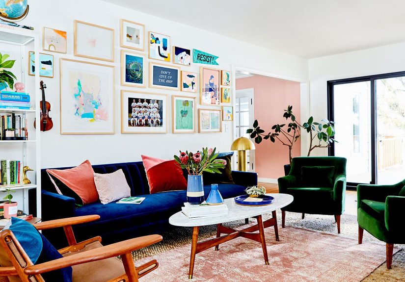
This is usually your most public space, so aim for a welcoming and flexible palette. Soft neutrals with one or two accent colors tend to work best. Think warm white walls, a camel sofa, navy pillows, and a deep green accent chair.
Kitchen
Kitchens do well with colors that feel clean and fresh. White or light neutral walls keep the space bright, while colorful lower cabinets (sage green, ink blue, or soft gray) add character. If your counters and backsplash are busy, keep the wall color subdued; if they’re simple, you can go bolder on the walls.
Bedrooms
Prioritize rest and retreat. Soft blues, blue-greens, muted mauves, or gentle earth tones are all excellent choices. Deep, cocooning colors on the walls can also work beautifully if you pair them with soft bedding and warm lighting.
Bathrooms
Bathrooms are great testing grounds for color. Because they’re small, you can crank the personality up: a deep jewel tone, a dramatic charcoal, or a spa-like blue-green. Just make sure the color flatters your skin tone in the mirror (nobody wants a paint color that makes them look vaguely seasick).
Kids’ Rooms
Instead of painting the walls neon, consider soft, versatile backgrounds (like pale blue, blush, or warm white) and bring the wild colors in with bedding, art, and toys. It’s much easier to update decor than to repaint hot pink walls later.
Real-Life Experiences: Lessons From Choosing Color Schemes
Theory is great, but nothing teaches you about interior color schemes quite like living with them. Here are some real-world style lessons that can help you skip a few of the more painful experiments.
1. The “Tiny Chip, Huge Wall” Surprise
A common experience: you fall for a sweet, medium greige on a paint chip. It looks soft, sophisticated, and safe. Then you paint your entire living room and suddenly it feels way darker than expected. Why? Because covering a whole wall amplifies depth and saturation. Many homeowners discover that colors read 1–2 steps darker once they’re on a large surface.
Takeaway: If you’re torn between two similar shades, most people are happier going slightly lighter and softer, especially in main living spaces. Save your deeper tones for accent walls, built-ins, or smaller rooms where the drama feels intentional rather than overwhelming.
2. The Open-Concept Jigsaw Puzzle
Another classic story: someone paints their kitchen a cool gray, their dining room beige, and their living room greigeonly to realize that, in an open floor plan, all three are visible at once. Instead of stylish variety, they get a patchwork of clashing undertones: blue-gray next to yellow-beige next to pink-greige.
Takeaway: In open layouts, it’s almost always better to repeat one main wall color across multiple spaces and change mood through textiles, art, and furniture. If you want different paint colors, keep them in the same color family and be very mindful of undertones.
3. The North-Facing Bedroom That Always Felt “Off”
Many people choose a trendy gray for their bedroom because it looks beautiful in photosonly to find it feels cold and lifeless in their actual space. Often, the culprit is a north-facing room, where light is naturally cooler and grays can go flat or even slightly blue.
Takeaway: If a room feels uninviting, don’t immediately blame the furniture. Ask whether your paint color is fighting the light. In darker, cooler rooms, even a small shift toward warmer, creamier tones can transform the mood from “meh” to “hotel suite.”
4. The White That Wasn’t Actually White
People often assume “white is white” and grab the first one the store hands them. Only once it’s on the walls do they notice it’s a little too yellow, or a bit too gray, or almost faintly pink at night. Suddenly, their crisp modern vision looks more like “mysteriously dingy rental.”
Takeaway: Always test whites side by side with a true, bright white. You’ll see immediately if a shade leans warm or cool. Then decide if that undertone plays nicely with your floors, countertops, and furniture. Warm whites love wood and beige; cooler whites look great with black accents and gray stone.
5. The Trendy Color Crush
At some point, everyone falls in love with a trendy shademaybe a dusty rose, deep green, or moody plum. It looks incredible on social media. But when you paint your entire main floor that color, you might realize you don’t actually want your home to be a Pinterest board 24/7.
Takeaway: It’s completely okay to have a color crush, but treat bold or trendy hues as accents or small-room showstoppers first. Try them in a powder room, on a single wall, or on a piece of furniture. If you still adore the color after a few months, then consider giving it more real estate.
6. The “Everything Neutral” Phase
Many people swing in the opposite direction and paint everything white, beige, or greige to “play it safe.” After a while, the house can start to feel flat and personality-free, even if the colors are technically fine.
Takeaway: A neutral base is fantasticbut it needs texture and accents to feel alive. Layer in wood, stone, woven pieces, plants, art, and a couple of accent colors through textiles. Even a calm palette needs a few moments of contrast to feel intentional.
7. The “I Wish I’d Hired Help Sooner” Moment
Some homeowners spend months agonizing over color, buying sample after sample, and repainting multiple timesthen finally bring in a designer or color consultant, who nails the palette in an afternoon.
Takeaway: If you’ve tried the steps above and still feel stuck, consider investing in a color consultation. A professional eye can be surprisingly affordable compared to the cost (in time, energy, and paint) of repeated trial and error. They’ll see undertones, light patterns, and architectural details you might miss on your own.
Ultimately, choosing interior color schemes you’ll love isn’t about getting it “perfect” on the first try. It’s about understanding how color, light, and your personal style work together, and then making confident, informed decisions. When you treat paint as a powerful but flexible design tool, your home becomes less of a project and more of a reflection of who you areand that’s the kind of color story you’ll love living in every day.
Final Thoughts
To recap: start with the mood and function of each room, then use the color wheel to build simple, balanced schemes. Create a whole-home palette for flow, pull inspiration from pieces you already own, respect the light in every space, and always test before you commit. Mix dependable neutrals with bolder accent colors and sprinkle trends lightly, like seasoning.
When you approach interior color schemes with this kind of strategy, you stop fearing the paint aisle and start using color to support how you actually live. And that’s when your house stops feeling like “a place you painted” and starts feeling like home.