Table of Contents >> Show >> Hide
- Step 1: Decide What You Want Your Outdoor Space to Feel Like
- Step 2: Understand Opacity (Because It Changes Everything)
- Step 3: Take Your Deck’s “Starting Color” Seriously
- Step 4: Let Lighting and Undertones Be Your Secret Weapon
- Step 5: Test Stain Colors Like a Slightly Paranoid Pro
- Step 6: Choose a Color Family That Works With Your Home (With Examples)
- 1) Warm natural browns (the “always looks right” category)
- 2) Redwood and richer ambers (for cozy, high-contrast warmth)
- 3) Driftwood, taupe, and greige (modern, relaxed, designer-friendly)
- 4) Gray and charcoal (sleekbut pick the right gray)
- 5) Deep espresso and near-black browns (bold, luxe, and surprisingly practical)
- 6) Blues, greens, and “personality colors” (use them like hot sauce)
- Step 7: Make Maintenance Part of the Color Decision
- Step 8: Use Design Tricks to “Level Up” the Final Look
- Step 9: A Simple Decision Framework (So You Don’t Spiral)
- Deck Stain Color Trends You Can Borrow Without Getting Trend-Trapped
- Common Mistakes (And How to Avoid Them)
- Conclusion: Your Deck Color, But Make It Intentional
- Experience Notes: Real-World Lessons People Learn When Choosing Deck Stain Colors (Extra)
- 1) The Gray That Turned Blue (aka “Why Is My Deck a Denim Jacket?”)
- 2) The “I Wanted Natural” vs. The “My Deck Has Opinions” Reality
- 3) The Small Deck That Felt Bigger Overnight
- 4) The Dark Stain That Looked Expensive (Until It Met Full Sun)
- 5) The Best Surprise: Two-Tone Solves More Problems Than It Creates
- 6) The Most Useful Habit: Choosing Stain Color With Furniture in Mind
Picking a deck stain color sounds simple until you realize your deck is basically a giant, horizontal billboard
attached to your house. It’s always “on,” it’s in direct sun, and it will absolutely judge you if you pick a shade
that clashes with your siding. The good news: you don’t need a design degree or a tarot readingjust a smart
process that accounts for light, wood type, stain opacity, and your home’s color palette.
This guide walks you through how to choose deck stain colors that look intentional (not accidental), feel cohesive
with your home, and hold up in the real worldwhere muddy shoes, pollen, grilling mishaps, and the occasional
“oops, I spilled iced coffee” are all part of outdoor living.
Step 1: Decide What You Want Your Outdoor Space to Feel Like
Before you even look at stain chips, decide the vibe. Think of it like picking the background for everything else:
furniture, planters, rugs, railings, and yesyour own feet in summer sandals.
Three easy vibe directions
- Natural & timeless: warm browns, cedar tones, honey, light walnutclassic and forgiving.
- Modern & calm: driftwood, taupe, greige, soft charcoalpairs well with black metal and clean lines.
- Statement deck: deep espresso, rich redwood, or even a bold tint on accentsgreat if your deck is a focal point.
If you’re stuck, take a quick inventory: do you want your deck to blend with nature or contrast your house?
Blending feels serene. Contrast feels crisp and architectural. Neither is “right”but picking intentionally avoids
the dreaded “Why does my deck look… green?” surprise.
Step 2: Understand Opacity (Because It Changes Everything)
“Deck stain color” isn’t just color. It’s also opacityhow much wood grain shows through. Opacity affects:
the final shade, how evenly it looks, how it weathers, and how often you’ll be re-coating.
The opacity spectrum in plain English
- Clear / transparent: maximum wood look, minimal pigment. Gorgeous on new, nice boardsmore frequent upkeep.
- Semi-transparent: visible grain + added pigment for a more “designed” look. A popular middle ground.
- Semi-solid / semi-opaque: less grain, more uniform color, often better coverage for aging boards.
- Solid: basically paint’s hardworking cousinopaque color, hides imperfections, often longest-lasting.
Here’s the trade-off: the more pigment, the more uniform and protective the finish tends to beespecially on older
decks. Testing organizations and manufacturers commonly note that solid stains generally outlast clear and
semi-transparent options, while the transparent end of the spectrum usually demands more frequent maintenance.
Step 3: Take Your Deck’s “Starting Color” Seriously
Stain is not paint. It interacts with the wood you already have, which means the same stain name can look different
from one deck to the next. Your deck has a “starting color” based on species, age, sun exposure, and previous
coatings.
Wood species and age: why your stain sample lies (a little)
Different woods absorb stain differently. Some have open grain and drink stain up; others have tight grain and
behave like they’re suspicious of commitment. Weathered wood also takes stain unevenly unless it’s properly
cleaned and prepped. Translation: color choice isn’t just aestheticit’s also chemistry.
Previous stain matters (a lot)
If your deck has an old solid stain, you typically can’t go back to a clear or semi-transparent look without major
stripping and sanding because the wood pores are already sealed. If you don’t know what’s on there, plan your
color/opacity choice with the existing finish in mind.
Step 4: Let Lighting and Undertones Be Your Secret Weapon
Lighting changes stain the way lighting changes makeupeverything looks great until you step outside. Natural sun,
shade from trees, and warm porch lights at night can all shift how undertones read.
Quick undertone rule
- Warm-leaning homes (beige siding, warm brick, creamy trim) often look best with warm stains (cedar, honey, walnut, redwood).
- Cool-leaning homes (blue-gray siding, crisp white + black accents, cool stone) pair well with cooler stains (taupe, driftwood, gray, charcoal).
If you’ve ever painted a room and watched the color turn “mysteriously peach,” you already understand undertones.
Deck stains do the same thingso we test. Which brings us to the most important step.
Step 5: Test Stain Colors Like a Slightly Paranoid Pro
Testing is not optional if you want to avoid regret. The final color depends on your deck’s wood tone and texture,
plus sun and shade patterns. Most pros recommend trying stain in a small, inconspicuous area (or on sample boards)
before committing to the whole deck.
How to test without turning your deck into a patchwork quilt
- Pick 3 candidates (not 12your brain will melt).
- Test on the deck in 2–3 spots: full sun, partial shade, and near the house.
- Label each test with painter’s tape, because “the nice brown” is not a scientific category.
- Wait for dry-down and check morning/noon/evening. Sun can make a warm stain look lighter and a gray stain look bluer.
Pro tip: if your deck is old or uneven, consider testing both a semi-transparent and a semi-solid version of a
similar color family. You may find the semi-solid gives you a cleaner, more even appearance without going fully
opaque.
Step 6: Choose a Color Family That Works With Your Home (With Examples)
1) Warm natural browns (the “always looks right” category)
Warm brownscedar, light oak, honey, pecan, walnuttend to feel inviting and classic. They pair well with
traditional architecture, warm brick, tan siding, and lots of greenery. If you want your deck to look like it grew
there (in a good way), start here.
Example: A craftsman-style home with cream trim + olive landscaping looks cohesive with a cedar or honey stain.
2) Redwood and richer ambers (for cozy, high-contrast warmth)
These tones add drama without going dark. They work especially well with white houses, warm stone, or brick, and
can make a deck feel more like an “outdoor room.” Just test carefullysome reds lean orange or pink depending on
the wood and sunlight.
Example: White siding + black windows looks sharp with a rich redwood tone for contrast.
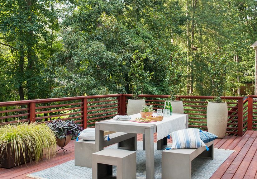
3) Driftwood, taupe, and greige (modern, relaxed, designer-friendly)
If your style is “minimal but not sterile,” driftwood and taupe stains can be a dream. They’re great with
contemporary exteriors, black railings, and neutral outdoor furniture. These also help outdoor rugs and cushions
stand out instead of competing with the floor.
Example: A blue-gray house with white trim looks clean with a taupe/greige deck stain that echoes the cool palette.
4) Gray and charcoal (sleekbut pick the right gray)
Gray stains can look modern and coastal, but they’re also the easiest to get “oops” wrong. Some grays pull blue,
some pull green, and some look like wet concrete (which is a vibe… if that’s your vibe). Testing is crucial.
Also consider temperature: darker shades can feel warmer underfoot in full sun. And while dark stains can hide some
dirt, ultra-light finishes can show grime faster.
5) Deep espresso and near-black browns (bold, luxe, and surprisingly practical)
Deep browns can make railings and furniture feel upscaleespecially with modern homes. These shades also pair well
with greenery and warm lighting. They can show pollen less than super-light finishes, but they may fade more
noticeably over time if the deck gets intense sun.
Example: A modern farmhouse exterior (white + black) looks sophisticated with a deep brown stain that reads almost black at night.
6) Blues, greens, and “personality colors” (use them like hot sauce)
Yes, you can go bold. But for most homes, bold colors work best as accents: bench seating, planters, railings, or
a smaller covered porch area. If you stain the entire deck a strong color, you’re committing to a whole aesthetic
(and you’ll be buying matching pillows forever).
Step 7: Make Maintenance Part of the Color Decision
Your deck stain color should match your lifestyle, not just your Pinterest board. Ask yourself: are you the kind of
person who loves seasonal upkeep… or the kind of person who thinks “maintenance” means “I own a broom”?
Color vs. real-world mess
- Very light stains can make small decks look bigger, but they may show dirt, scuffs, and mildew faster.
- Mid-tones (taupe, cedar, medium brown) tend to be the most forgiving day-to-day.
- Very dark stains can hide some grime but may show dust/pollen and can fade in harsh sun.
Performance matters too
If longevity is your #1 goal, consider looking at independent testing and reviews when choosing a product line.
Many homeowners focus on color first, then regret it when the finish fails early. A great color in a weak formula
is like buying a beautiful umbrella made of tissue paper.
Step 8: Use Design Tricks to “Level Up” the Final Look
You don’t have to pick just one stain color for everything. Smart contrast can make a basic deck look custom.
Easy upgrades that look expensive
- Two-tone approach: darker border + lighter center, or contrasting stair treads.
- Match railings to trim: tying rails to the house color can make the whole exterior feel intentional.
- Create zones: dining area slightly darker than lounge area (subtle, not circus).
If your deck is attached to a white house, deeper browns can create an eye-catching contrast. If your home is dark,
a lighter stain can keep the deck from feeling too heavy.
Step 9: A Simple Decision Framework (So You Don’t Spiral)
Answer these five questions
- Is my deck new or weathered? (New can go clearer; weathered often looks better with more pigment.)
- Do I want to see wood grain? (Yes → semi-transparent; not really → semi-solid/solid.)
- Is my house warm or cool? (Match undertones.)
- Full sun or shade? (Sun can lighten and fade; shade can emphasize cool/green undertones.)
- How much maintenance do I tolerate? (Be honest. Your future self deserves it.)
Deck Stain Color Trends You Can Borrow Without Getting Trend-Trapped
Trend watching can be useful when you want your outdoor space to feel current. In recent “color of the year”
announcements from major brands, you’ll notice a theme: nature-inspired warmth (cedar and rich
browns) plus the occasional bold statement shade (hello, violet).
- Warm cedar tones: popular for a timeless, wood-forward look.
- Deep, earthy browns: often described as grounding and high-end, especially on modern exteriors.
- Bold accent stains: best used on smaller elements or covered areas for personality.
Common Mistakes (And How to Avoid Them)
Mistake 1: Picking a color from a tiny swatch
Your deck is not a two-inch square. Test on the deck itself, in multiple lighting conditions.
Mistake 2: Ignoring undertones
Gray that looks “perfect” indoors can turn blue outside. Brown can turn orange. Testing prevents heartbreak.
Mistake 3: Choosing the wrong opacity for the deck’s condition
If the boards are blotchy, cracked, or stained, a more opaque stain often looks cleaner and lasts longer.
Mistake 4: Forgetting the future
Ask: will I still like this color in three years? A deck refinish is not the same as swapping throw pillows.
Conclusion: Your Deck Color, But Make It Intentional
The best deck stain colors do three things: they work with your home, they flatter your deck’s wood, and they fit
how you actually live outside. Pick a vibe, choose an opacity that matches your deck’s condition, test in real
lighting, and think about maintenance before you commit. Do that, and your outdoor space won’t just look “done”
it’ll look like it belongs.
Experience Notes: Real-World Lessons People Learn When Choosing Deck Stain Colors (Extra)
If you want the short version of deck stain color experience, it’s this: people rarely regret testing, and they
frequently regret skipping it. The “extra step” is usually the step that saves the project.
1) The Gray That Turned Blue (aka “Why Is My Deck a Denim Jacket?”)
A common story: someone falls in love with a modern gray stain because it looks clean and current. They pick a
shade that reads neutral on the sample card, apply it, and thenunder bright outdoor lightit shifts cool and
slightly blue. Suddenly the deck feels more nautical than modern. What happened? Outdoor light is intense, and
cool undertones can get amplified in open shade or north-facing spaces. The fix is often simple: test a few grays
that lean warmer (greige/taupe), or choose a driftwood tone that has a touch of brown in it. Even switching outdoor
decor to warmer cushions and planters can rebalance the look, but the best solution is choosing the right undertone
upfront.
2) The “I Wanted Natural” vs. The “My Deck Has Opinions” Reality
Many homeowners aim for a natural, semi-transparent finish because the wood grain is beautifulon day one. But if
the deck boards are already weathered, patched, or uneven, semi-transparent stain can highlight every difference:
new board vs. old board, sun-faded section vs. shaded section, sap streaks, knots, you name it. This is where
experience teaches a helpful truth: choosing a slightly more pigmented stain (semi-solid, or even solid) isn’t
“giving up.” It’s choosing a finish that makes the whole deck look unified. People often end up happier with an
even, intentional look than with a “natural” finish that unintentionally spotlights flaws.
3) The Small Deck That Felt Bigger Overnight
There’s a reason lighter and mid-tone stains are often recommended for smaller decks. When the floor is brighter,
the space can feel more openespecially if the deck is surrounded by darker landscaping or fencing. A light cedar,
warm honey, or soft taupe can create that “airier” effect. The lesson people share after doing this: it’s not just
the colorit’s the contrast. Pairing a lighter deck with darker planters or black railings can give the space crisp
edges and a designer feel, while keeping the footprint visually expanded.
4) The Dark Stain That Looked Expensive (Until It Met Full Sun)
Deep espresso and near-black browns look stunningespecially next to white or light-colored siding. The deck reads
dramatic, modern, and intentionally styled. Then summer happens. In full sun, very dark surfaces can feel hotter
underfoot, and intense UV exposure can make fading more noticeable over time. The experience-based takeaway is not
“don’t go dark,” but “go dark with a plan.” That plan can include: choosing a high-performing stain product line,
accepting that maintenance may be more visible, adding outdoor rugs in high-traffic areas, and using furniture
layout to create natural walking paths. People who love their dark decks often treat them like a statement floor:
gorgeous, but worth protecting.
5) The Best Surprise: Two-Tone Solves More Problems Than It Creates
Two-tone decks can sound complicated, but they often make decisions easier. People who can’t pick between “warm”
and “modern” sometimes use a warm mid-tone on the main surface and a darker, cooler border for structureor the
reverse. Two-tone designs also help disguise wear in high-traffic zones (stairs, grill area) while keeping the main
deck bright and welcoming. The key lesson is restraint: two tones should feel related, not random. Think “same
family, different depth,” not “surprise zebra deck.”
6) The Most Useful Habit: Choosing Stain Color With Furniture in Mind
People who end up happiest with their stain color often choose it like a background for their outdoor furniture.
If your furniture is warm wood, woven, or tan cushions, warm stains look effortless. If your furniture is black
metal and crisp neutrals, driftwood and charcoal can look sharp. And if you love colorful pillows, a calmer deck
stain gives those accents room to shine. The experienced approach is simple: decide what you want to “star” (deck
itself, furniture, landscaping), then pick a stain color that supports that star rather than competing with it.
Bottom line from real-world experience: the right deck stain color usually isn’t a single perfect shadeit’s the
shade that looks good in your light, on your wood, next to your house, and on the kinds of days you actually use
your outdoor space. Test thoughtfully, pick an opacity that matches reality, and you’ll end up with a deck that
feels like an upgrade instead of a lesson.