Table of Contents >> Show >> Hide
- What Is Light Gold?
- Why Light Gold Works So Well
- Where Light Gold Looks Best
- The Best Colors to Pair With Light Gold
- How to Use Light Gold Without Overdoing It
- Styles That Suit Light Gold
- Common Mistakes to Avoid
- Real-Life Examples of Light Gold Done Right
- Experiences Related to Light Gold
- Conclusion
Some colors walk into a room politely. Light gold enters like it knows where the good snacks are. It is warm without being loud, elegant without trying too hard, and versatile enough to work in interiors, fashion, branding, and everyday design. If bright yellow is a trumpet solo, light gold is jazz in a well-lit lounge: smooth, confident, and just a little bit extra in the best possible way.
That mix of glow and restraint is exactly why light gold keeps showing up in stylish homes, polished packaging, timeless accessories, and color palettes that want warmth without the heaviness of mustard or the drama of full metallic gold. It gives spaces a lifted look, softens hard lines, and adds an instant sense of richness that does not have to feel flashy.
In this guide, we will break down what light gold really is, why people love it, what colors pair with it, how to use it well, and how to avoid turning your room into something that looks suspiciously like a fancy banquet hall from 2007. We will also explore real-life experiences with light gold so the color feels less abstract and more usable.
What Is Light Gold?
Light gold is a soft yellow-gold hue that sits somewhere between warm beige, muted yellow, and classic metallic gold. It usually carries gentle golden undertones rather than the deeper amber, bronze, or mustard notes found in darker gold shades. In plain English, it is gold after it has had a glass of water and decided to calm down.
One important thing to know: light gold is not one universal, fixed shade. In paint, decor, fashion, and digital design, it can range from creamy and buttery to sandy and metallic-inspired. Some versions lean warm and sunny. Others look more antique, champagne-like, or slightly olive depending on the undertone. That is why two products labeled “gold” can look wildly different when placed side by side.
Light Gold vs. Gold vs. Champagne
Classic gold tends to be richer, deeper, and more obviously metallic. Light gold is softer, paler, and easier to live with every day. Champagne usually has more beige, blush, or gray in it, making it even quieter and more neutral. If classic gold is a statement necklace, light gold is the delicate chain you wear every week, and champagne is the one that whispers, “I have excellent taste and also a very organized pantry.”
Why Light Gold Works So Well
Light gold borrows positive traits from both yellow and gold. Yellow family colors often feel bright, welcoming, optimistic, and energetic. Gold brings in associations with quality, luxury, celebration, and warmth. When those ideas are softened into a lighter shade, the result feels approachable rather than intimidating.
That balance matters. Bright yellow can overwhelm a room or an outfit if it is used carelessly. Heavy gold can feel formal or fussy. Light gold lands in the sweet spot. It still adds warmth and visual interest, but it does not dominate everything around it. It reflects light beautifully, especially in rooms with limited sunshine, and it tends to flatter natural materials such as linen, oak, marble, leather, and woven textures.
Psychologically, light gold also gives off a “quiet confidence” vibe. It feels cheerful, but not childish. Luxurious, but not cold. Calm, but not boring. That is a rare combination in color design, which helps explain its long shelf life.
Where Light Gold Looks Best
In Interior Design
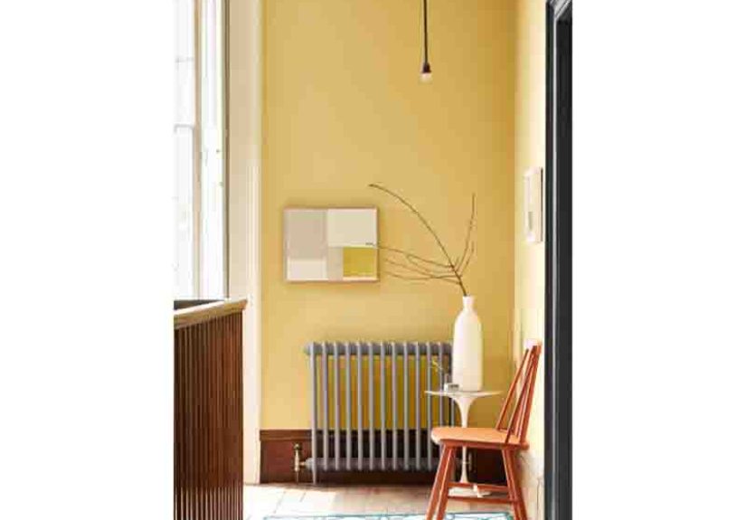
Light gold shines in interiors because it can act as either a soft wall color or an accent finish. On walls, it creates a cozy glow that feels especially welcoming in dining rooms, powder rooms, entryways, and living areas. In darker rooms, a cleaner gold can brighten the space more effectively than muddy neutrals. In sunnier rooms, a pale gold can look rich and layered instead of flat.
As an accent, light gold is a superstar. Think cabinet hardware, mirror frames, sconces, faucet finishes, bar stools, curtain rods, picture frames, and decorative trays. These smaller touches bring warmth and polish without demanding a complete redesign. That is why homeowners often start with gold accents before committing to a larger color move.
It also works beautifully with the popular 60-30-10 decorating approach. Use your main neutral for most of the room, a secondary color for furniture or textiles, and let light gold live in the finishing 10 percent. That way it sparkles instead of shouting.
In Fashion and Accessories
Light gold is one of the easiest warm metallics to wear. It is softer than bright yellow gold and often more forgiving than very icy silver. In clothing, it appears in satin, knitwear, embroidery, heels, handbags, or subtle shimmer. In jewelry, it reads classic, flattering, and versatile.
It pairs especially well with ivory, cream, camel, navy, olive, blush, chocolate brown, and black. That makes it easy to style in both casual and dressy looks. A light gold heel with a neutral dress feels polished. A soft gold clutch with navy feels rich. A light gold earring with a white shirt feels like effort was made, even if the rest of the day is held together by coffee and determination.
In Branding and Digital Design
Brands use light gold when they want to communicate elegance, quality, prestige, and warmth without looking too severe. It works well for beauty, wellness, hospitality, jewelry, boutique retail, stationery, and premium food packaging. A lighter gold can feel more modern and accessible than a dark, high-shine metallic effect.
In digital design, the trick is restraint. Gold effects can turn cheesy very quickly if they rely on aggressive gradients or low-contrast text. A better approach is to use light gold as an accent color on buttons, borders, icons, or highlights, while keeping the layout clean and readable.
The Best Colors to Pair With Light Gold
Light gold is flexible, but not magic. It still needs good company. Here are the most reliable pairings:
White and Cream
This is the easiest and most timeless match. White and cream let light gold glow while keeping the overall look airy. It is ideal for kitchens, bathrooms, bedrooms, branding, and event design.
Navy and Deep Blue
Blue and gold are a famously elegant pairing because the cool depth of blue makes gold feel brighter and more regal. Navy with light gold looks refined, classic, and a little tailored.
Green and Sage
Soft greens, olive, sage, and even deeper emerald tones give light gold a grounded, natural backdrop. This pairing feels organic, layered, and expensive without being stiff.
Blush, Clay, and Warm Pink
If you want softness, use light gold with blush or muted terracotta. The combination feels romantic, warm, and modern, especially in bedrooms, beauty packaging, and wedding styling.
Charcoal and Black
Need drama? Dark neutrals give light gold contrast. The look can be glamorous, but it stays cleaner when the gold is brushed, muted, or limited to accents.
Wood Tones and Warm Browns
Light gold loves natural wood. Oak, walnut, rattan, leather, and woven textures keep it from feeling too slick. This is a smart move if you want warmth that still feels relaxed and livable.
How to Use Light Gold Without Overdoing It
The biggest mistake people make with gold is assuming more shine equals more style. It does not. It usually equals more fingerprints.
To use light gold well, start with one clear role for it. Maybe it is the cabinet hardware in a white kitchen. Maybe it is the trim on a mirror wall in a powder room. Maybe it is the accent color in a brand identity. Giving it one job makes the whole palette feel intentional.
Finish matters too. Brushed, matte, aged, and satin gold usually feel more sophisticated than a super-glossy yellow metallic. The softer finish suits the softer personality of light gold.
Lighting is another huge factor. Warm bulbs can make light gold look richer and cozier. Cool bulbs can flatten it or pull it toward beige. Always test a paint swatch or finish sample in daylight, evening light, and lamplight before committing. A color that looks dreamy at 10 a.m. can look oddly sleepy by 8 p.m.
Finally, pay attention to undertones. If your light gold leans yellow, pair it with warmer whites and woods. If it leans beige or champagne, it can handle cooler grays and dusty blues more gracefully.
Styles That Suit Light Gold
Modern
Use light gold in slim lines, simple hardware, and clean shapes. Pair it with white, black, stone, and natural oak. The result feels crisp and elevated.
Traditional
Light gold works beautifully with molding, antique mirrors, tailored upholstery, and layered neutrals. It brings warmth to classic spaces without making them feel stuffy.
Art Deco and Glam
This one is almost unfair because gold was born ready. Use it with velvet, marble, geometric forms, lacquer, and high contrast. Just keep one foot on the brake so the room feels chic, not theatrical.
Cottage, Farmhouse, and Collected Interiors
Yes, light gold can work here too. Choose aged brass or weathered gold finishes rather than shiny metallic ones. Mix them with soft linens, painted wood, vintage finds, and floral or botanical notes.
Common Mistakes to Avoid
- Using too many gold finishes at once: Pick a dominant gold tone and stick close to it.
- Ignoring undertones: A yellow-heavy gold and a pink-champagne gold do not always play nicely together.
- Skipping contrast: Light gold needs white, blue, green, wood, or dark neutrals nearby so it does not wash out.
- Going full metallic everywhere: One glamorous element is elegant. Twelve can feel like a trophy shop exploded.
- Choosing the wrong bulb temperature: Lighting can make or break this color faster than you can say “Why does this wall look tan now?”
Real-Life Examples of Light Gold Done Right
A white kitchen with brushed light gold hardware and warm wood stools feels fresh but not sterile. A bedroom with creamy walls, a light gold mirror, and soft sage bedding looks restful and quietly refined. A boutique skincare brand using off-white packaging and light gold accents feels premium without becoming intimidating. A navy powder room with a muted gold sconce can look like a tiny jewel box in the best possible sense.
These examples work because light gold is not trying to do all the labor. It is part of a team. Great design rarely relies on one dramatic element alone. The magic usually comes from balance: light and shadow, warm and cool, texture and shine, softness and structure.
Experiences Related to Light Gold
Light gold is one of those colors that people often remember emotionally before they remember it technically. You may not walk into a room and announce, “Ah yes, this is clearly a pale yellow-gold with warm undertones.” You are more likely to say, “This place feels warm,” or “Why does this kitchen suddenly feel expensive?” That is the sneaky charm of light gold. It works through atmosphere.
One of the most common experiences people have with light gold is seeing it change throughout the day. In the morning, it can look soft, creamy, and almost buttery. By late afternoon, it tends to glow more deeply, especially near wood furniture or sunlight. At night, under warm lamps, it can take on a cocoon-like richness that makes a room feel inviting and settled. It is not a static color, and that is part of the appeal. Living with light gold can feel a little like living with candlelight that pays rent.
In homes, light gold often creates a sense of welcome. Entryways with warm gold mirrors or sconces feel more intentional. Dining rooms with light gold walls or accents can seem more flattering, which is wonderful news for dinner parties and terrible news for anyone trying to leave early. Bedrooms with light gold details often feel softer and calmer than rooms filled with cooler metals. Even a simple lamp base or picture frame can make a space feel finished, as though someone actually remembered the accessories instead of panic-buying them 20 minutes before guests arrived.
In fashion, light gold tends to create the experience of “effortless polish.” A soft gold necklace with a white shirt can make a basic outfit feel styled. A light gold sandal can make linen pants feel vacation-ready. A brushed gold watch or belt buckle can bring warmth to black, navy, camel, or blush without screaming for attention. Many people like light gold because it feels less harsh than bright yellow gold and less icy than silver. It sits in the middle with very good manners.
There is also a memory component to light gold. For some people, it recalls holiday candlelight, heirloom frames, warm hotel lobbies, old jewelry boxes, or the soft glow of late summer. For others, it feels modern and clean when paired with white walls, oak floors, and simple shapes. That flexibility is unusual. Few colors can feel nostalgic and current at the same time without tripping over themselves.
In branding and packaging, the experience of light gold is often about trust and quality. Customers tend to read it as a signal that a product is a little more thoughtful, a little more elevated, and probably not stored in a bargain bin next to mystery candles. But the best uses are subtle. A fine line, a foil stamp, a border, or a small icon is usually enough. When brands overdo it, the experience shifts from premium to “trying very hard,” which is never the goal.
What makes light gold especially memorable is that it often improves ordinary moments. Sunlight hitting a gold-framed mirror. A matte gold faucet against a marble backsplash. A holiday table with cream linens and soft metallic details. A wedding invitation with understated foil. A cozy cafe logo with warm lettering on textured paper. None of these moments require giant drama. They just need the right amount of glow.
That is probably the best way to describe the lived experience of light gold: it is not a spotlight color. It is a glow color. It does not always demand attention first, but it improves the way everything around it feels. And honestly, that is a pretty excellent personality trait for a color.
Conclusion
Light gold earns its place because it balances warmth, elegance, and usability better than many trendier shades. It can brighten a dim room, soften a modern palette, elevate everyday accessories, and bring a premium feel to visual design. Used carefully, it is timeless. Used recklessly, it becomes a warning label from the decorating gods. The good news is that the smarter path is simple: choose the right undertone, give it contrast, and let it glow in moderation.
If you want a color that feels sunny, polished, and surprisingly adaptable, light gold is a strong pick. It is warm enough to feel inviting, refined enough to feel elevated, and flexible enough to work across styles. That is not just a pretty color. That is a useful one.