Table of Contents >> Show >> Hide
- What the Map Measures (And What It Doesn’t)
- A Quick Snapshot: Best and Worst States by Average PM2.5
- Why Would a Southern State Rank Last?
- Why Hawaii (and Friends) Can Look So Good
- Air Quality Isn’t One Number: PM2.5 vs. AQI vs. Ozone
- Why Rankings Can Mislead (Without Being “Wrong”)
- What You Can Do on Bad-Air Days (Without Panicking)
- The Bigger Fix: How States Actually Improve Air Quality
- Extra: Real-World Experiences When a State Ranks Last ()
- Conclusion
If you’ve ever stepped outside, inhaled, and immediately thought, “Ah yeseau de freeway,” you’re not alone.
A new-ish map making the rounds ranks U.S. states by average PM2.5 (tiny particle pollution you can’t see but your lungs absolutely remember),
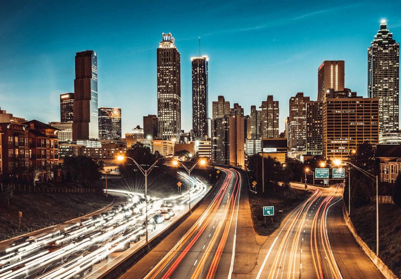
and it lands on a headline that feels both surprising and painfully believable: Georgia ranks last for air quality by this metric.
Meanwhile, Hawaii sits at the “breathe easy” end of the spectrum.
Before anyone starts packing up their house and moving to Maui with nothing but a suitcase and a dream, let’s slow down and look at what the map
actually measures, why the South can struggle with fine-particle pollution, and what “best” and “worst” really mean when air quality changes by the hour.
Consider this your friendly guide to the data, the reasons behind it, and a few practical ways to protect your lungs without living inside a bubble.
(Though if someone invents a stylish bubble helmet, please notify the group chat.)
What the Map Measures (And What It Doesn’t)
The ranking behind this particular map is based on annual average PM2.5 concentrationfine particulate matter that’s
2.5 microns or smaller. That’s about 30 times thinner than a human hair. Translation: your body can’t just “filter it out” like a bouncer at a club.
PM2.5 can travel deep into the lungs and is associated with a range of health risks, especially for people with asthma, heart disease, and other conditions.
PM2.5 comes from a mix of sources, including:
- Vehicle exhaust (especially heavy-duty trucking corridors)
- Industry and power generation
- Wildfire smoke (even when the fire isn’t in your state)
- Wood burning and other combustion sources
- Secondary particles formed when gases react in the atmosphere (yes, air can “cook” new pollution)
What the map doesn’t fully capture: the whole cast of air-quality characters.
Air quality isn’t just PM2.5. It also includes ground-level ozone (“smog”), nitrogen dioxide, sulfur dioxide, and more.
Some states may look decent on annual PM2.5 but still get hammered by ozone on hot, sunny days.
And state averages can hide big local differencesone metro area or industrial region can drag a state’s number upward, even if rural areas breathe cleaner.
A Quick Snapshot: Best and Worst States by Average PM2.5
Based on the widely shared map and its underlying analysis of 2024 PM2.5 data, here’s the headline picture:
Top 10 “Worst” States (Higher Average PM2.5)
| Rank | State | Avg. PM2.5 (µg/m³) |
|---|---|---|
| 1 | Georgia | 8.9 |
| 2 | Arkansas | 8.8 |
| 3 | Idaho | 8.7 |
| 4 | Mississippi | 8.3 |
| 5 (tie) | Texas | 8.3 |
| 6 (tie) | Oklahoma | 8.3 |
| 7 | Louisiana | 7.8 |
| 8 (tie) | Kansas | 7.8 |
| 9 (tie) | Illinois | 7.8 |
| 10 | Ohio | 7.7 |
Top 10 “Best” States (Lower Average PM2.5)
| Rank | State | Avg. PM2.5 (µg/m³) |
|---|---|---|
| 1 | Hawaii | 3.4 |
| 2 | Alaska | 3.6 |
| 3 (tie) | Rhode Island | 3.6 |
| 4 | Washington | 4.8 |
| 5 (tie) | Vermont | 5.0 |
| 6 (tie) | Maine | 5.0 |
| 7 | New Mexico | 5.3 |
| 8 | Oregon | 5.4 |
| 9 | Colorado | 5.6 |
| 10 | Nevada | 5.7 |
Those numbers matter because global health benchmarks are increasingly strict. For example, the WHO guideline for annual PM2.5 is
5 µg/m³. Many “good” states hover near that line, and most “worst” states clear it comfortablylike it’s a limbo contest nobody wanted to enter.
Why Would a Southern State Rank Last?
Georgia taking the bottom spot may surprise people who picture the South as all pine trees and porch swings.
But air pollution doesn’t care about your aesthetic. It cares about emissions, weather, geography, and what the atmosphere does with your emissions after you release them.
1) Big metros + traffic = steady particle load
Georgia is anchored by a major metro region with heavy commuter traffic and freight movement. Even when modern vehicles are cleaner than older fleets,
sheer volume matters. High traffic density can raise direct particle emissions and also contribute gases that form secondary PM2.5 downwind.
2) Heat and sunlight can “cook” pollution
Hot weather doesn’t just make you sweat through your shirt. It also speeds up atmospheric chemistry.
In warm, sunny conditions, pollutants can react to form ozone and secondary particles, worsening both smog and fine-particle levels.
This is part of why “air quality season” often feels like summer’s most annoying bonus feature.
3) Smoke travelssometimes hundreds of miles
Wildfire smoke is a PM2.5 super-spreader (for particles, not people). Smoke can travel long distances, and when it mixes down to where we live and breathe,
it can push particle levels up even in places far from flames. That means a “good air” state can have a bad week, and a “struggling” state can have a worse one.
4) Prescribed burning is a real trade-off
The Southeast uses prescribed burns as a land-management tool. These burns can reduce fuel loads and lower the risk of catastrophic wildfires,
but smoke from controlled burns still contains PM2.5. The result is a tough balancing act: reduce one kind of risk without ignoring the health costs of smoke exposure.
In other words: sometimes air quality is a “choose your hard” situation.
5) Industry, energy, and the “many small sources” problem
PM2.5 doesn’t come from a single villain twirling a mustache. It’s more like a committee of minor villains:
industrial activity, power generation, heavy-duty diesel, construction dust, residential burning, and regional pollution transport.
Any one source might not dominate everywhere, but together they build a baseline that can keep annual averages elevated.
Why Hawaii (and Friends) Can Look So Good
Hawaii ranking best makes intuitive sense: fewer large industrial corridors, fewer mega highways, and ocean winds that can help disperse pollution.
Geography can be an air-quality cheat codethough it’s not foolproof.
Even Hawaii has unique challenges. Volcanic smog (“vog”) forms when sulfur dioxide and other volcanic gases react in the atmosphere,
creating fine particles that qualify as PM2.5. So yes, Hawaii can have clean air and occasionally remind you it’s sitting on a dramatic geologic stage.
Alaska and Rhode Island appearing near the top also highlights an important point: “best” doesn’t always mean “always perfect.”
Alaska can experience conditions where pollution lingers (especially when the atmosphere traps air near the ground),
but overall emissions and population density can keep annual averages relatively low.
Rhode Island benefits from coastal influences and the broader trend of reduced PM2.5 in many parts of the eastern U.S. over the long term.
Air Quality Isn’t One Number: PM2.5 vs. AQI vs. Ozone
Here’s where many people get tripped up: PM2.5 is a pollutant measurement, while AQI is a communication tool.
The AQI converts pollutant concentrations into an easy-to-read scale (0–500) with color categories.
The AQI value you see for your area is typically driven by the “dominant” pollutant at that timeoften PM2.5 during smoke events or ozone on hot afternoons.
That means your state can rank relatively “clean” on an annual PM2.5 average but still rack up plenty of unhealthy ozone days.
It also means a “dirty” state can have plenty of great daysbecause weather, season, and daily emissions patterns matter.
Think of it like this: annual averages are your report card; the AQI is your pop quiz.
Why Rankings Can Mislead (Without Being “Wrong”)
State averages hide hot spots
A state is not a single breathing organism. It’s a patchwork of cities, suburbs, farms, forests, and industrial zones.
A metro area with heavy traffic and industry can drive up the average, while rural counties may be far cleaneruntil smoke arrives.
Monitoring coverage varies
Air quality monitoring is strong in many populated areas, but coverage can be uneven across rural regions.
Fewer monitors can mean less data, and less data can mean the picture is fuzzier than we’d like.
(Yes, it’s ironic that some of the places with the least visibility into air quality are places that could benefit from better visibility.)
Different metrics, different winners
This map focuses on PM2.5. Another ranking might use average AQI, number of unhealthy days, ozone levels, or a combined index.
A state that looks “great” under one method can slide under anotherbecause air quality is multi-dimensional.
Always check what’s being measured before you declare your state the champion of breathing.
What You Can Do on Bad-Air Days (Without Panicking)
Air pollution is a systems problem, but you still deserve practical steps todayespecially during smoke events or high-AQI stretches.
Here are smart moves that public health and environmental agencies commonly recommend:
1) Check air quality like you check the weather
Use official AQI reporting (and local alerts) to decide when it’s a good day for a long run versus a good day for… walking slowly and dramatically indoors.
2) Adjust outdoor activity when AQI is high
If AQI is elevated, reduce strenuous outdoor exerciseespecially kids, older adults, and people with asthma or heart/lung conditions.
You’re not “being soft.” You’re being evidence-based.
3) Make indoor air cleaner
During smoke events, keep windows and doors closed when possible, and use filtration if available.
Even basic stepsclosing gaps, using HVAC filtration appropriately, and avoiding indoor pollution sources (like burning candles nonstop)can help.
4) Know when a well-fitting respirator helps
In heavy smoke, a well-fitting N95-style respirator can reduce particle exposure when you must be outside.
Fit matters. A mask worn like a chin accessory is just fashion. And your lungs are not impressed by fashion.
The Bigger Fix: How States Actually Improve Air Quality
The long-term story of U.S. air quality includes real progress over decadesdriven by regulation, technology, and cleaner energy systems.
Federal standards under the Clean Air Act set health-based limits for major pollutants, and states implement plans to meet those standards.
But the challenge is evolving: climate-driven heat and wildfire smoke can erase gains quickly, and growth in traffic and freight can keep pressure on metro areas.
Improvements that tend to move the needle include:
- Cleaner transportation (lower-emission vehicles, better transit, smarter freight logistics)
- Industrial controls and modernized permitting/enforcement
- Cleaner power generation and efficiency upgrades
- Wildfire and prescribed-burn smoke management strategies that reduce exposure
- More monitoring so communities can see problems clearly and respond faster
If you live in a state that ranks “worst,” the takeaway isn’t “your air is doomed forever.”
It’s that the baseline is higher, spikes can hit harder, and smart policy plus smart personal habits matter more.
And if you live in a “best” state? Congratulationskeep it that way. Clean air is not a self-sustaining hobby.
Extra: Real-World Experiences When a State Ranks Last ()
Rankings can feel abstract until they show up in your everyday routine. If you live somewhere like Georgiaranked last on this PM2.5-based mapthe “experience”
of air quality often isn’t one dramatic, movie-scene moment. It’s the slow drip of small signals that add up: the hazy horizon that looks like humidity
(until you realize it’s not), the scratchy throat that you blame on allergies (until everyone else is also “randomly” coughing), and the phone alert that
politely suggests you “limit outdoor exertion.” Translation: the air has entered its “please do less” era.
A typical summer day can start with perfectly normal blue skies. By mid-afternoon, heat builds, traffic thickens, and the atmosphere starts doing chemistry
homework it wasn’t assigned. Ozone rises; particles can build. You might notice it when you step outside after lunch and the air feels heavierlike breathing
through a warm towel. If you’re a runner, this is the moment you bargain with yourself: “I’ll do a shorter route.” Ten minutes later: “I’ll do an indoor workout.”
Twenty minutes later: “I’ll do a stretch.” Thirty minutes later: “I’ll do a nap.” Honestly? Not the worst outcome.
Then there are smoke days. The weird part about transported wildfire smoke is how it can sneak into places that don’t look like fire country.
You wake up, notice the sunrise looks unusually orange, and think, “Wow, nature is being so cinematic today.” Later you check the AQI and realize nature is not
being cinematicnature is being a public health advisory. Schools may keep kids inside for recess. Coaches shift practice times. Parents suddenly become amateur
HVAC experts, debating filters like it’s a fantasy sports league: “MERV 13 is solid, but do you have HEPA?”
The most relatable experience might be the constant decision-making. You start treating air quality like weather:
checking it before you plan a park visit, a bike ride, or even errands. You learn which parts of town tend to feel worse during rush hour,
and which routes make you sit behind diesel trucks long enough to rethink your life choices. You get better at small upgrades: running the air conditioner on
recirculate in traffic, keeping windows closed on bad days, swapping “cozy candle night” for “maybe not tonight,” and choosing indoor hangouts when the outdoor
air is having a meltdown.
And here’s the thing people don’t say enough: living with inconsistent air quality can be emotionally tiring. It’s not panicmore like annoyance mixed with vigilance.
The good news is that small habits help, and community-level changes help even more. When cities invest in cleaner transit, when states strengthen pollution controls,
when monitoring expands so neighborhoods can see problems quicklythat’s when the “experience” shifts from coping to actually improving. The goal isn’t perfection.
It’s more days where the air feels like air, not like a complicated personality.
Conclusion
The viral map ranking states by PM2.5 tells a clear story: Georgia lands at the bottom, while places like Hawaii sit near the top.
But the deeper lesson is even more useful: air quality depends on what you measure, where you measure it, and how weather, smoke, and emissions interact.
Annual PM2.5 averages can spotlight chronic exposure risks, while AQI helps you navigate day-to-day decisions.
If your state ranks poorly, it’s a signalnot a sentence. Cleaner vehicles, smarter planning, stronger pollution controls, better monitoring,
and smoke-aware public health strategies can all bend the trend in the right direction. In the meantime, a little AQI awareness and a few indoor-air habits
can go a long way. Your lungs do a lot for you. Returning the favor is only fair.