Table of Contents >> Show >> Hide
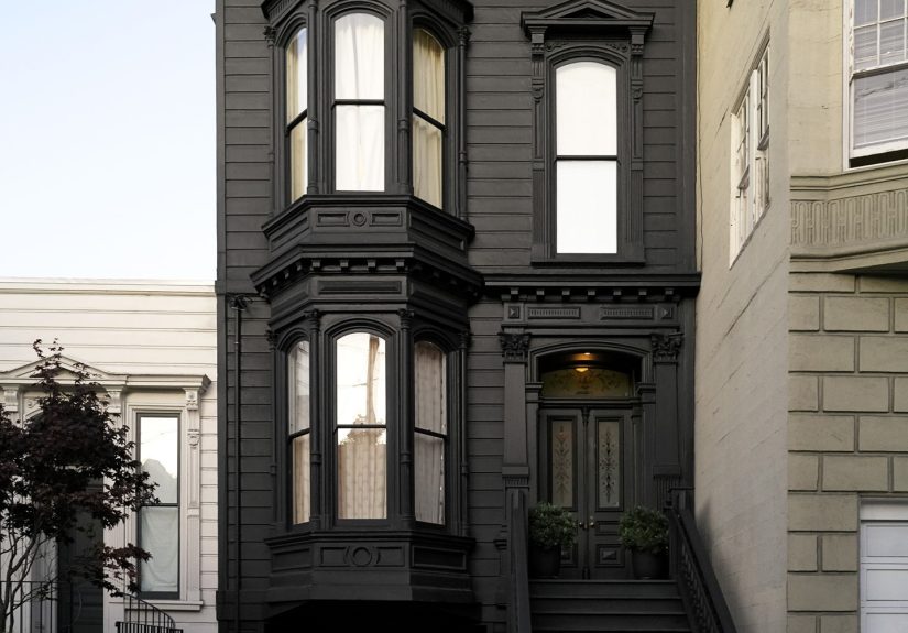
Black paint has had a serious image makeover. It used to be the color people whispered about in the paint aisle, usually while clutching a safe beige and pretending they were “just browsing.” Now it is one of the most designer-loved tools for making a room feel dramatic, tailored, calm, and, when done right, downright luxurious. The secret is that there is no single black. There are blue-blacks, warm charcoal blacks, velvety off-blacks, and rich true blacks that act more like a sharp tuxedo than a moody cave.
That is why architects and interior designers tend to get weirdly loyal about their favorite black paint picks. Once they find one that behaves beautifully in shifting light, flatters wood tones, and does not turn a room into a theatrical void, they stick with it. Below are 10 standout black paints that keep showing up in professional conversations, design projects, and paint roundups for good reason. Some are true blacks with crisp edges. Others are softer, friendlier, and a little more forgiving when morning sun, cloudy skies, and warm bulbs all start arguing with each other.
Why Black Paint Keeps Winning Fans
The best black paint colors work because they do two things at once: they simplify a room and make it feel more intentional. A black wall can quiet visual clutter. A black front door can make a plain exterior look expensive. Black cabinetry can feel classic, modern, industrial, or refined depending on the sheen and the hardware you pair with it. In other words, black is not one-note. It is more like a very talented actor who can play villain, hero, or mysterious neighbor with excellent taste in lamps.
Design pros also love black because it highlights shape and texture. Crown molding reads sharper. Brass looks warmer. White trim pops harder. Linen curtains seem softer. Wood grain feels richer. And in smaller rooms, especially powder rooms, dining rooms, libraries, and bedrooms, a deep black or soft off-black can blur the room’s edges and create an enveloping, cocoon-like effect that feels intentional instead of cramped. The trick is choosing the right undertone, the right finish, and the right amount of confidence.
The 10 Black Paint Picks Designers and Architects Reach For
1. Farrow & Ball Railings
If you want a black that is not quite black-black, Railings is the darling of the design world for a reason. It has a blue undertone that gives it a softer, inkier look, which means it feels elegant rather than severe. It is especially handsome on cabinetry, interior doors, built-ins, and exterior accents. In a matte or eggshell finish, it reads relaxed and atmospheric. In gloss, it becomes polished and dramatic. This is the shade for people who want black with a little poetry.
2. Farrow & Ball Off-Black
Off-Black is the black for people who claim they are “not ready for black,” and then accidentally become black-paint evangelists. It is softer and milder than a true black, leaning toward deep graphite. That makes it incredibly versatile on walls, trim, paneling, and even ceilings. If Railings is moody and marine, Off-Black is quieter and more tailored. It plays especially well with plaster tones, creamy whites, old wood furniture, and rooms that want depth without high drama.
3. Sherwin-Williams Tricorn Black
Tricorn Black is one of the most popular modern true blacks because it is clean, balanced, and dependable. It does not wander off into obvious brown, blue, or green territory, which makes it a favorite for people who want strong contrast. On kitchen islands, front doors, window trim, and accent walls, it delivers a crisp, graphic effect. If your style leans modern, minimal, or classic black-and-white, this is the paint color equivalent of a perfectly cut blazer.
4. Sherwin-Williams Black Magic
Black Magic has a bold, crisp presence that designers often describe as timeless and sophisticated. It is deep and dramatic without feeling gimmicky, which is surprisingly rare in the land of dark paint. This color shines in dining rooms, powder rooms, and kitchens where you want a stronger statement than charcoal but do not want the shade to feel cold or flat. If Tricorn Black is precise, Black Magic is slightly moodier and more theatrical in the best possible way.
5. Benjamin Moore Black Beauty
Black Beauty lives up to the name, which is almost annoying because usually paint names oversell things. This one does not. It has a hint of warmth that keeps it from feeling icy, and that subtle warmth makes it especially good for bedrooms, libraries, and living rooms where comfort matters as much as drama. It is rich, soft, and expensive-looking. In matte finishes, it can feel velvety. Against warm brass, walnut, leather, or antique wood, it is excellent.
6. Benjamin Moore Cheating Heart
Cheating Heart is beloved for being a dark charcoal that can still behave like a luminous black. That sounds contradictory, but designers love it for exactly that reason. It is deep and dramatic, yet it has enough complexity to reflect light and avoid feeling dead on the wall. This makes it a smart choice for smaller spaces, cabinets, and rooms with inconsistent light. It is a shade with movement, which is why so many professionals talk about it like an old friend with great cheekbones.
7. Benjamin Moore Soot
Soot is what happens when black and deep navy decide to collaborate on something chic. It has blue notes that give it a soft, atmospheric quality, making it perfect for bedrooms, media rooms, and moody studies. It feels sophisticated rather than stark, and it pairs beautifully with creamy white, pale gray, brass, and warm wood. If you love the idea of black but secretly want a bit of blue depth, Soot is your co-conspirator.
8. Behr Cracked Pepper
Cracked Pepper earned major attention because it sits in the sweet spot between soft black and dark gray. It has an approachable depth that makes it easier to use across whole rooms than a more severe, pitch-dark black. It is modern, versatile, and surprisingly elegant on walls, cabinetry, or even a bedroom ceiling. This is the color for anyone who wants mood without melodrama. Think refined, not spooky. Chic, not “I live in a Victorian novel and collect ravens.”
9. PPG Black Flame
Black Flame offers a cooler, more nuanced take on black with hints that push it toward blue-violet territory. That complexity gives it personality, especially in dining rooms, living rooms, and accent applications where you want something deeper than charcoal but more layered than a standard true black. It looks sharp with metallics, pale upholstery, and richly stained wood. This is not the safest black on the board, but it is one of the more interesting ones.
10. Clare Blackest
Blackest is for anyone who wants a modern, saturated, no-apologies black. It is crisp, strong, and graphic, which makes it ideal for accent walls, doors, trim, built-ins, and contemporary spaces that want maximum contrast. It performs especially well when you want colorful art, sculptural furniture, or white bedding to stand out dramatically. If some blacks whisper, this one makes an entrance. Tastefully, of course, but still very much an entrance.
How to Choose the Right Black Paint for Your Room
Start with undertones. This is where most black paint decisions either become brilliant or mildly tragic. A blue-black like Railings or Soot feels cooler and moodier. A warmer black like Black Beauty or Off-Black feels softer and more grounded. A true black like Tricorn Black or Blackest creates sharper contrast and a more graphic look. None of these is inherently better. The room decides.
Next, look at light. Natural light changes everything. A black that feels elegant in a bright south-facing room may look too flat in a dim hallway. A soft black can become cozy in a bedroom but muddy in a room with heavy yellow lighting. Always sample several colors side by side. View them in morning light, afternoon light, lamplight, and that mysterious 5:30 p.m. lighting that makes everyone question their life choices.
Finish matters too. Matte and flat finishes make black feel soft, velvety, and architectural. Eggshell and satin add a little bounce and are easier to live with in hardworking rooms. Gloss turns black into a statement piece, especially on trim, paneling, or front doors. If you want a color to feel more luxurious, sheen is often doing half the work.
Finally, think about what black is sitting next to. Warm woods, unlacquered brass, stone, linen, plaster whites, and camel leather all make black feel richer and more welcoming. Pair black with cool whites and chrome, and it becomes sharper and more modern. Pair it with deep greens, oxbloods, or navy, and suddenly your room looks like it has opinions about architecture magazines.
Where Black Paint Works Best
Black paint is especially effective in spaces that benefit from mood and definition. Dining rooms feel intimate. Powder rooms become jewel boxes. Bedrooms feel restful and cocooning. Kitchens gain instant sophistication on islands, lower cabinets, or pantry doors. Exterior trim and front doors look more polished and substantial. Even ceilings can benefit from black, especially when you want to downplay awkward height differences or make a room feel more atmospheric.
There is also a practical reason designers love it: black can make other elements look better. Art pops. Upholstery looks richer. Architectural lines seem cleaner. That is why designers often use black strategically rather than randomly. It is not just color. It is framing.
Experience Notes: What It Actually Feels Like to Live With Black Paint
Here is the part people do not always talk about in polished design photos: living with black paint is less about bravery and more about rhythm. The first day a room goes dark, it can feel dramatic, almost suspiciously dramatic, as if your house has suddenly developed a point of view. Then something interesting happens. Your eye adjusts. The room settles. What looked bold on day one often feels calm by day five.
One of the biggest surprises is how black changes your relationship with clutter. In many cases, a good black paint color actually makes a room feel quieter because it reduces visual noise. Shelves look more curated. Cabinets feel less bulky. A television almost disappears. That is why black works so well in media rooms, offices, and bedrooms where visual calm matters. It is not that black hides everything. It simply edits the room more aggressively than pale colors do.
Black paint also changes texture in a way that lighter colors cannot. Linen looks softer. Velvet looks richer. Wood grain looks deeper. Brass and bronze feel warmer. Even humble objects, like a ceramic lamp or a stack of books, gain more presence against a dark backdrop. A room painted black often feels layered faster, which can save you from endlessly shopping for “one more decorative thing” you probably did not need in the first place.
That said, black demands honesty. If a room has poor lighting, black will tell on you. If your trim is rough, your prep was sloppy, or your patch job looked “good enough” at midnight, black will absolutely file a formal complaint. Dark paint highlights surface imperfections, so the prep work matters more than usual. This is the unglamorous part of the story, but it is also the reason some black rooms look custom and expensive while others look like a rushed theater set.
Emotionally, black rooms can be surprisingly comforting. Bedrooms painted in softer blacks often feel restful, almost like the visual version of a weighted blanket. Dining rooms feel more intimate and flattering at night. Entryways become memorable. Powder rooms get away with a level of drama that would feel excessive anywhere else. There is a confidence to black paint that changes how a room is experienced, not just how it is photographed.
The best real-world advice is simple: commit, but do it thoughtfully. Sample more than one shade. Watch the undertones. Choose the sheen with intention. And style the room so black has something to play against: pale textiles, warm wood, stone, metal, art, or even just one excellent lamp. A black room without contrast can feel flat. A black room with contrast feels designed.
In the end, that is why architects and designers keep returning to their favorite black paints. Not because black is trendy, but because the right black solves problems while adding personality. It can sharpen a room, soften a room, modernize a room, and ground a room all at once. That is a rare trick in interior design. And unlike some trends that arrive with trumpets and leave with embarrassment, black paint tends to stay useful long after the internet moves on to the next big obsession.
Conclusion
The best black paint picks are not just dark. They are nuanced. Some lean blue, some lean warm, some behave like charcoal in daylight and near-black at night. That complexity is exactly what makes them valuable. If you want crisp contrast, go with a truer black like Tricorn Black or Blackest. If you want softness and atmosphere, try Railings, Off-Black, Cracked Pepper, or Soot. If you want depth with a little warmth, Black Beauty and Cheating Heart are especially compelling.
In other words, choosing black paint is not about asking whether black will work. It is about asking which black works for your room, your light, and your tolerance for drama. Pick wisely, and black stops feeling risky. It starts feeling inevitable.