Table of Contents >> Show >> Hide
- Why “Design Pet Peeves” Matter More Than You Think
- Layout Choices That Sound Fun Until You Live With Them
- Kitchen Design Choices That Age Like a Banana
- Bathroom Choices That Look Luxe but Live Rough
- Whole-Home Decisions That Quietly Create Daily Annoyance
- A Quick “Will I Hate This Later?” Checklist
- Conclusion: A Home That Looks Good and Feels Good
- Bonus: 500+ Words of Real-World “Been There” Experiences (So You Don’t Have To)
- Experience 1: The Open Shelf That Turned Into a Dust Exhibit
- Experience 2: The Barn Door That Announced Every Bathroom Decision
- Experience 3: The “Statement Light” That Lit Nothing
- Experience 4: The Open Floor Plan That Became an Echo Chamber
- Experience 5: The Bathroom Without a Fan (or With One That “Doesn’t Count”)
- Experience 6: The Countertop That Required a Rulebook
- Experience 7: The Kitchen With the Two-Outlets Problem
- Experience 8: The Tiny Tile Trend That Became a Grout Hobby
- Experience 9: The Entryway That Had No Plan for Shoes
- Experience 10: The “All Neutral” Room That Still Felt Wrong
Home design is supposed to make life easier. So why do so many “beautiful” rooms feel like a daily obstacle coursecomplete with toe-stubbing, dusting marathons, and the occasional “Why did we do this?” whispered into a throw pillow?
To be fair, decorating is wildly subjective. One person’s dream kitchen is another person’s stress spiral. But there’s a pattern to the choices that consistently drive homeowners crazy: they photograph well, trend fast, and then collapse under the weight of real lifekids, pets, cooking smells, laundry piles, and the shocking amount of stuff humans accumulate just by existing.
This guide breaks down the most common home design mistakes that lead to regret, frustration, and a permanent smudge of “unfinished vibes.” We’ll talk about why they fail, what to do instead, and how to choose upgrades that still look great when no one has staged your counters with three lemons and a single artisanal cutting board.
Why “Design Pet Peeves” Matter More Than You Think
The choices that drive us crazy usually hit one of these pressure points:
- Maintenance: Looks chic, requires constant cleaning. (Hello, open shelving.)
- Function: Works in theory, fails in daily routines. (Hello, barn doors on bathrooms.)
- Comfort: Pretty space, unpleasant to live in. (Hello, echo-y open floor plans.)
- Longevity: Trendy today, dated tomorrow. (Hello, anything that screams “2017 Pinterest.”)
- Resale and flexibility: Buyers and future-you won’t share your current obsession.
The goal isn’t to avoid personality. The goal is functional home design: a space that supports how you live, not how a listing photo wants you to pretend you live.
Layout Choices That Sound Fun Until You Live With Them
1) The “Everything Is Open” Floor Plan (Including the Noise)
Open concept can feel airy and socialuntil someone is blending a smoothie while someone else tries to watch TV, nap, or attend a video call. With fewer walls, you also lose places for storage, art, furniture placement, and (minor detail) hiding mess.
Smarter fix: Keep sightlines, add zones. Half-walls, wide cased openings, ceiling changes, rugs, and thoughtful lighting can create separation without turning your home into a hallway maze. If you do go open, plan for acoustics (soft surfaces, drapery, upholstered pieces) and invest in strong kitchen ventilation so cooking odors don’t become your home’s signature scent.
2) A Front Door That Opens to… the Entire House
Walking straight into your living room can feel welcominguntil packages pile up, shoes multiply, and every guest gets an instant tour of your entire private life. Zero transition space also means less storage and more clutter in “public view.”
Smarter fix: Create a drop zone. Even a slim bench, wall hooks, a closed cabinet, and a runner can turn chaos into a system. If you’re remodeling, think about a mini-mudroom moment or a partial screen wall that softens the view without shrinking the space.
3) Furniture Layouts That Ignore Human Movement
If you have to sidestep a coffee table like it’s an agility test, the room isn’t “cozy.” It’s a low-key hazard. Common offenders: oversized sectionals, chairs blocking traffic paths, and dining rooms where you can’t pull out a chair without negotiating terms.
Smarter fix: Measure the “walking lanes.” Aim for comfortable clearance around major paths and seating. Choose fewer, better-scaled pieces instead of cramming in everything you’ve ever loved.
Kitchen Design Choices That Age Like a Banana
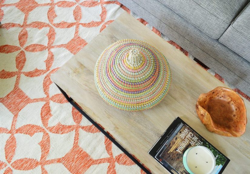
4) Open Shelving for Everyday Dishes
Open shelves can be charminguntil you realize your plates are now on display 24/7 like they’re auditioning for a museum exhibit titled “Grease and Dust: A Retrospective.” The closer shelves are to the stove, the faster they collect grime. And unless you’re naturally tidy, the shelves will broadcast clutter in high definition.
Smarter fix: Use a hybrid approach. Keep a small section of open shelving for curated items (or glassware you don’t use daily), and rely on closed uppers for the rest. If you crave openness, consider glass-front cabinets, lighter upper cabinet colors, or open shelves in a lower-mess zone like a bar area.
5) Trend-First Features That Don’t Match the House
Shiplap everywhere. Faux farmhouse beams. Random industrial piping. These can workwhen they match the architecture and the homeowner’s lifestyle. But when they’re pasted onto a home with no context, they often feel costume-y and dated fast.
Smarter fix: Borrow from the home’s “native language.” A mid-century house wants different details than a craftsman, and a modern box wants different warmth than a colonial. When in doubt, prioritize materials that look believable in your region and era.
6) High-Maintenance Countertops in High-Use Kitchens
Some surfaces are gorgeous but demanding. If your kitchen is command centralcooking daily, kids doing homework, friends gatheringthen porous or easily etched materials can become a constant battle of stains, rings, and regret.
Smarter fix: Choose durability that still looks premium: engineered stone, quality laminates, or other low-fuss surfaces that can handle “normal Tuesday energy” without panic. Save the delicate stone moment for a less abusive surface like a bar top or baking station, if you love the look.
7) Not Planning Outlets, Lighting, and Work Zones
A pretty kitchen with poor lighting and not enough outlets is like a sports car with square wheels: bold concept, miserable experience. Kitchens need layered lighting (ambient + task + accent) and outlet placement that matches how you actually cookcoffee station, charging spot, appliances, and under-cabinet lighting that doesn’t make you chop onions in a shadow.
Smarter fix: Do an “electrical walk-through” on paper before walls close up. Stand in the imagined space and ask, “Where will the toaster live? Where will the phone charge? Where will the blender go?” It’s cheaper to plan now than to rely on extension cords later.
Bathroom Choices That Look Luxe but Live Rough
8) Barn Doors for Bathrooms (A Privacy Thriller)
Barn doors are popular because they look cool and save swing space. But they often don’t seal well, which means sound and light leaksand “sound and light leaks” is not what most people want as a bathroom brand identity. If the door also rattles on a track, congrats: you’ve installed a suspense soundtrack.
Smarter fix: If you need a space-saving door, consider a pocket door (when feasible) or a well-fitted swinging door. If you insist on sliding hardware, look for options that close more tightly and prioritize rooms where privacy isn’t critical.
9) Vessel Sinks and Above-Mount Basins
Vessel sinks can look like spa sculptural artuntil you clean around the base, where grime loves to settle. They can also feel awkwardly tall, depending on the vanity height and user height. Many homeowners find they’re less “serene spa” and more “why is water everywhere?”
Smarter fix: Consider undermount or integrated sinks for easier wipe-downs and fewer splash issues. If you love the vessel look, pair it with the right faucet height and leave enough counter space to keep things practical.
10) Ventilation Treated Like an Optional Accessory
Bathrooms create moisture. Moisture creates mold and mildew if it lingers. Good ventilation isn’t glamorous, but it’s foundational. Running a properly vented fan during and after showers helps remove moisture and protect finishes (and your patience).
Smarter fix: Install a quality exhaust fan that vents outdoors, and actually use it. If you’re remodeling, confirm the fan is doing more than making noiseyour goal is removing damp air, not providing white noise for your shower playlist.
11) “Statement” Materials That Are Slippery, Stain-Prone, or Impossible to Maintain
Glossy floors that show every footprint. Matte finishes that smudge. Grout-heavy tiny tiles that turn into cleaning homework. These can be gorgeous in photos, but bathrooms are wet, busy, and sometimes chaotic.
Smarter fix: Choose finishes that look good with normal living. Larger-format tiles reduce grout lines. Textured floors can help with slip resistance. And if a surface requires a strict rulebook, ask yourself whether your household is the type to follow rules. (No judgment. Just data.)
Whole-Home Decisions That Quietly Create Daily Annoyance
12) Not Enough Storage (or Storage That Doesn’t Match Behavior)
People don’t fail at organization because they’re lazy. They fail because the home has nowhere convenient to put the things they use. Or because storage exists but is awkward: too high, too deep, too far from where the item is used.
Smarter fix: Design storage around routines. Put the cleaning supplies near the cleaning zone. Create a dedicated spot for backpacks and keys near entry points. Use drawers where you need visibility. And don’t be afraid of closed storagesometimes the most peaceful design choice is the ability to shut a door.
13) Decorative Lighting That Acts Like Mood Lighting… All the Time
Exposed bulbs can look vintage and edgy, but they can also create harsh glare and surprisingly poor light. A room can be stylish and still allow you to read a label, find a sock, or not feel like you’re living inside a film noir.
Smarter fix: Layer lighting and choose fixtures that look great and perform. Add table lamps, floor lamps, sconces, and dimmers. Then use decorative pendants as the jewelry, not the only source of illumination.
14) The “All Gray Everything” Trap
Gray can be sophisticated. But when every wall, floor, cabinet, and sofa lives in the same cool-toned family, the home can feel flat, cold, and dated fastespecially as trends shift back toward warmer neutrals and richer colors.
Smarter fix: If you love neutrals, add warmth through wood tones, textured textiles, and layered whites/creams. Or keep gray as a supporting actor, not the entire cast.
15) Painting Brick (A One-Way Door for Many Homes)
Painted brick can look fresh and modern. It can also be a long-term commitment that’s hard to reverse and can create maintenance or moisture issues if done improperly. Many homeowners report regret because the original character is gone, and “fixing it” later is expensive and messy.
Smarter fix: If you’re tempted, explore gentler updates first: cleaning, limewash (when appropriate), thoughtful landscaping, or changing surrounding elements like trim color. If you do paint, research correct materials and prep so you don’t trap problems under a pretty coat.
A Quick “Will I Hate This Later?” Checklist
- Can I clean it in under 5 minutes? If not, will I actually clean it?
- Does it add daily friction? (Noise, glare, clutter, awkward reach, constant wiping.)
- Does it match my house? Or is it a trend costume?
- Does it support routines? Cooking, entering the home, getting ready, relaxing.
- Would I still choose it if it never appeared on social media? Be honest.
Conclusion: A Home That Looks Good and Feels Good
The home design choices that drive us crazy aren’t “bad taste.” They’re usually a mismatch between style and real life. The fix isn’t to make everything boring. The fix is to choose beauty that survives Tuesday: durable materials, thoughtful storage, layered lighting, proper ventilation, and layouts that respect how humans actually move through a space.
If you’re remodeling, do one unglamorous exercise before you pick the fun finishes: walk through your day and map your pain points. Where do shoes land? Where does mail pile up? Where do you cook, charge, drop bags, and do homework? Design around that reality and your home won’t just look betterit’ll feel calmer, work harder, and age more gracefully.
Bonus: 500+ Words of Real-World “Been There” Experiences (So You Don’t Have To)
Below are common homeowner moments that capture why certain interior design regrets keep popping up again and again. If any of these feel painfully familiar, that’s not you failing at your home. That’s your home quietly asking for a more practical plan.
Experience 1: The Open Shelf That Turned Into a Dust Exhibit
Open shelving starts out cute: matching bowls, a few glasses, maybe a cookbook leaning artfully. Then real life moves in. Grease sneaks onto plates near the stove, dust coats the “pretty” mugs, and suddenly every time guests come over, you’re rinsing dishes that were already cleanbecause the air decided to season them anyway. The lesson: open shelves are for curated display or low-use items, not the everyday dinnerware of a busy household.
Experience 2: The Barn Door That Announced Every Bathroom Decision
A sliding barn door looks great until someone realizes it doesn’t actually seal. Then it becomes a family inside joke (“We can hear you… and the door is also glowing.”). Privacy matters. Sound control matters. And no one wants to feel like their bathroom is an open-mic night. The lesson: save sliding doors for pantries, laundry rooms, or closetsspaces where sound leaks don’t change relationships.
Experience 3: The “Statement Light” That Lit Nothing
A gorgeous pendant with exposed bulbs can photograph like a dreamright up until you try to cook, read, or find the lid to the container that matches the container you’re holding. People often discover their room looks stylish but feels dim and harsh at the same time. The lesson: decorative lighting should be paired with real task lighting, and bulbs should be chosen for comfort, not just aesthetics.
Experience 4: The Open Floor Plan That Became an Echo Chamber
At first, open concept feels modern and spacious. Then the first movie night happens. Someone is washing dishes, someone is on the phone, the dog is skittering across hard floors, and the TV audio is battling the world. Even normal conversation bounces around and sounds louder than intended. The lesson: if you go open, plan soft surfaces and zones so the house doesn’t sound like a cheerful gymnasium.
Experience 5: The Bathroom Without a Fan (or With One That “Doesn’t Count”)
A bathroom can look brand-new, but without proper ventilation, moisture wins. Mirrors stay foggy, grout darkens, paint peels, and that “clean” smell turns into a mystery scent. Homeowners often realize too late that a fan needs to vent outside and actually move damp airnot just make noise. The lesson: ventilation is not a luxury upgrade; it’s basic home-care infrastructure.
Experience 6: The Countertop That Required a Rulebook
Some countertops are stunning, but living with them can feel like caring for a rare plant that hates sunlight, water, and attention. Coasters become a household religion. One spilled lemon wedge becomes a crisis. Over time, the anxiety outweighs the beauty. The lesson: choose surfaces that match your lifestyleespecially in the highest-traffic rooms where “durable” is the real definition of luxury.
Experience 7: The Kitchen With the Two-Outlets Problem
Many people only notice outlet placement after moving inor after a remodelwhen the coffee maker, toaster, phone charger, and mixer all want the same two plugs. Then the extension cords come out, and your beautiful backsplash gets framed by a tangle of wires. The lesson: plan outlets early based on real routines. Convenience is a design feature.
Experience 8: The Tiny Tile Trend That Became a Grout Hobby
Small tiles can be gorgeous, especially in vintage-inspired bathrooms. But more grout lines mean more cleaning, more discoloration, and more “Why does this look dirty one week after I scrubbed it?” moments. The lesson: if you love small tiles, use them in strategic areas and balance them with larger-format surfaces to cut maintenance.
Experience 9: The Entryway That Had No Plan for Shoes
Homes without a drop zone quickly develop a “shoe tide” near the door. It expands after school, after errands, after guests. Without hooks, baskets, or closed storage, the clutter doesn’t just look messyit makes leaving the house harder. The lesson: the best-looking entry is the one that quietly handles real life without constant resets.
Experience 10: The “All Neutral” Room That Still Felt Wrong
Homeowners often try to create calm by choosing all neutralsthen wonder why the room feels flat or chilly. The missing ingredient is usually contrast: warm woods, texture, varied materials, layered lighting, and a few intentional accents. The lesson: calm doesn’t come from one color; it comes from balance.