Table of Contents >> Show >> Hide
- Rule 1: Start With the Room’s “Traffic Laws” (Clearances First, Furniture Second)
- Rule 2: Anchor the Room With the Right Rug Size (Because Tiny Rugs Cause Big Problems)
- Rule 3: Use the “Two-Thirds Rule” to Keep Key Pieces in Proportion
- Rule 4: Balance Visual Weight (Not Everything Can Be the “Main Character”)
- Rule 5: Match Furniture “Mass” to the Room (Big Room Needs Substance; Small Room Needs Strategy)
- Rule 6: Test Scale Before You Buy (Tape, Cardboard, Photos, Repeat)
- Putting It All Together: A Fast, Real-Life Plan
- Conclusion
- Real-World Experiences: What People Learn the Hard Way About Scale & Proportion (So You Don’t Have To)
Ever walked into a room and thought, “Why does this feel… off?” (Like the space is side-eyeing you?)
Nine times out of ten, the problem isn’t your color palette or your throw pillows’ emotional availability.
It’s scale (how big things are) and proportion (how those things relate to each other, the room, and real-life humans who enjoy moving without bruising a hip).
The good news: designers aren’t secretly born with measuring tapes for brains. They use a handful of repeatable rules
to make rooms feel balanced, comfortable, and intentionalwhether you live in a cozy apartment or a “why do I own this much hallway?” house.
Below are six designer rules you can use immediately, with real numbers, examples, and zero fluff.
Rule 1: Start With the Room’s “Traffic Laws” (Clearances First, Furniture Second)
Before you fall in love with a sofa the size of a small yacht, map your room’s circulation.
Furniture that’s technically “beautiful” but forces guests to crab-walk to the couch is not a vibe.
Designers begin with clearancesthe invisible space that makes a room feel easy.
Designer spacing benchmarks (steal these)
- Main walkways: aim for about 30–36 inches so people can pass comfortably.
- Tighter paths (small rooms): 24 inches can work if it’s not a major route.
- Sofa to coffee table gap: about 16–18 inches for legroom + reach.
- Dining chairs behind the table: plan space so chairs can pull out without hitting a wall or a plant stand you “temporarily” put there in 2021.
Quick example
Let’s say your living room is 12′ x 14′, with a doorway that needs a clean path. If you place a sectional that sticks 42″ into the room
and then add a chunky coffee table, you may accidentally create a 14″ “walkway,” which is less “inviting living space” and more “escape room.”
Instead, pick a sofa depth and table size that protects your 30–36″ main path.
Pro tip: don’t forget door swing and drawer clearance (media consoles, credenzas, dressers).
If a drawer can only open halfway, you’ve basically bought a very expensive suggestion.
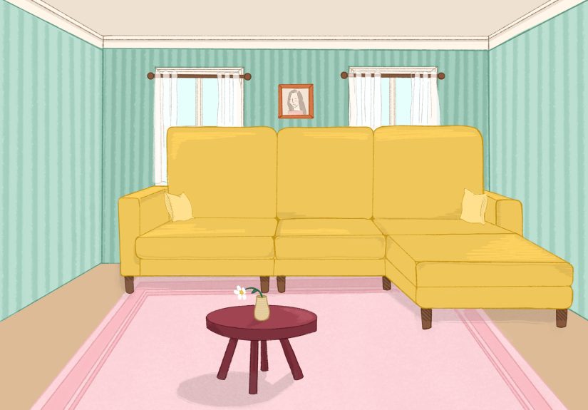
Rule 2: Anchor the Room With the Right Rug Size (Because Tiny Rugs Cause Big Problems)
If furniture scale is the band, the rug is the stage. Too small, and everything looks like it’s performing on a postage stamp.
Designers use rugs to define zones and “unify” furniture so the room reads as one intentional composition instead of scattered seating thoughts.
The living room rug rule that saves relationships
- At minimum: the front legs of your sofa and chairs should sit on the rug.
- Better: all furniture legs on the rug (when room size allows) for a truly grounded look.
- Margin matters: leave a border of exposed floor so the rug fits the room, not fights it.
Living room rug sizing example (real numbers)
You have an 84″ sofa. A rug that’s at least a little wider than the sofa (so it extends beyond the arms) typically looks more proportional.
An 8′ x 10′ often works in standard rooms when you do “front legs on.”
A 9′ x 12′ can make the whole seating area feel more expansiveespecially if you want chairs fully anchored.
Dining room rug sanity check
For dining rugs, think “chairs stay on the rug even when pulled out.”
A simple method: measure the table, then add about 24 inches on each side (total +48″) so chairs don’t snag the edge.
That’s why a 72″ x 36″ table often needs something around 8′ x 10′ (or larger) to feel right.
If you’re stuck with a smaller rug, you can still make it work by aligning the front legs on the rug and pulling the rug forward to
visually “catch” the seating area (instead of leaving it stranded in the middle like a little rug island).
Rule 3: Use the “Two-Thirds Rule” to Keep Key Pieces in Proportion
Designers love a repeatable ratio. One of the easiest is the two-thirds rule:
when one item visually “belongs” to another, make it about two-thirds the size.
It’s not a law of physics, but it’s close to a law of “this looks right.”
Where the two-thirds rule shines
- Coffee table length: aim for about 1/2 to 2/3 the length of your sofa.
- Artwork above a sofa/console: about two-thirds the width of the piece below.
- Layered rugs: a top rug often looks best around two-thirds the size of the base rug.
Example: coffee table math you can do without crying
If your sofa is 90″ long, a coffee table around 45″–60″ tends to look balanced. Pair that with the spacing rule from Rule 1:
keep it roughly 16–18 inches from the sofa edge. This gives you reach for snacks and enough space for knees to exist.
Example: art placement that doesn’t float like a lost balloon
For a 72″ sofa, art around 48″ wide often looks properly connected (that two-thirds sweet spot).
Then hang it so the bottom of the frame sits roughly 8–10 inches above the furniture,
and keep the overall composition near “eye level” (designers often reference gallery height in the mid-50s inches range).
Rule 4: Balance Visual Weight (Not Everything Can Be the “Main Character”)
Scale isn’t only about inches. It’s also about visual weight:
how heavy something feels based on color, material, leggy vs. grounded silhouettes, and how much space it occupies.
Two bulky pieces placed side-by-side can make a room feel lopsidedlike it’s slowly leaning into a nap.
How designers balance weight on purpose
- Mix heights: pair low seating with a taller bookcase, floor lamp, or art to avoid a “flat line” room.
- Use negative space: blank space is not “wasted”it’s breathing room for the eye.
- Let furniture show a little leg: in smaller rooms, pieces raised off the floor can feel lighter than skirted, boxy silhouettes.
- Float furniture when possible: pulling a sofa even a few inches off the wall can improve flow and make the layout feel intentional.
Quick fix for the classic “everything is pushed to the walls” look
It sounds logical: push furniture back, get more space. But often it creates an awkward empty “dance floor” in the middle
and separates conversation pieces too far apart. Try pulling the sofa forward slightly, then add a console table behind it
or a floor lamp nearby so the new gap looks deliberate, not accidental.
Rule 5: Match Furniture “Mass” to the Room (Big Room Needs Substance; Small Room Needs Strategy)
A common mistake is choosing furniture based solely on stylethen being shocked when the room feels like a dollhouse or a warehouse.
Designers match the room’s architecture (ceiling height, window placement, wall length) with furniture mass:
depth, height, and overall presence.
Choose the right silhouette for your space
- Small rooms: consider slimmer arms, shallower depth, and pieces that do double duty (ottoman + tray, bench seating).
- Large rooms: don’t be afraid of deeper seating, larger sectionals, or substantial case goodsotherwise the room can feel under-furnished.
- High ceilings: bring in height with taller bookcases, larger art, or curtains hung higher to keep the room proportional top-to-bottom.
Dining + lighting scale bonus (the “jewelry” rule)
Lighting is a scale tool, not just a “see your food” tool. A chandelier or pendant can define a zone and correct proportion in open layouts.
Two handy guidelines designers use:
- Chandelier height over a table: often around 30–36 inches above the tabletop (adjust for ceiling height).
- Chandelier diameter (quick estimate): add the room’s length + width in feet, then use that number as inches for fixture diameter (a common designer shortcut).
Example: a 12′ x 14′ dining room = 26 → a fixture around 26″ wide can be a solid starting point. Not perfect for every style,
but excellent for avoiding the “tiny pendant lost in the void” problem.
Rule 6: Test Scale Before You Buy (Tape, Cardboard, Photos, Repeat)
Designers aren’t psychicthey prototype. The fastest way to avoid scale regret is to test dimensions in your actual room
before committing. This is especially important for large-ticket pieces like sofas, beds, dining tables, and rugs.
Low-effort ways to test furniture scale
- Painter’s tape: outline the footprint of the sofa, rug, or table on the floor.
- Cardboard mockups: cut a top-down shape of a coffee table to test reach and clearance.
- Photo check: take a wide-angle photo from the doorwayyour camera catches proportion issues your brain politely ignores.
- Measure “touchpoints”: can you reach the side table from the chair? Is there a surface within arm’s reach for each seat?
A designer-style “edit” checklist
If a room feels cramped, designers don’t add more. They subtract.
Ask:
- Do I have one too many small pieces (extra chair, extra table, extra “where did that stool come from?”)?
- Are my biggest pieces fighting each other (oversized sofa + oversized recliner + oversized coffee table = furniture thunder dome)?
- Would one larger, better-scaled piece replace multiple undersized ones?
Putting It All Together: A Fast, Real-Life Plan
- Measure the room and mark doors, windows, vents, and pathways.
- Choose your anchor (usually the sofa, bed, or dining table) based on clearances first.
- Size the rug so furniture legs connect to itat least the front legs on.
- Select supporting pieces using proportional shortcuts (two-thirds rule, coffee table spacing).
- Balance height + weight so one side of the room doesn’t feel visually heavier.
- Prototype with tape/cardboard/photos before spending real money.
Conclusion
Perfect scale and proportion isn’t about making your home look like a catalogit’s about making it feel easy to live in.
When your clearances make sense, your rug anchors the room, and your key pairings hit those simple ratios,
the whole space gets calmer. And suddenly your living room stops feeling “off” and starts feeling like it’s on your team.
Real-World Experiences: What People Learn the Hard Way About Scale & Proportion (So You Don’t Have To)
Below are common “in-the-wild” scenarios designers see again and againbecause scale mistakes are incredibly normal.
The goal here isn’t shame. The goal is to keep you from owning a coffee table that requires a running start to walk around.
1) The Rug That Shrunk the Room
A frequent story: someone buys a gorgeous rug… in a size that looks fine online, but in the room it makes everything feel smaller.
Why? Because the furniture ends up floating around it instead of connecting to it. Visually, the seating zone fractures into pieces.
The fix is usually simple: slide the rug forward so the sofa’s front legs land on it, then pull the chairs in so their front legs do too.
Even without changing the rug, the room suddenly reads as one “unit,” not three separate islands.
2) The Sofa That “Looked Normal” Until It Arrived
Another classic: a deep, modern sofa shows up and suddenly the room feels half its original size.
This isn’t because deep sofas are badit’s because depth changes how people move. If your previous sofa was 35″ deep and the new one is 42″,
you just stole 7 inches from the entire circulation plan. In a small room, that can be the difference between a comfortable walkway and a daily obstacle course.
People often solve this by switching to a slimmer coffee table, reducing side-table bulk, or choosing chairs with exposed legs (lighter visual weight)
to “give back” the feeling of space.
3) The Coffee Table That Ruined Conversation (Yes, Really)
Coffee tables are sneaky. Too large, and people feel trapped. Too small, and nobody can reach itso drinks migrate to the floor like they’re starting a new society.
The most common improvement is adjusting two things: distance and length. When the table sits roughly 16–18 inches from seating,
it feels reachable without knee collisions. When it’s about half to two-thirds the sofa length, it looks “paired” rather than random.
If a large rectangular table feels like a roadblock, many people switch to two smaller tables or a round/oval shape to soften the pathways.
4) The “Everything Against the Wall” Phase
People do this because it feels logical: more open space in the middle. But often it creates a giant empty center
and pushes seating too far apart to feel social. The room can start to resemble a waiting roompolite, spaced out, and emotionally distant.
A small fix that often surprises people: pull the sofa forward 3–6 inches and bring chairs closer to the coffee table zone.
Suddenly, the layout becomes a conversation area instead of a perimeter patrol.
5) The Art That Floated Away
Hanging art too high is incredibly commonusually because people fear commitment (valid) and choose “up and out of the way.”
But art that’s too high disconnects from the furniture and makes walls feel taller in a not-helpful way.
The “aha” moment happens when someone lowers the art so it relates to the sofa or console beneath it.
Once the piece is visually connectedoften with the bottom edge just a bit above the furnitureit feels intentional and finished.
6) The Lighting That Didn’t Match the Room
Lighting scale is the silent mood-killer. A tiny pendant in a big dining room reads like a keychain.
An oversized fixture in a low-ceiling room can feel like it’s hovering threateningly over dinner.
People often find success using simple guidelines (like hanging a dining fixture roughly 30–36 inches above the table)
and choosing a diameter that makes sense for the room’s footprint. When the lighting finally “fits,” the whole space feels more designed
even if nothing else changed.
The best part? These lessons compound. Once you start measuring pathways, anchoring with a properly sized rug,
and using simple ratios for pairings, your eyes get trained. You’ll walk into a roomyours or anyone else’sand instantly spot
why it feels off. And you’ll also know how to fix it without buying seventeen new things (a miracle).