Table of Contents >> Show >> Hide
- How to Choose a Bedroom Color Scheme That Actually Works
- 15 Bedroom Color Schemes Designers Return to Again and Again
- 1) Warm White + Natural Wood + Soft Black
- 2) Soft Greige + Cream + Muted Brass
- 3) Misty Blue + Crisp White + Sand Beige
- 4) Sage Green + Warm White + Light Oak
- 5) Blue-Green + White + Weathered Wood
- 6) Lavender Gray + Soft White + Silver
- 7) Blush + Chocolate Brown + Ivory
- 8) Terracotta + Oatmeal + Olive
- 9) Deep Navy + White + Warm Wood
- 10) Charcoal + Pale Blush + Walnut
- 11) Forest Green + Cream + Leather Caramel
- 12) Monochrome Neutrals (Layered Beige/Taupe)
- 13) Soft Yellow + White + Light Blue
- 14) Wine + Linen + Antique Gold
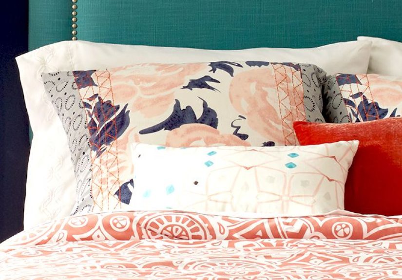
- 15) Pattern-First Palette (Wallpaper or Textile as the “Boss”)
- Designer Tricks That Make Bedroom Colors Look Expensive
- Quick Pairing Guide: Bedding, Metals, and Wood Tones
- Common Bedroom Color Mistakes (and How to Dodge Them)
- of Real-World “Living With It” Bedroom Color Experiences
- Conclusion
- SEO Tags
Your bedroom has exactly one job: make you feel like you can exhale. A smart bedroom color scheme helps do thatwithout you needing to light 47 candles
or buy a duvet that costs more than your rent. The right palette can make a small room feel bigger, a bright room feel softer, and a “why is it so
stressful in here?” room feel like a real retreat.
Designers often lean on calming familiessoft blues, greens, lavenders, and cozy neutralsbecause they’re easy on the eyes and play nicely with most
furniture styles. But “calming” doesn’t have to mean “beige forever.” You can absolutely go moody, colorful, or dramaticas long as the palette is
intentional and balanced.
How to Choose a Bedroom Color Scheme That Actually Works
Before you fall in love with a color name like Moonlit Whisper (which, let’s be honest, could be either gray or a ghost), run your room through
this quick reality check:
1) Start with the light you already have
- North-facing rooms: Light can feel cooler. Warm whites, creamy neutrals, and warmer greiges help prevent a “hospital hallway” vibe.
- South-facing rooms: Warm sun can intensify color. Cool-toned blues/greens often look balanced and restful.
- Low-light bedrooms: Mid-tones can look darker than expected. Go one shade lighter than your first instinct (future-you will thank you).
2) Pick a palette type, not just a single color
A bedroom color scheme is a team sport. Think in 3–5 components:
Wall color, trim/ceiling, bedding, one accent color, and one “anchor” neutral
(like wood, black, brass, or linen).
3) Match undertones like you’re doing friend-group compatibility
Undertone mismatches are why some rooms feel “off.” If your paint is warm (yellow/red undertone), keep nearby whites and neutrals warm too. If your paint
is cool (blue/green undertone), choose crisp whites or cool grays that won’t fight it.
4) Decide what mood you want at night and in the morning
Bedrooms are used in two lighting extremes: sleepy nighttime lamps and brutal morning daylight. If you love a moody color, it may feel cozy at night but
heavy in the morning unless you balance it with lighter bedding, mirrors, or warm wood.
5) Test like a pro (without turning your walls into a checkerboard)
- Paint a large sample on poster board (at least 2 ft x 2 ft).
- Move it around: near the window, behind the bed, by the closet.
- Look at it morning, afternoon, and nightbecause paint is a shape-shifter.
15 Bedroom Color Schemes Designers Return to Again and Again
Below are flexible palettes you can personalize. Each includes a core wall direction, supporting neutrals, and accentsso you get a “put-together” room
instead of a “why does my bedding look angry?” room.
1) Warm White + Natural Wood + Soft Black
Palette: warm white walls, oak/walnut furniture, matte black accents
This is the “clean but not cold” classic. Warm whites feel cozy, wood adds warmth, and black gives the room structure (like eyeliner for your bedroom).
Add texturelinen bedding, a chunky knit throw, or woven shadesso the white feels layered instead of flat.
2) Soft Greige + Cream + Muted Brass
Palette: greige walls, creamy bedding, brushed brass hardware/lamps
Greige is popular for a reason: it’s a neutral that can lean warm or cool depending on decor. Keep it calm with cream textiles and warm metal finishes.
If you want one color moment, add dusty blue pillows or a sage throw.
3) Misty Blue + Crisp White + Sand Beige
Palette: light blue walls, bright white trim, sandy/beige accents
Blue is a go-to for a soothing bedroom vibe, especially in lighter or slightly gray-blue versions that don’t scream “sports team.” Layer whites and
soft neutrals to keep it airy. Bonus: it pairs beautifully with natural textures like rattan and jute.
4) Sage Green + Warm White + Light Oak
Palette: sage walls, warm white bedding, light oak furniture
Green reads as grounded and naturalideal if you want your room to feel like a quiet walk without the bugs. Sage is especially forgiving in different
lighting. Add cream curtains and a few black details (picture frames, lamp base) for contrast.
5) Blue-Green + White + Weathered Wood
Palette: sea-glass walls, white trim, driftwood tones
Blue-green shades (teal-leaning but muted) are popular because they feel fresh and calm at once. Keep decor light and breezy: white bedding, washed
woods, and soft brass or nickel.
6) Lavender Gray + Soft White + Silver
Palette: pale lavender walls, soft white textiles, silvery metals
Lavender can be surprisingly sophisticated when it’s muted and slightly gray. It reads restful, not sugary. Pair with plush textures (velvet pillow,
boucle bench) to make it feel grown-up and cozy.
7) Blush + Chocolate Brown + Ivory
Palette: dusty blush walls, deep brown accents, ivory bedding
Blush gets a bad rap because people imagine bubblegum pink. Dusty pinks are warmer and calmer, and they look incredible with deep browns and creamy
whites. If you want a little sparkle, add antique brass.
8) Terracotta + Oatmeal + Olive
Palette: clay/terracotta walls (or accent wall), oatmeal linens, olive accents
Earthy and warm, this scheme is perfect for a cozy, cocoon-like bedroom. Terracotta loves natural materialslinen, cane, potteryand looks best when you
keep whites creamy rather than stark.
9) Deep Navy + White + Warm Wood
Palette: navy feature wall, white bedding/trim, walnut or medium oak
Navy feels tailored and timeless. If you’re nervous about darkness, use it behind the headboard only. Balance it with bright bedding and warm wood so it
feels classic, not cave-like.
10) Charcoal + Pale Blush + Walnut
Palette: charcoal walls, pale blush textiles, dark wood
This is a moody scheme with softness built in. Charcoal brings drama; blush prevents it from feeling harsh. Add warm lighting (soft white bulbs) and
avoid icy chromego for brass, bronze, or black.
11) Forest Green + Cream + Leather Caramel
Palette: deep green walls, cream bedding, caramel leather accents
Forest green is cozy and luxe. It works especially well with cream textiles and warm browns. If your room is small, consider forest green on the lower
half (board-and-batten or wainscoting) with a lighter top.
12) Monochrome Neutrals (Layered Beige/Taupe)
Palette: taupe walls, beige bedding, oatmeal rug, warm white trim
This is the quiet-luxury approach: tone-on-tone neutrals where the interest comes from texture. Think linen sheets, a boucle pillow, a wool rug, and a
woven bench. Keep the undertones consistent so it looks intentional, not accidental.
13) Soft Yellow + White + Light Blue
Palette: buttery yellow walls (very soft), white trim, light blue accents
Yellow can feel cheerful without being loud when it’s creamy and muted. Pair with white for freshness and add light blue for a breezy, optimistic look.
If your yellow starts feeling “highlighter,” you’ve gone too brightpull back to a softer version.
14) Wine + Linen + Antique Gold
Palette: deep wine/burgundy accents, linen neutrals, warm gold details
A rich wine tone is dramatic but surprisingly restful when paired with natural linens and warm metals. Use it on a headboard wall or in textiles if you
want the mood without repainting the whole room.
15) Pattern-First Palette (Wallpaper or Textile as the “Boss”)
Palette: pull 2–3 colors from a wallpaper/duvet, add 1 steady neutral
If you’re using a patterned wallpaper or a bold duvet cover, let it lead. Choose one dominant background color, one accent color, and one neutral to
calm things down. This prevents the room from turning into a chaotic mood board.
Designer Tricks That Make Bedroom Colors Look Expensive
Use “quiet contrast” instead of loud contrast
High-contrast black-and-white can look sharp, but in bedrooms it can feel visually busy. A softer approachcream + charcoal, navy + warm white, sage +
beigekeeps things calm while still looking intentional.
Try color drenching (aka: the brave, cozy move)
Painting walls, trim, and sometimes even the ceiling in the same color creates a wrapped-up, boutique-hotel effectespecially with mid-to-deep tones.
If that sounds intense, start with a softer shade (dusty blue, warm greige, muted green) and use satin on trim for subtle definition.
Make the ceiling part of the plan
A bright ceiling can lift a room. A tinted ceiling (one or two shades lighter than the walls) can feel warm and intentional. Either way, ignoring the
ceiling is like forgetting to season your foodeverything is technically fine, but it’s not the best version.
Quick Pairing Guide: Bedding, Metals, and Wood Tones
- Cool walls (blue/green/lavender): pair with crisp whites, light oak, nickel, or soft black.
- Warm walls (terracotta, beige, blush): pair with creamy whites, walnut, brass/bronze, and warm leather.
- Dark walls (charcoal, forest, navy): brighten with light bedding, big art, and warm lamps (avoid tiny cold bulbs).
- Neutral walls (greige/taupe): pick one accent directioneither cool (blue/sage) or warm (rust/blush)and commit.
Common Bedroom Color Mistakes (and How to Dodge Them)
Mistake: Choosing paint under store lighting
Store lighting is basically a liar in a nice vest. Always test at home, and view the sample next to your bedding and flooring.
Mistake: Going too bright for the “restful” goal
Neon energy is great for a sneaker drop, not for falling asleep. If you love bold color, use it in accents (pillows, art, a bench) and keep walls
more muted.
Mistake: Mixing warm and cool whites
A warm wall color next to a cool, stark white trim can look accidental. Match undertones so the room feels cohesive.
Mistake: Too many competing colors
If everything is the “star,” nothing is. Keep a simple rule: one main wall color, one main neutral, one accent, and one metal/wood tone.
of Real-World “Living With It” Bedroom Color Experiences
Here’s something people rarely mention when they share gorgeous bedroom photos: your relationship with color changes after you’ve lived with it for a
few weeks. The first day is all adrenaline and fresh-paint optimism. The tenth day is when you notice whether the room feels calm at bedtime, flattering
in morning light, and flexible when your decor inevitably shifts (because a throw pillow follows you home like a friendly stray).
One common experience with bright, stark whites is that they look crisp in photos but can feel a little sterile in real lifeespecially
under cool LED bulbs. People often end up warming the space back up with creamy bedding, wood tones, and softer lighting. The takeaway: if you want a
white bedroom, many find that a warm white or an off-white reads more “cozy hotel” and less “science lab chic.”
With soft blues and blue-grays, the experience tends to be the opposite: they feel soothing fast, and they’re surprisingly forgiving with
messy real life. Slightly rumpled white sheets look intentional against a dusty blue wall (it’s giving “effortless,” not “I overslept”). People also
notice that blue can shift a lotmore gray on cloudy days, more vibrant in direct sunso testing in multiple spots matters. When someone says, “This
looked perfect on the swatch,” nine times out of ten they didn’t see it at night under warm lamps.
Greensespecially sage and muted blue-green shades often earn long-term loyalty because they pair well with both warm and cool decor. If you
swap your bedding from bright white to cream, green still behaves. If you add black frames or brass lamps, green still behaves. It’s the friend who gets
along with everyone. The biggest “learning moment” tends to be undertone: some greens lean minty and fresh, while others lean olive and earthy. People
who want calm but choose a very yellow-green sometimes find it reads more energetic than expected.
Then there are moody dark colors (charcoal, deep navy, forest green). The real-life experience is often “wow, this feels like a cocoon” at
nightexactly what many want for sleep. But in the daytime, especially in smaller or low-light rooms, people sometimes feel the walls “come closer.”
The fix is usually simple: lighten the bedding, add a bigger mirror, use warm lighting, and keep at least one large surface light (a rug, curtains, or a
quilt) to balance the depth. Dark walls don’t have to be depressing; they just need a light counterweight.
Pastelsblush, lavender, pale peachoften surprise people. In theory, they can sound sweet or childish, but in practice, when they’re dusty
and muted, they read sophisticated and flattering. Many find that these colors create a gentle glow in morning light, which makes the room feel softer.
The key is pairing: pastels look best with grown-up neutrals (ivory, taupe, warm gray) and richer accents (walnut, bronze, black) so the palette feels
balanced.
The most consistent “this worked” story across many color choices is not about the perfect shadeit’s about building a palette. People who choose one wall
color and then pick two steady neutrals plus one accent usually end up with a bedroom that feels finished and restful, even if they change
decor later. In other words: color is the vibe, but the scheme is the strategy.
Conclusion
The best bedroom color schemes don’t follow a single trendthey follow a simple goal: make the room feel like a place you want to land. Start with your
light, choose a palette (not just a paint chip), and balance walls with bedding and warm textures. Whether you go airy with soft blues, grounded with
sage, timeless with warm neutrals, or dramatic with a moody hue, the “right” scheme is the one that feels calm at night and welcoming in the morning.