Table of Contents >> Show >> Hide
- What Makes Sago’s Design Story Worth a Closer Look
- The Building Sets the Tone Before You Even Check In
- The Arrival Experience: Minimal, Warm, and Surprisingly Luxe
- Guest Rooms: Industrial-Chic, But Make It Livable
- Bathrooms: Where Tile, Geometry, and Calm Collide
- The Hallmark Move: Exposed Structure, Softened by Color and Light
- Design Details That Signal “Boutique” Without Shouting
- Suites and the “Splurge” Factor: When the Layout Opens Up
- What Designers (and Curious Guests) Can Learn from Sago
- Experience Add-On: A Guest-Style Walkthrough of Sago’s Interiors (Approx. )
- Conclusion
New York has a special talent for turning “impossibly narrow” into “obviously cool.” The Sago Hotel NYC (set inside the
120 Allen Street building on the Lower East Side) is a masterclass in that trick: an apartment-hotel concept wrapped in
an industrial-chic wardrobe, then softened with smart, tactile details that make you want to cancel your plans and
“accidentally” stay in.
This is not a lobby-and-hallways kind of place. It’s a “walk in and immediately start mentally redecorating your own
apartment” kind of placewhere exposed structure and masonry get paired with Calacatta marble, cork headboards, and
lighting that flatters both the furniture and your end-of-day selfie (no promises about your subway hair, though).
What Makes Sago’s Design Story Worth a Closer Look
The Sago’s design stands out because it treats hospitality like residential livingmore “move-in ready studio” than
“generic hotel room.” The building was originally conceived as furnished studios and apartments and later operated as
a boutique lodging option with short- and long-term stays, which explains why so many rooms include kitchenettes and a
layout that feels genuinely livable.
And then there’s the attitude: the interiors lean into the Lower East Side’s grit without turning it into a costume.
Instead of spraying “industrial” everywhere like a fragrance sample, Sago uses raw structure as a backdrop and lets
proportion, texture, and light do the heavy lifting.
The Building Sets the Tone Before You Even Check In
A Two-Faced Form That Fits the Neighborhood
A big part of Sago’s interior success starts with the building’s urban logic. The structure stretches between Allen and
Orchard Streets, working with a narrow footprint by splitting the mass into a slender tower on Allen and a lower-volume
section on Orchard. In plain English: it’s a skinny building that knows how to behave on both a busy avenue and a tighter,
tenement-lined street.
Material Honesty, New York Edition
Inside, that same honesty continues. The design language favors exposed structural elements and masonry, then upgrades
the experience with refined finishesthink marble details, wide-plank oak flooring, and curated furnishings that feel
intentional rather than “we bought the whole showroom display.”
It’s the kind of place where the rough stuff isn’t a compromise; it’s the canvas.
The Arrival Experience: Minimal, Warm, and Surprisingly Luxe
Lobby Lighting That Knows What It’s Doing
The lobby and reception zone read like a modern apartment loungecalm, composed, and quietly confident. Sculptural
lighting pieces and soft seating make the space feel less like a checkpoint and more like a place you’d actually sit.
(A revolutionary concept, honestly.)
High-Low Pairings That Feel Like New York
One of Sago’s signatures is how it mixes “this could be from an old factory” with “this belongs in a design gallery.”
You’ll see industrial bones balanced by polished stone, thoughtful millwork, and furniture selections that nod to modern
classics without turning the hotel into a museum.
Guest Rooms: Industrial-Chic, But Make It Livable
The Core Palette: Gray, Oak, Concrete, and Calm
Sago’s rooms lean minimalist, but not cold. Natural wood floors ground the space, while gray walls (including painted
concrete surfaces) provide a neutral backdrop that makes textures stand out. Instead of relying on loud color, the design
leans on contrast: smooth vs. rough, matte vs. reflective, crisp edges vs. soft textiles.
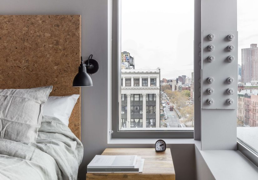
The Cork Headboard: The Star You Didn’t Know You Needed
Let’s talk about the cork headboards, because they’re doing a lot of work herein the best way. Cork is warm, tactile,
and visually soft, which is exactly what you want when you’ve got concrete, steel, and masonry in the same room.
It’s also a clever hospitality move: cork can help reduce the “everything echoes” effect that sometimes comes with hard,
minimal interiors.
The detailing matters too. These aren’t thin cork sheets slapped onto a board. The design uses thick cork (mounted on a
base) so the corners can be cleanly finishedproof that “simple” is often just “carefully engineered.”
Furniture That Feels Collected, Not Corporate
The room styling lands in that sweet spot between boutique and apartment. Expect rustic wood side tables, mixed metal-and-wood
pieces, and small, pragmatic accents like ottoman stools. The vibe says, “Yes, you can work here,” but also, “You could
absolutely take a nap immediately.”
Sliding Doors and Smart Layout Tricks
In one-bedroom setups, sliding doors help separate sleeping and living zones without eating up precious square footage.
That’s a classic small-space strategy, and it fits the building’s narrow footprint perfectly. It’s also a subtle clue that
these interiors were conceived with residential habits in mind (like not wanting your bed to be part of every conversation).
Kitchenettes: The “Apartment Hotel” Detail That Changes Everything
Many rooms include kitchenettes, which shifts the whole tone of the stay. Instead of “where do we store leftovers,” it’s
“we can actually live here for a week.” That feature also influences the interior design choices: you’ll notice finishes
and layouts that can handle real use, not just photo shoots.
Bathrooms: Where Tile, Geometry, and Calm Collide
Tile as Architecture, Not Decoration
The bathrooms don’t treat tile like an afterthought. They use it to shape spacewrapping surfaces in distinctive patterns
and tones that feel modern but not sterile. The result is a bathroom that reads “designed,” not “default.”
Statement Pieces Without the “Look at Me” Energy
Some bathrooms feature bold tile moves and sculptural fixtures, including designs that pair geometric tile collections
with clean-lined tubs and modern hardware. When you see a bathroom where the tile edges are intentionally finished (instead
of awkwardly cut), you’re looking at a team that cares about the last 5%which is where most hotels quietly give up.
Why the Material Mix Works
If you’re wondering how you can put cork, concrete, and marble in one project without it turning into a sample board fight,
Sago offers the answer: keep the palette restrained, then let texture do the storytelling. Tile brings crisp geometry,
wood brings warmth, and stone brings that “quiet luxury” weight that makes a space feel more expensive than it’s trying to be.
The Hallmark Move: Exposed Structure, Softened by Color and Light
The Color-Blocking Trick That Makes Narrow Spaces Feel Bigger
A standout strategy in Sago’s interior approach is a disciplined use of color-blocking: a horizontal line set at a consistent
height, with a deeper tone below and a lighter tone above. This creates a visual “horizon” that stabilizes the space and
makes walls feel more deliberateespecially helpful in long corridors and narrow rooms.
Design nerd note (the fun kind): a consistent color line can also help unify mismatched surfaceslike concrete block,
exposed structure, and plasterso they read as one composition instead of a collage of construction phases.
Light That Grazes, Not Blasts
The building’s configuration and window placement allow daylight to stretch deep into the interiors. That “long light”
effectwhere illumination grazes walls, textiles, and tileturns texture into a feature. This is where Sago’s material
choices pay off: textured surfaces look richer when light rakes across them at an angle.
Design Details That Signal “Boutique” Without Shouting
Wide-Plank Floors and Stone Moments
Wide-plank oak floors deliver the residential warmth that keeps the industrial vibe from feeling harsh. Meanwhile,
strategic stone details (including marble on stairs and niches) add refinement where your eye naturally landsan elegant
way of saying “yes, we’re minimal, but we’re not cheap.”
Lighting + Seating as Interior Identity
Public areas use sculptural lighting and comfortable lounge seating to establish the mood: modern, design-forward, and
quietly inviting. The effect is less “hotel lobby” and more “a friend with excellent taste just offered you a seat.”
Accessories That Don’t Feel Like Filler
Even small elementsvases, side tables, the occasional patterned textilefeel curated. You get personality without clutter,
which is a tough balance in hospitality design. Too bare and it’s cold; too decorated and it’s busy. Sago stays on the
right side of calm.
Suites and the “Splurge” Factor: When the Layout Opens Up
While the standard rooms nail the minimal-industrial formula, larger suites and top-floor accommodations push the
“apartment hotel” idea further, adding more breathing room, separate living zones, and in some cases private access and
outdoor space. These bigger layouts show how the core palette scales: the same restrained materials, just with more volume
to let them breathe.
The key takeaway: Sago doesn’t change personalities as it gets bigger. It simply turns up the comfort and expands the
moments where light, texture, and view can do their thing.
What Designers (and Curious Guests) Can Learn from Sago
1) “Industrial” Works Best as Structure, Not Theme
Sago succeeds because it uses authentic industrial cuesstructure, masonry, concreterather than decorative cosplay.
If you’re borrowing the look for a home project, focus on honest materials and clean lines, then warm them up with
texture and lighting.
2) Texture Is the Secret to Minimalism That Feels Good
Cork, oak, tile, and stone: none of these need bright color to feel interesting. If you want a minimalist palette at home,
swap “more color” for “more texture.” Your space will feel layered without feeling loud.
3) Small-Space Planning Is a Design Superpower
Sliding doors, smart zoning, and kitchenette-ready layouts are all reminders that function is a design feature.
The more a space supports real life, the more beautiful it feelsbecause you’re not fighting it every day.
4) Use One Bold Move, Then Let Everything Else Behave
Sago’s bold moves (cork headboards, distinctive tile, strong material contrasts) work because the rest of the room stays
disciplined. That’s a great rule of thumb for any project: pick your headline, then write the rest of the story in a calm voice.
Experience Add-On: A Guest-Style Walkthrough of Sago’s Interiors (Approx. )
Picture a typical Lower East Side moment: the sidewalk is doing its usual juggling actcoffee cups, vintage jackets,
tourists with cameras, locals who look like they’re late to something important (even if they’re just going to buy a bagel).
You spot the entrance and step inside, and the city’s volume drops like someone turned down a radio.
The first thing you notice isn’t a giant chandelier screaming for attention. It’s the calm. The lobby feels composedmore
like a modern living room than a transactional “stand here and wait” zone. The lighting is soft but intentional, and the
seating looks like it was chosen by someone who actually sits in chairs. You get that rare hotel sensation: you’re not
being processed; you’re being welcomed.
As you move toward your room, the building’s personality comes through in the surfaces. There’s a confidence to exposed
structuresteel, masonry, and concrete that doesn’t pretend it’s anything else. But it isn’t cold. The textures soften
the edges, and the color decisions feel measured, like the design is quietly guiding your eyes instead of demanding your
attention. Long corridors can feel endless in a city building; here, the palette and the horizontal rhythm make the walk
feel intentional, almost gallery-like.
In the room, the vibe shifts into “you could live here.” The floor is warm underfoot, the walls are restrained, and the
layout doesn’t force everything into one awkward rectangle. If there’s a sliding door separating zones, it’s doing that
New York magic trick: making a small footprint feel like multiple rooms without actually adding square footage. The bed
is backed by corkan unexpected material that instantly makes the space feel more human. It’s tactile, warm, and subtly
insulating, like the room is telling you it understands what a loud day in Manhattan can do to a nervous system.
You start noticing the “quiet flex” details. Hardware that feels good in your hand. Lighting that doesn’t turn your face
into a high-contrast science experiment. A mix of wood and metal furniture that looks collected rather than copied-and-pasted
across a thousand rooms. The textures do the decorating: the grain of the wood, the matte finish of tile, the soft rumple of
bedding. Nothing is shouting, yet everything feels considered.
Then the bathroom: crisp geometry, purposeful tile, fixtures that look modern without trying to be futuristic. Even if you’re
not the type who notices sinks, you might notice this sink. The lines are clean, the proportions are right, and the room feels
like a designed spacenot a leftover box behind a door.
By the time you’re settled, the biggest design success becomes obvious: Sago doesn’t feel like a generic hotel that could be
anywhere. It feels like the Lower East Sideedited, elevated, and made comfortable. Which is basically the dream, right?
The city outside is still doing its chaotic thing, but inside, the textures, light, and calm make it feel like you’ve found a
little architectural exhale in the middle of Manhattan.
Conclusion
The Sago Hotel NYC shows how to do “industrial-chic” with real restraint and real warmth: expose what’s honest, refine what
matters, and use texture (cork, oak, tile, stone) to make minimalism feel livable. It’s a Lower East Side interior that
doesn’t try to erase its neighborhoodit amplifies it, then hands you a comfortable place to land.