Table of Contents >> Show >> Hide
- What Impasto Really Is (And Why It Looks So Alive)
- Choosing Your Paint: Oil vs. Acrylic for Impasto
- The Secret Sauce: Mediums That Make Texture Possible
- Tools of the Trade: Brushes, Palette Knives, and “Whatever’s in the Drawer”
- Technique Walkthrough: A Simple Impasto Painting Plan (That Doesn’t Collapse Into Mud)
- Color + Texture: How to Keep Your Hues From Getting Weird
- Drying, Cracking, and Other Texture-Related Plot Twists
- How to Photograph Impasto So People Can Feel It With Their Eyes
- “39 Pics” Inspiration Gallery: Texture Moments Worth Stealing (Ethically)
- Care and Storage: Don’t Squish the Good Stuff
- Conclusion: Why I Keep Coming Back to Impasto
- Extra: of “Journey” Experience (A Studio Journal-Style Add-On)
Some people like their paintings smooth, sleek, and politelike a freshly ironed shirt. I am not some people.
I like my paint the way I like my mashed potatoes: with peaks. Impasto painting is the art-world
equivalent of saying, “Yes, I meant to make it that chunky,” and then doing it again on purpose.
If you’ve ever stood in front of a Van Gogh and thought, “I want to climb that brushstroke like a tiny mountain
goat,” you already understand the appeal. Impasto is thick paint applied in a way that leaves visible tool marks
brush, palette knife, even a card edgeso the surface becomes part of the story, not just the support system for color.
What Impasto Really Is (And Why It Looks So Alive)
“Impasto” comes from an Italian word meaning mixture, and in practice it means paint applied so thickly it stands up
off the surface. The fun part is what happens next: light hits those ridges and valleys, creating tiny shadows and
highlights that change depending on where you stand. In other words, impasto is a painting that refuses to sit still.
Texture Is Not DecorationIt’s a Lighting Strategy
When impasto is working, it’s not just “3D paint for the sake of 3D paint.” Texture can:
- Direct the viewer’s eye using raised lines as visual arrows.
- Intensify highlights by catching more light on peaks.
- Suggest motion with repeated tool marks (think wind, waves, hair, grass).
- Add emotional volumebecause a thick stroke often reads as a confident stroke.
Choosing Your Paint: Oil vs. Acrylic for Impasto
You can do impasto with either oils or acrylics, but the experience is differentlike choosing between a slow-cooked stew
and a quick stir-fry. Both delicious. Both capable of setting off smoke alarms if you ignore them long enough.
Oil Impasto: Luxurious, Slow, and a Little Dramatic
Oil paint’s naturally longer working time gives you room to push, scrape, and rework thick passages. It’s great for
soft transitions and bold peaks. The trade-off is patience: thick oil layers can take a while to cure, and
drying time becomes part of your planning.
Practical example: if you’re building thick petals on a floral piece, you can sculpt them over multiple sessionsletting
layers firm up so the next pass sits proudly on top instead of collapsing into a buttery puddle.
Acrylic Impasto: Fast, Crisp, and Ready for Another Layer Before You Finish Your Coffee
Acrylics dry quickly, which is a gift when you want to stack texture without waiting days. But straight-from-the-tube acrylic
often needs help to hold dramatic peaks. That’s where gels, pastes, and heavy-body acrylics come in: they extend paint,
add body, and keep tool marks visible.
The Secret Sauce: Mediums That Make Texture Possible
If paint is your main character, mediums are the supporting cast that steals the scene. In acrylic impasto especially,
gels and pastes can change consistency (from honey to frosting), sheen (matte to glossy), and strength (flexible to more rigid).
Gels: “Colorless Paint” That Thickens Without Turning Chalky
Acrylic gels are essentially binder without pigmentuseful for thickening, extending, and preserving brush or knife marks.
Extra-heavy gels can hold sharp peaks, while softer gels blend more smoothly for rounded relief.
- Use case: Mix gel into heavy-body acrylic to create thick, sculptable strokes that dry durable.
- Look: Often dries translucent/clear-ish, letting color stay more true than some opaque pastes.
- Pro tip: If you want crisp ridges, load your knife and place paint with minimal overworking.
Modeling Paste & Pastes: Big Texture, Big Responsibility
Modeling paste is the “build a small mountain range” option. It’s fantastic for sculptural effects and can be applied with
a knife, spatula, or textured tool. Many pastes dry white/opaque and can shift mixed-in color lighter, so artists often
apply paste first, let it dry, then paint over it.
Important reality check: thick paste wants a stable surface. Many manufacturers recommend rigid supports (like wood panels)
for heavy applications to reduce cracking or support flex issues. Also, building in thinner layers and letting each layer dry
helps prevent shrinkage cracks.
Oil Mediums for Impasto: When You Want Thickness Without Forever-Drying Doom
For oils, certain mediums can adjust flow, transparency, and drying time. Alkyd mediums, for example, are commonly used to
speed drying while maintaining workable body. The key is to stay consistent and avoid overcomplicating your mixture:
one or two reliable mediums beat a chemistry set of mystery bottles.
Tools of the Trade: Brushes, Palette Knives, and “Whatever’s in the Drawer”
The classic impasto tool is the palette knifebecause it places paint in clean slabs and leaves distinct edges. But the
true spirit of impasto is experimental. Cards, combs, silicone shapers, even the back of a spoon can carve or stamp texture.
(Just maybe don’t return the spoon to the kitchen afterward. Or do, if you enjoy chaos.)
Palette Knife Basics That Instantly Level Up Texture
- Load, don’t smear: Scoop a generous amount and place it with intention.
- Press and lift: Press the flat side down, then lift to leave a peak.
- Drag edges lightly: Use the knife edge for thin, raised lines that read like drawn highlights.
- Scrape to edit: Scraping back can reveal underlayers and create energetic, broken surfaces.
Brush Impasto: Softer Peaks, More Gesture
Brushes can create thick, expressive strokesespecially stiff bristle brushes. Brush impasto often looks more “handwritten”
than knife work. It’s excellent for skies, foliage, hair, and anywhere you want visible directionality.
Technique Walkthrough: A Simple Impasto Painting Plan (That Doesn’t Collapse Into Mud)
Here’s a reliable workflow that keeps texture readable and your colors from turning into sad beige soup:
Step 1: Choose a Support That Won’t Betray You
For heavy acrylic paste or thick impasto, a rigid panel is your best friend. Stretched canvas can flex, which can stress
thick, rigid textures over time. If you love canvas, consider keeping the impasto lighter or using flexible gels and
moderate thickness.
Step 2: Underpaint for Value and Direction
A thin underpainting (acrylic or thinned oil, depending on your medium) establishes the map: light, shadow, and major shapes.
Think of it as the blueprint before you start building your “paint architecture.”
Step 3: Build Texture in Intentional Passes
Instead of piling everything on at once, build texture where it mattershighlights, focal areas, and movement lines.
Leave quieter zones smoother so the textured parts feel even more dramatic by contrast.
Step 4: Reserve the Thickest Impasto for the End
The final pass is where impasto shines: bright highlights, crisp edges, and signature marks. If everything is thick,
nothing is thick. Save the “wow” peaks for the moments you want viewers to remember.
Color + Texture: How to Keep Your Hues From Getting Weird
Texture changes how color reads because it changes how light hits it. A smooth ultramarine wash and an ultramarine ridge
can look like cousins rather than twins.
Three Ways to Keep Color Intentional in Impasto
- Use fewer mixtures: Premix a few key piles so you’re repeating a “family” of colors across the surface.
- Glaze (when appropriate): With oils (or acrylic glazing mediums), thin transparent layers can unify passages without flattening texture.
- Paint over paste: If your paste dries white/opaque, let it dry fully, then paint on top for cleaner color.
Drying, Cracking, and Other Texture-Related Plot Twists
Impasto is the glorious moment when paint becomes sculpture. But sculpture has physics. Here are common issues and the
gentler ways to avoid them:
Problem: Cracks in Thick Acrylic Paste
- Why it happens: Thick paste can shrink as water evaporates, especially if applied too thickly at once.
- What helps: Build up in thinner layers, allow drying between layers, and avoid forcing a quick dry with heat.
- Design workaround: If fine cracking appears, treat it like a featureaccent it with a thin wash to emphasize the pattern.
Problem: Oil Impasto That Stays Sticky Forever
- Why it happens: Oils cure by oxidation, and thick layers take longersometimes much longer.
- What helps: Work in stages, use an appropriate drying medium if you choose to, and keep airflow reasonable.
- Reality check: “Touch-dry” isn’t the same as “fully cured.” Thick oils need time before varnishing.
How to Photograph Impasto So People Can Feel It With Their Eyes
Impasto can look flat in straight-on photos. The trick is raking light: light coming from the side so it
casts tiny shadows across texture. Even a desk lamp placed at a low angle can reveal ridges like topography.
- Angle: Try 30–45° from the surface.
- Multiple shots: Photograph from two different light directions to show different textures.
- Detail crops: Close-ups sell the “I could touch that” feeling.
“39 Pics” Inspiration Gallery: Texture Moments Worth Stealing (Ethically)
You asked for 39 picsso here are 39 “caption ideas” you can use as prompts for your own shots, progress photos, or
a texture-focused post. Each one is a mini-mission for your palette knife (or your bravest brush).
- Pic 1: A single ridge of titanium white catching side light like a snowy dune.
- Pic 2: Knife-laid sky strokes that look like wind directions on a weather map.
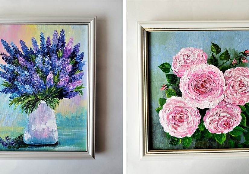
- Pic 3: Thick petals built in three passessoft base, midtone ridge, highlight peak.
- Pic 4: Scraped-back underlayer revealing a surprise color (the painting’s plot twist).
- Pic 5: Staccato knife taps making a rocky shoreline texture.
- Pic 6: A mountain silhouette edged with raised paint that glows at the rim.
- Pic 7: A comb pattern pulled through wet paintinstant fabric illusion.
- Pic 8: Palette knife “brick” marks building a wall without drawing a single line.
- Pic 9: Thick tree bark made with vertical knife drags and a final highlight scrape.
- Pic 10: A wave crest: translucent glaze over raised white foam (the ocean’s frosting).
- Pic 11: Sunlit grass: short upward flicks clustered like a tiny crowd at a concert.
- Pic 12: A glossy gel peak beside a matte passagetexture contrast and finish contrast.
- Pic 13: “Butterfly knife” marks (press, twist, lift) for leaves with volume.
- Pic 14: A moon rendered as a single thick disk with crater dents.
- Pic 15: A portrait cheekbone where the highlight is literally raised.
- Pic 16: Knife-stacked paint that forms a clean edge without tape (show-off behavior).
- Pic 17: A background kept smooth so the foreground impasto looks extra loud.
- Pic 18: Thick paint “calligraphy” linesgesture you can trace with your finger.
- Pic 19: A floral center dotted with heavy paint like candy sprinkles.
- Pic 20: A shadow built with cooler, thinner paint so it recedes behind thick highlights.
- Pic 21: A palette knife gradient made by pressingnot smearingtwo colors together.
- Pic 22: A field of clouds made from rounded, marshmallow-like brush impasto.
- Pic 23: An abstract “fault line” where scraping reveals layers like geology.
- Pic 24: A metal object with thick, sharp highlight strokes (instant shine).
- Pic 25: A sweater texture created by repeating small knife zigzags.
- Pic 26: Hair rendered with raised directional strokeslike stylized topographic lines.
- Pic 27: A fruit still life where the juiciest highlight is the thickest stroke.
- Pic 28: A watercolor-ish background effect achieved with thin paint plus a few bold peaks.
- Pic 29: A knife “stamp” pattern: place paint, lift, repeattexture with rhythm.
- Pic 30: A cracked paste texture used intentionally as a desert floor.
- Pic 31: A city skyline where windows are raised dots catching side light.
- Pic 32: A flower stem made with one confident knife drag (no wiggling allowed).
- Pic 33: Snowdrifts built with soft, rounded palette knife piles.
- Pic 34: A galaxy: thick stars over smooth nebula glazes.
- Pic 35: A mountain path made by scraping a lighter line through dark wet paint.
- Pic 36: A textured frame edge that makes the painting feel like an object, not a window.
- Pic 37: A close-up showing tool marksbecause the marks are the personality.
- Pic 38: A raking-light shot that turns your painting into a tiny relief sculpture.
- Pic 39: The final hero shot: full painting + one macro detail + one side-light texture shot.
Care and Storage: Don’t Squish the Good Stuff
Texture is fragile in the most annoying way: it’s strong until it meets pressure. If you stack paintings face-to-face,
or wrap them too tightly, raised brushwork can flatten. When storing or transporting impasto work, protect the surface
with spacers, keep pressure off the paint film, and avoid anything that presses directly on the peaks.
Conclusion: Why I Keep Coming Back to Impasto
Impasto is more than a techniqueit’s a decision to let the process stay visible. It’s honest, tactile, and just a little
rebellious. You can use it to make light shimmer, to turn brushwork into handwriting, and to give your painting a surface
that feels alive even when the subject is still.
If you’re curious, start small: one knife, one gel, one painting where you save the thickest highlights for last. Then take
a side-lit photo and watch your texture show up like it’s been waiting for an audience.
Extra: of “Journey” Experience (A Studio Journal-Style Add-On)
The first time I tried impasto, I had a completely reasonable plan: “Add a little texture.” This plan lasted about twelve
seconds. Then I loaded a palette knife with paint and made a stroke so thick it could’ve applied for its own ZIP code.
I stared at it, proud and slightly concernedlike a person who accidentally baked a five-layer cake while trying to toast
a bagel.
What surprised me wasn’t just the thicknessit was how the painting started to behave. With flat paint, you can
judge everything head-on. With impasto, the surface changes as you move. I’d step left and a ridge would glow; step right
and it would sulk into shadow. It felt like the painting had moods. (Relatable.)
My next lesson arrived quickly: texture has consequences. I mixed an ambitious amount of paste into acrylic, slapped it on
like frosting, and walked away feeling like a genius. The next day, it had dried with tiny cracksnothing catastrophic,
but enough to humble me. I learned to build up texture in calmer layers, letting each one dry before adding the next.
Think: geology, not mudslide.
The best breakthrough came when I stopped trying to make everything thick. I used to chase “maximum texture” across the whole
canvas, as if the painting needed to be 100% crunchy at all times. But the paintings that worked best had quiet areassmooth
stretches that made the thick parts feel louder. It was like arranging music: you need pauses so the chorus hits harder.
Then came the “tool rebellion” phase. Yes, palette knives are wonderful. But once I realized impasto welcomed odd tools, I
started experimenting: the edge of an old card for crisp bands, a silicone shaper for grooves, a fork for patterns that
looked suspiciously like knit fabric. The painting became less about perfect rendering and more about mark-making with
intention. When a texture felt wrong, I scraped it back and tried againimpasto taught me that editing is part of the style,
not an admission of defeat.
Now, when I plan an impasto piece, I think in layers of decisions: where the light should sparkle, where the eye should land,
where the texture should whisper instead of shout. And every time I photograph it with side light, I get that same little
thrilllike the painting is revealing a secret topographic map I didn’t know I made. That’s the magic: impasto doesn’t just
show what you painted. It shows how you painted itand somehow, that’s the most personal part.