Table of Contents >> Show >> Hide
- Why “Revolution Road” Feels Like a Big Deal (Even If the Buildings Are Small)
- The Minus-K House, Explained Like You’re Touring It With a Coffee
- One Shared Table Changes Everything
- The 10-by-10 Trick: Small Rooms That Don’t Feel Small
- Brick That Pulls Triple Duty (Structure, Finish, and Mood)
- The Courtyard as a Climate Strategy (Not Just a Pretty Void)
- Privacy Without the Fortress Energy
- What Designers (and Renovators) Can Steal From Revolution Road
- Conclusion: A Quiet Revolution in Brick and Light
- Experience: What It Feels Like to Live (or Linger) in a Revolution Road Compound
Shanghai is the kind of city that makes you feel like you should start power-walking immediately, just to keep up.
Towers sparkle, scooters zigzag, and somewhere in the background a construction crane is doing yoga. So when you hear
about a low-slung, brick-walled compoundtwo small homes wrapped around a shared courtyardyour brain does a double take.
Wait… quiet living? In Shanghai? Who authorized that?
Welcome to Revolution Road, where a minimalist project nicknamed the Minus-K House proves that “less”
doesn’t have to mean “cold,” and “small” can still feel generous. Designed as a compact compound with two separate
residences, it’s a study in smart planning, honest materials, and a bold social idea: if you want community, design it
into the floor planthen put dinner right in the middle.
Why “Revolution Road” Feels Like a Big Deal (Even If the Buildings Are Small)
Shanghai’s built identity is a mash-up of eras and speeds. On one end: glass-and-steel skylines that look like they were
rendered at 4K resolution. On the other: older neighborhoods of dense lane housing, courtyards, and shared outdoor space
living patterns that prize proximity because they’re practical, social, and efficient.
In that context, an architect-designed compound isn’t just an aesthetic flex. It’s a statement about how to live
in a city where land is precious, privacy is hard-won, and light is basically a luxury good. The Minus-K compound doesn’t
fight density with bigger walls and louder design. It reduces, edits, and organizeslike Marie Kondo for architecture,
but with structural brick instead of sparkly storage bins.
The Minus-K House, Explained Like You’re Touring It With a Coffee
The compound is made up of two separate houses arranged around a communal courtyard.
One is a weekend home for the owner. The other is for an employee’s family. That pairing matters, because the design
isn’t just about minimalismit’s also about relationships, hierarchy, and the choice to share space in a way that’s
intentional rather than accidental.
The architecture uses a simple kit-of-parts approach: compact rooms, clear circulation, and a courtyard that works like
the project’s lungs (air) and eyes (light). You’re never far from outdoors, but you’re also not living in a fishbowl.
The result is calm and surprisingly warmmore “quiet confidence” than “empty showroom.”
One Shared Table Changes Everything
If you remember one image from this compound, make it this: a single, central table that both households
share. It’s positioned so that each family has its own kitchen counter facing the other across the table. That means
cooking is automatically socialno separate “private” kitchen where one household disappears behind a door.
It’s a deceptively radical move. A shared table turns “community” from a vibe into a daily choice:
- It encourages casual connection (a hello, a quick chat, a shared dumpling, a shared complaint about humidity).
- It builds flexible boundaries: you can eat together, eat separately, or do the classic “we’re just having tea” diplomacy.
- It makes outdoor space useful, not decorativethis is a courtyard you actually inhabit.
In a lot of modern housing, shared space is treated like a perk: a rooftop lounge you’ll use twice a year and only if you
remember the code. Here, the common space is unavoidable in the best way. It’s the heart of the compound, and it’s placed
where life naturally gathersfood, light, and conversation.
The 10-by-10 Trick: Small Rooms That Don’t Feel Small
Many compact homes fail not because they’re small, but because they’re fussytoo many tiny zones, too many doors,
too much “hallway tax.” The Minus-K approach is cleaner: think of rooms as compact modules that can be combined, expanded
vertically, or visually connected through openings and window placement.
Design moves that make the footprint feel bigger
- Double-height moments: A taller volume in the living zone adds drama and breathing room, like a deep inhale.
-
High-and-low windows: Windows placed at different heights pull in light while protecting privacy, and they make
walls feel less like barriers and more like filters. -
Borrowed views: Openings between rooms and toward the courtyard create longer sight lines, which your brain
reads as “spacious,” even if the square footage says “be humble.” -
Built-ins instead of bulky furniture: Shelving and storage tuck into wall zones and around windows, keeping the
floor plan open and the vibe uncluttered.
This is the kind of design that respects real life: where people need storage, circulation, and surfaces that work. The
compound isn’t minimalist because it hates stuff; it’s minimalist because it plans for stuff properly.
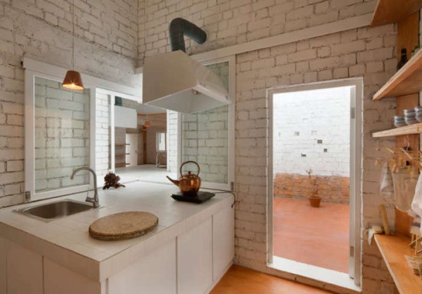
Brick That Pulls Triple Duty (Structure, Finish, and Mood)
The compound’s defining material choice is refreshingly straightforward: structural brick walls that are
left unplastered and painted white inside and out. In other words, the brick isn’t a decorative “feature wall.”
It’s the actual buildingdoing the heavy lifting literally and visually.
Material honesty like this tends to age well, both aesthetically and practically. When structure and finish are the same
thing, you avoid the layers that often fail first: peeling paint on drywall, cracked plaster, fussy trim that doesn’t love
humidity. White-painted brick also does something emotionally important: it brightens the interiors and softens the texture,
giving the rooms a calm, diffused glow rather than the harsh “all-white apartment” glare.
Why white masonry works so well here
- Light amplification: White surfaces bounce daylight deeper into compact rooms.
- Texture without clutter: Brick adds richness and shadow without adding objects or patterns.
- A unified palette: When walls, ceilings, and courtyard surfaces speak the same language, the space feels coherent and restful.
There’s also a quiet sustainability argument: using durable masonry and reducing finish layers can lower maintenance over time.
That’s not as Instagrammable as a marble waterfall island, but it’s the kind of “luxury” you feel when nothing is falling apart.
The Courtyard as a Climate Strategy (Not Just a Pretty Void)
Courtyards are ancient for a reason: they’re an elegant response to climate, density, and the human need for daylight.
In a humid, hot-summer/cold-winter region like Shanghai, you want light and airflow without turning your home into a heat trap.
A courtyard can help moderate that, especially when paired with smart window placement and ventilation planning.
Think of the courtyard here as a performance space for the fundamentals:
- Daylight: Bringing natural light into the center reduces reliance on artificial lighting and makes small rooms feel alive.
- Ventilation potential: Operable windows and cross-breezes can help flush heat and cooking moisture when outdoor air quality allows.
- Outdoor living: The courtyard becomes a dining room, a play space, a quiet reading zonewhatever the day needs.
Importantly, good ventilation is both a comfort issue and an indoor-air-quality issue. Practical homes treat kitchens and baths
as “source zones” that need proper exhaust, and treat fresh air as a design inputnot an afterthought. The Minus-K compound’s
indoor-outdoor relationship supports that mindset: air has somewhere to go, and light has a path in.
Privacy Without the Fortress Energy
Small compounds can accidentally feel like you’re living in a polite standoff: everyone can hear everyone, and your morning
routine becomes performance art. The Minus-K project avoids that by using layered privacy:
windows that frame sky instead of faces, room orientations that prioritize the courtyard, and simple boundaries that allow
togetherness without forcing it.
This is the sweet spot: the architecture encourages interaction, but it doesn’t demand constant socializing.
You can step outside for dinner and conversation, then retreat to a quiet bedroom with high windows and soft curtains.
Community is offered, not imposed.
What Designers (and Renovators) Can Steal From Revolution Road
You don’t need a Shanghai compound to apply these lessons. The project is basically a masterclass in doing more with lesswithout
making “less” feel like deprivation.
1) Start with the “commons,” not the bedrooms
Most homes are planned from the private outward: bedrooms first, then whatever space is left becomes “living.”
Revolution Road flips that. The shared courtyard and table define the project, and everything else organizes around it.
2) Use one strong material idea and commit
A disciplined palettewhite masonry, warm wood, simple built-inskeeps the design coherent. It also makes later changes easier
because the background stays calm. Your future rug choices will thank you.
3) Make small rooms feel big with light, height, and sight lines
If you can’t expand outward, expand perception. Taller volumes, borrowed light, and thoughtful window placement are the
classic toolsand they still work because human brains haven’t updated since the Stone Age.
4) Treat ventilation as part of the plan
Especially in compact homes, moisture and odors build quickly. Prioritize kitchen and bath exhaust, and plan for fresh-air strategies
that match the local environment. Comfort isn’t only about temperature; it’s also about air that feels clean and breathable.
5) Design for real life, not just real estate photos
Built-in storage, durable finishes, and outdoor space you’ll actually usethese are the unglamorous decisions that make a home
lovable after the novelty wears off.
Conclusion: A Quiet Revolution in Brick and Light
The Revolution Road compound is memorable because it’s restrained in all the right ways. It takes simple elementsbrick walls,
compact rooms, a courtyard, a tableand arranges them with clarity and courage. The result isn’t minimalism as a style.
It’s minimalism as a lifestyle strategy: reduce friction, increase light, and make room for connection.
In a city famous for speed and scale, this project chooses a different kind of ambition. It doesn’t try to outshine Shanghai.
It creates a pocket of calm inside itproof that the most radical luxury might be a place where you can hear yourself think,
and where dinner outside is always an option.
Experience: What It Feels Like to Live (or Linger) in a Revolution Road Compound
Imagine arriving after a long Shanghai daythe kind where your phone says you walked 14,000 steps but your brain insists it was
40,000. The compound doesn’t greet you with drama. It greets you with quiet: white brick catching the late light, a courtyard
that feels like an exhale, and a layout that immediately tells you where life happens.
First stop is the courtyard, because courtyards have a strange superpower: they reset your mood without asking permission.
The walls create a sense of enclosure, but the open sky keeps it from feeling boxed in. Even the light behaves differently here.
It’s not the sharp, reflective glare you get bouncing off glass towers; it’s soft and scattered, sliding over brick texture like
it has nowhere urgent to be.
Now picture the shared table at the center. It’s the kind of feature that makes you smile because it’s so direct.
No “formal dining room” that becomes a storage museum for chairs nobody sits on. No kitchen island the size of an aircraft carrier.
Just a table that says: people eat here. People talk here. People do homework here. People place groceries here and then
pretend they’re going to unpack them immediately (a timeless fantasy across all continents).
If one household is cooking, you catch it instantlynot in a nosy way, but in a normal, human way. You might exchange a few words.
You might trade a vegetable. You might share a laugh when the weather swings from “pleasant” to “why is the air hugging me?”
And because the courtyard is right there, the whole scene can spill outside with almost no effort: plates travel a short distance,
conversation gets a little louder, and dinner becomes a small event instead of a quick survival task.
The interior experience is just as thoughtful. A compact bedroom with high-and-low windows feels private but not sealed off.
You see the sky, not your neighbor’s schedule. Built-in shelves do the work that bulky furniture usually does, so the room stays
calm even when your life is not. The white masonry makes the space feel clean, but the brick texture keeps it from feeling sterile.
It’s like the room is saying, “Yes, we’re minimalist, but we’re not mad about it.”
On rainy daysthe kind where Shanghai humidity could convince you that you’re slowly turning into soupthe courtyard still earns its keep.
You watch water darken the brick and hear the softened sound of the city beyond the walls. You open a window when the air outside cooperates.
You close it when it doesn’t. The compound makes these shifts easy because the boundary between indoors and outdoors is designed, not accidental.
And maybe that’s the most lasting “experience” here: the sense that the architecture is quietly on your side.
It doesn’t demand a perfect lifestyle. It doesn’t punish you for owning things. It simply gives you a calm frameworklight, air, durable surfaces,
and a shared centerso everyday life can unfold with a little more ease. In a city famous for intensity, that kind of calm is its own revolution.