Table of Contents >> Show >> Hide
- Why This YSG Apartment Feels So Fresh
- Avocado and Salmon: A Risky Pairing That Totally Works
- Small-Space Design, Minus the Tiny-Home Cliches
- Texture Is Doing a Lot of Heavy Lifting
- A Bondi Apartment That Refuses Beach-House Stereotypes
- What Homeowners Can Learn From This Apartment
- The Experience of Living in a Place Like This
- Final Thoughts
- SEO Tags
Some homes whisper. This one struts in, flips its scarf, and says, “Yes, the floor is fabulous. No, I will not apologize.” That is the delicious charm of this compact Australian flat by YSG, the Sydney studio led by Yasmine Ghoniem. Set in Bondi and measuring just 55 square meters, the apartment does not rely on square footage to make an impression. It relies on nerve, mood, and a wildly confident color story built around avocado green, salmon pink, peachy spice tones, and a few supporting characters that deserve their own agent.
On paper, the palette sounds like it should belong to a retro diner, a bowl of fruit, or a rebellious bridesmaid dress. In practice, it feels chic, cinematic, and oddly relaxing. That is the magic trick here. YSG takes colors that could easily go cartoonish and turns them into something layered, tactile, and deeply livable. The result is a flat that feels both collected and composed, playful and grown-up, punchy and cocooning. In a design era that often mistakes beige restraint for sophistication, this apartment is a glorious reminder that personality is not clutter. Sometimes personality is the whole point.
Why This YSG Apartment Feels So Fresh
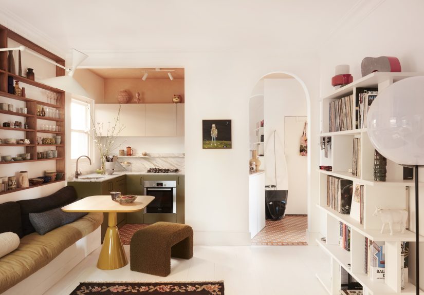
The project, known as BAIT, sits in Bondi, Sydney, and proves that a small home can feel generous when every inch works hard and every finish pulls its weight. YSG did not just decorate the apartment; the studio reimagined it through custom joinery, built-in seating, new finishes, and a painterly approach to color. According to project details shared by the studio, olive green, turmeric, and peach act as linking shades across the modest floor plan, showing up in everything from joinery to linens and rugs.
That consistency matters. One of the smartest design lessons from the best U.S. interiors coverage right now is that immersive color creates cohesion. Color drenching, tonal layering, and related techniques have become popular because they blur hard edges, soften visual clutter, and make a room feel intentional rather than pieced together by panic and weekend sale shopping. YSG’s flat does exactly that, but with more swagger than trend-chasing. It is not color for color’s sake. It is color with choreography.
And that may be the apartment’s greatest strength: everything feels connected. Nothing looks random, even when the room is filled with vintage textiles, quirky objects, sculptural furniture, and surfaces that beg to be touched. The home avoids the sterile “showroom apartment” problem by embracing patina, softness, and the kind of visual looseness that makes a place feel inhabited. In other words, it has taste without acting smug about it.
Avocado and Salmon: A Risky Pairing That Totally Works
The green keeps the apartment grounded
Avocado green is one of those colors with serious baggage. Mention it, and half the room sees chic olive sophistication while the other half sees a 1970s appliance that may or may not still be running in somebody’s aunt’s basement. YSG smartly leans into the good version of avocado: earthy, warming, organic, and quietly dramatic. In this flat, the green joins the architecture rather than sitting on it like a loud accessory. It gives the kitchen and built-ins a rooted, settled quality.
That is a big reason green keeps returning to design conversations in the U.S. It has a natural connection to the outdoors, so even bold or moody versions often read as restorative rather than aggressive. Olive and avocado tones can feel especially sophisticated because they are muted enough to behave like near-neutrals, yet interesting enough to keep a room from lapsing into sleepy sameness. YSG uses that quality masterfully. The green surfaces feel calm, but they are not boring. They are calm with a pulse.
The salmon adds warmth, wit, and a little cheek
If avocado is the anchor, salmon is the flirt. It lightens the mood, introduces warmth, and keeps the apartment from becoming too earnest. Pink and green are classic opposites in the best possible sense: one earthy, one juicy; one cool-ish, one warm-ish; one grounding, one lifting. When balanced well, they make each other look more complex.
Here, salmon shows up in one of the project’s best details: a rich tapestry of salmon pink tiles with white inlays that create an aged patina effect in the kitchen and entrance. The twist is that these “tiles” are hand-painted on the original floorboards. That move tells you everything about YSG’s attitude. This is not decoration that sits politely in the corner. It is atmosphere. It is illusion. It is craftsmanship with a wink.
And because the salmon is dusty and earthy rather than sugary, it reads as mature. Think less bubblegum, more sunset seen through a linen curtain. That distinction matters. Pink can be elegant when it carries mineral warmth and a bit of age. YSG understood the assignment and then scribbled on it with much better handwriting.
Small-Space Design, Minus the Tiny-Home Cliches
Small apartments are often told to be white, sparse, and vaguely apologetic. Apparently, if you only have 592 square feet, you are expected to live inside a cloud and own three mugs. YSG rejects that nonsense. This flat shows that compact living does not require aesthetic self-denial. It requires strategy.
One of the smartest interventions is the built-in banquette, described elsewhere as the nucleus of the home. Banquettes are beloved in compact interiors for a reason: they save space, create structure, and often hide storage below. In this apartment, the banquette does more than squeeze in seating. It acts as a spatial anchor, helping the living area feel settled and social rather than awkwardly floating.
Open shelves at varying heights also draw the eye around the home and make the vertical dimension work harder. That is a clever move in a small footprint. Layered shelving introduces rhythm, display, and function all at once. Instead of treating storage like something shameful that must vanish behind flat doors, YSG turns some of it into part of the composition. Mugs, books, objects, and collected pieces become texture. Storage becomes storytelling.
Mirrors also play a practical role. As many American design editors and stylists love to point out, mirrors are one of the oldest and best small-space tricks because they bounce light and visually extend a room. In this flat, they do not feel like gimmicks. They feel like part of a larger strategy: increase light, deepen sightlines, and make the home feel airy without bleaching its soul.
Texture Is Doing a Lot of Heavy Lifting
If the color palette is what gets you through the door, texture is what keeps you lingering. The apartment is full of tactile contrasts: smooth paint, vintage fabrics, terrazzo, timber, marble, linen, and a Marmorino bathroom finish that adds depth without busy pattern. This is where the project becomes more than a pretty palette exercise. It becomes sensory.
The bathroom deserves a slow clap. While the main palette moves through olive, turmeric, peach, and salmon, the bathroom takes a blue-toned detour. Done in Marmorino render with custom joinery and terrazzo floors, it creates a cool counterpoint to the warmer rooms. This is a savvy move. A palette does not need to be monotonous to be cohesive. Sometimes the best way to make the warmer tones sing is to give one room a different note entirely.
American design coverage increasingly emphasizes textured finishes like plaster, limewash, and Venetian-style surfaces because they soften light and add age, even in newly renovated spaces. YSG’s bathroom follows that logic beautifully. The room feels atmospheric, not glossy. You can almost sense how the walls would shift from morning light to evening shadow. That kind of finish gives a compact apartment emotional range. It also saves a room from looking too flat, which is always a risk when bold paint colors take center stage.
A Bondi Apartment That Refuses Beach-House Stereotypes
One of the most refreshing things about this home is what it does not do. Bondi is famous for sun, surf, and all the visual clichés that often follow coastal interiors: bleached wood, watery blues, white-everything, and enough rope detailing to make a sailboat nervous. YSG goes in the opposite direction.
Yasmine Ghoniem has described the home as a retreat that is “not very beachy,” and that rejection of expected coastal styling is exactly what makes the project memorable. Instead of performing location in an obvious way, the apartment creates an emotional response. It feels warm, plump, tactile, and relaxed. That may actually be truer to coastal living than the usual parade of seashells and driftwood cosplay. After all, the point of a home near the water is not to resemble a themed restaurant. It is to help you exhale.
This is where YSG’s broader design philosophy comes through. The studio’s work often favors storytelling, sensory impact, and layered cultural references over rigid style labels. In this Bondi flat, those instincts translate into a home that feels deeply personal. The pieces are mixed rather than matched. Vintage textiles sit beside custom joinery. Objects collected over time share space with bold color and sculptural lighting. The apartment does not look “finished” in the frozen-magazine sense. It looks alive.
What Homeowners Can Learn From This Apartment
1. Bold color works better when it is repeated
One fearless color can feel accidental. A family of related tones feels intentional. YSG repeats earthy greens, peachy pinks, and warm neutrals across surfaces and objects so the palette reads as deliberate rather than chaotic.
2. Small spaces need personality, not punishment
You do not have to strip all character from a compact home. In fact, smaller rooms often benefit more from bold choices because every element has a stronger visual impact. The trick is editing, not erasing.
3. Built-ins are worth the trouble
Custom seating, wardrobes, shelves, and joinery can transform a small apartment from “fine, I guess” into highly functional. They help eliminate dead space and make awkward corners earn their rent.
4. Texture keeps color from looking flat
Plaster finishes, textiles, timber, terrazzo, and painted floor effects add age and nuance. Without that tactile variety, strong colors can look one-dimensional. With it, they look layered and expensive.
5. A home can be stylish without being precious
One of the most charming details in YSG’s design worldview is the acceptance of wear: wrinkles in linen, scuffs on painted boards, objects that shift and multiply over time. That gives a home grace. It lets design breathe.
The Experience of Living in a Place Like This
What would it actually feel like to live in a home like this day after day? Probably a lot more transporting than the square footage suggests. That is because the apartment is designed less as a backdrop and more as an experience. In the morning, the olive tones would likely feel steady and centering, especially as natural light moves across the custom joinery and shelving. Green has that peculiar ability to be both restful and alive. It does not demand attention the way scarlet or cobalt might, but it still gives a room energy. You wake up, shuffle toward coffee, and the apartment seems to meet you halfway instead of glaring at you with a blank white wall and the personality of printer paper.
Then there is the salmon. In real life, that hue would probably perform differently across the day, which is part of its charm. Morning light might pull out its softness, making the kitchen and entry feel almost sun-washed. By late afternoon, it would deepen and glow, creating a warmer, more theatrical mood. That changing quality is one reason earthy pinks are so appealing in residential design. They carry warmth without overheating a room. They flatter wood, stone, brass, linen, and skin tones. In a practical sense, they make everyday rituals feel slightly better dressed.
There is also something psychologically reassuring about living with a palette that does not try too hard to be “correct.” This apartment is cool, yes, but it is not sterile cool. It is the kind of cool that allows books on the table, a half-finished conversation, a slouch into the banquette, and a favorite mug left on the shelf because it looks good there anyway. The lived experience would likely feel less like occupying a design object and more like participating in a mood. That matters. The best interiors do not just photograph well; they support a rhythm of life.
And because the home layers storage, mirrors, display shelves, and built-ins so carefully, daily living would also feel smoother. There is a practical ease hidden beneath the visual richness. Things have places. Sightlines are considered. The banquette creates a social center. The shelves invite personal curation. The wardrobes add order. Even the hand-painted floor detail in the kitchen and entry would change the ritual of moving through the apartment. Transitional spaces would not feel like throwaway zones; they would feel noticed.
Perhaps most importantly, a home like this would resist emotional flatness. Neutral interiors can be beautiful, but many fail because they ask too little of the senses. This flat asks more. It asks you to look, touch, notice, and return. The textures would make rainy days feel moodier in a good way. The color would make evening lamplight feel richer. The blue bathroom would offer a little cool exhale from the warmer core palette, like stepping into a quieter chapter of the same story.
That is probably why the apartment lingers in the imagination. It suggests a style of living that is expressive without chaos, edited without lifelessness, and compact without compromise. You do not leave thinking, “I should copy that exact paint color.” You leave thinking, “My home could stand to be a little braver.” And honestly, that may be the highest compliment any design can receive.
Final Thoughts
YSG’s Bondi flat is unconventional cool because it understands something many homes forget: beauty is not always about restraint. Sometimes it is about contrast, courage, and knowing exactly how far to push a room before it starts singing. Avocado green gives the apartment its grounding force. Salmon pink gives it sparkle and warmth. Custom storage and built-ins keep the small footprint efficient. Tactile finishes give the palette maturity. And the overall result is a home that feels intimate, expressive, and completely itself.
In a sea of safe interiors, this apartment goes full flavor. Not chaos. Not gimmick. Flavor. That is why it works. It is bold, but edited. Retro-minded, but not nostalgic. Compact, but never cramped. Most of all, it proves that a home can be practical and still have a vivid inner life. Beige may be peaceful, sure. But YSG makes a very convincing case that peace can also come in avocado and salmon.