Table of Contents >> Show >> Hide
- How to Choose a Living Room Color Scheme That Actually Works
- The 33 Beautiful Living Room Color Schemes
- 1) Warm White + Natural Oak + Matte Black
- 2) Greige + Cream + Soft Brass
- 3) Dove Gray + Turquoise + Crisp White
- 4) Navy + White + Camel Leather
- 5) Sage Green + Warm White + Light Wood
- 6) Forest Green + Linen + Cognac
- 7) Charcoal + Blush + Gold
- 8) Soft Black + Off-White + Walnut
- 9) Sand Beige + Terracotta + Olive
- 10) Clay Pink + Mustard + Deep Indigo
- 11) Powder Blue + Bright White + Rattan
- 12) Denim Blue + Cream + Rust
- 13) Teal + Warm Gray + Copper
- 14) Cobalt + White + Marigold
- 15) Olive Green + Cream + Black
- 16) Mushroom Taupe + Dusty Rose + Bronze
- 17) Lavender Gray + Ivory + Antique Gold
- 18) Plum + Oatmeal + Brass
- 19) Chocolate Brown + Sand + Soft White
- 20) Mocha + Pale Pink + Charcoal
- 21) Butter Yellow + White + Light Gray
- 22) Apricot + Warm White + Honey Wood
- 23) Brick Red + Beige + Dark Wood
- 24) Brick + Cream + Navy
- 25) Coastal Sand + Sea Glass + White
- 26) Aqua + Coral + Warm White
- 27) Monochrome Grays + Warm Wood
- 28) Scandinavian White + Soft Gray + Pale Blue
- 29) Mid-Century Orange + Walnut + Slate
- 30) Boho Neutrals + Olive + Burnt Sienna
- 31) Modern Minimal: White + Black + Concrete Gray
- 32) Jewel Box: Emerald + Sapphire + Soft Neutral
- 33) Tonal Blues: Sky + Slate + Navy
- Quick Pairing Cheat Sheet
- Common Color Mistakes (and Easy Fixes)
- Real-World Lessons and Experiences with Living Room Color Schemes (The Stuff Nobody Brags About)
- Conclusion
Generated with GPT-5.2 Thinking
Picking a living room color scheme is basically choosing the vibe of your home’s “group chat.”
It’s where you host friends, scroll in silence, negotiate with pets about couch ownership, and
pretend that one throw blanket counts as “interior design.”
The good news: you don’t need a design degree or a mysterious accent wall that “just happened.”
You need a plan. Below are 33 beautiful living room color schemesranging from “soft and serene”
to “bold enough to make your mother-in-law clutch her pearls”plus practical tips so the colors
look amazing in real life (not only in perfectly staged photos where nobody owns a phone charger).
How to Choose a Living Room Color Scheme That Actually Works
1) Start with what you can’t (or won’t) change
Flooring, big rugs, a brick fireplace, that giant sectional you love too much to break up withthese
are your “fixed elements.” Match your palette to them, not the other way around. Wood tones lean warm
(golden oak, walnut) or cool (ashy, gray-washed). Your paint should be friends with the undertones, not frenemies.
2) Respect lighting like it pays your rent
A color can look crisp in morning light, cozy at dusk, and suspiciously green at night under warm bulbs.
Test paint samples on multiple walls and look at them across the day. If a shade feels “off,” it’s usually
undertones + lighting doing a secret handshake behind your back.
3) Decide the mood first, then pick the hues
Want calm? Cool and neutral tones (soft blues, greens, warm whites, greige) tend to read soothing. Want
energy? Warmer hues (ochre, terracotta, coral) bring the pep. Want drama? Go deeper (navy, charcoal, emerald)
and add lighter trims or textiles so the room doesn’t feel like it’s plotting something.
4) Use the “60–30–10” guideline (but don’t be a robot)
Think: 60% dominant (walls/large rug), 30% secondary (sofa/curtains), 10% accent (pillows/art).
It’s a helpful training wheelfeel free to take it off once you can ride without crashing into a beige wall.
5) In open floor plans, “zone” with colorgently
You can define areas with related shades: one hue in the living space, a complementary tone nearby, and a shared
trim color to keep flow. Translation: your home can have distinct spaces without looking like a paint aisle exploded.
The 33 Beautiful Living Room Color Schemes
Each scheme includes a core palette and a quick “how to use it” note. Swap specific shades to match your style
the magic is in the relationships between colors.
1) Warm White + Natural Oak + Matte Black
A bright, breathable base with grounded contrast. Use warm white walls, oak furniture, and matte black accents
(frames, lighting) for a modern, gallery-clean look that still feels lived-in.
2) Greige + Cream + Soft Brass
Greige (that perfect beige-gray diplomat) makes everything feel pulled together. Add creamy upholstery and brushed
brass for warmth. Ideal if you want “cozy” without turning your living room into a cinnamon latte.
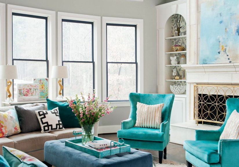
3) Dove Gray + Turquoise + Crisp White
Gray walls can shine when paired with a clear, watery accent like turquoisethink pillows, art, or a statement chair.
Keep trim and ceilings crisp white so the scheme stays bright.
4) Navy + White + Camel Leather
Navy brings instant sophistication; camel leather adds warmth so it doesn’t feel nautical-themed. Add white trim and
light textiles to keep the room from going “midnight cave.”
5) Sage Green + Warm White + Light Wood
Sage is the chill friend of greennature-inspired, soft, and easy to style. Pair with warm white and light wood for an
airy, fresh palette that still feels cozy year-round.
6) Forest Green + Linen + Cognac
Moody green walls with linen upholstery and cognac accents (leather ottoman, warm wood) create a grounded, luxe vibe.
Pro tip: add layered lighting so the depth reads “rich,” not “gloomy.”
7) Charcoal + Blush + Gold
Charcoal gives structure; blush softens it; gold adds sparkle. Use blush in textiles (pillows, throws) rather than huge
furniture pieces if you want a timeless look.
8) Soft Black + Off-White + Walnut
A bold, editorial scheme that’s surprisingly livable. Keep black on one focal wall or built-ins, balance with off-white
walls/curtains, and bring in walnut for warmth.
9) Sand Beige + Terracotta + Olive
Earth tones that feel welcoming and collected. Terracotta works best as an accent (vases, art, pillows) while olive grounds
the palette through greenery or a rug pattern.
10) Clay Pink + Mustard + Deep Indigo
This is the “sunset” palette: warm, playful, and design-forward. Use clay pink as a soft wall color, then anchor with indigo
(sofa or rug) and sprinkle mustard in smaller doses.
11) Powder Blue + Bright White + Rattan
Breezy and light. Powder blue walls read calm without going babyish when paired with bright white trim and natural textures like
rattan, jute, and linen.
12) Denim Blue + Cream + Rust
A relaxed classic: denim-blue sofa, creamy walls, and rust accents (pillows, art, pottery). Great for family rooms because it hides
life’s little messes with dignity.
13) Teal + Warm Gray + Copper
Teal makes a confident statement, warm gray keeps it grounded, and copper adds glow. If teal walls feel like a commitment, try teal
on built-ins or a feature wall.
14) Cobalt + White + Marigold
High-energy, high-style. Use cobalt as the anchor (accent wall or major upholstery), keep white as the buffer, and add marigold in art
and textiles for punch.
15) Olive Green + Cream + Black
Olive is earthy and sophisticated. Creamy upholstery lightens it; black accents sharpen it. This palette looks especially good with
vintage rugs and framed prints.
16) Mushroom Taupe + Dusty Rose + Bronze
Understated but not boring. Mushroom taupe walls create warmth without yellowing, dusty rose adds softness, and bronze metals feel
richer than bright gold.
17) Lavender Gray + Ivory + Antique Gold
If you want a “neutral” that’s quietly interesting, lavender-gray is the move. Keep the rest creamy/ivory and use antique gold for a
gentle glow.
18) Plum + Oatmeal + Brass
Plum delivers drama with elegance. Oatmeal upholstery keeps it approachable; brass adds polish. Works beautifully with velvet textures
and warm wood.
19) Chocolate Brown + Sand + Soft White
Brown is back, and it’s not apologizing. Use chocolate in furniture or one wall, then layer sand and soft white so the room feels warm
and envelopingnot heavy.
20) Mocha + Pale Pink + Charcoal
A modern twist on neutrals. Mocha walls or a rug, pale pink textiles, and charcoal accents create a scheme that’s grown-up, cozy, and
unexpectedly flattering.
21) Butter Yellow + White + Light Gray
Butter yellow brings sunshine without neon energy. Keep trim and ceilings white, and use light gray in upholstery for balance. Perfect for
north-facing rooms that need warmth.
22) Apricot + Warm White + Honey Wood
Apricot reads fresh and friendlyespecially with warm white and honey wood tones. Add woven textures to lean into a soft, welcoming,
“come sit down” feeling.
23) Brick Red + Beige + Dark Wood
Cozy and traditional with a modern edge. Brick-red accents (pillows, art, a painted console) feel rich against beige walls and deep wood.
Add cream textiles to keep it airy.
24) Brick + Cream + Navy
If you have brick (fireplace, wall), this palette is a natural fit. Cream walls soften the brick; navy adds tailored contrast through a sofa,
built-ins, or a patterned rug.
25) Coastal Sand + Sea Glass + White
A beachy palette that doesn’t require seashell decor. Sand neutrals on large surfaces, sea-glass accents in pillows/art, and white trim to keep
it crisp.
26) Aqua + Coral + Warm White
Energetic and happy. Use warm white as the main backdrop, aqua in textiles or an accent wall, and coral in small hits (art, pillows, a vase).
It’s “vacation” without the sunburn.
27) Monochrome Grays + Warm Wood
If you love gray, keep it lively with multiple shadeslight walls, mid-tone upholstery, deeper accentsthen add warm wood and cozy textures so
it doesn’t feel sterile.
28) Scandinavian White + Soft Gray + Pale Blue
Minimal, bright, and calming. Use Scandinavian white walls, soft gray in furniture, and pale blue in textiles or art. The key is texture:
boucle, linen, wooltouchable is the new color.
29) Mid-Century Orange + Walnut + Slate
Retro, but refined. Orange works best in controlled doses (a chair, art, pillows). Walnut adds warmth and authenticity, while slate (rug or accent)
prevents the palette from going full cartoon.
30) Boho Neutrals + Olive + Burnt Sienna
Start with creamy neutrals (walls, sofa), then layer olive through plants and textiles, and add burnt sienna in pottery, pillows, or a patterned rug.
The result feels collectednot curated to death.
31) Modern Minimal: White + Black + Concrete Gray
Clean lines, crisp contrast. White walls, black accents, and concrete gray in a rug or sofa create a minimalist look that still feels grounded.
Soften with warm lighting and natural wood touches.
32) Jewel Box: Emerald + Sapphire + Soft Neutral
Jewel tones can be stunning when you give them a calm “resting place.” Use a soft neutral (warm white/greige) on most walls, then bring emerald and
sapphire in velvet chairs, art, and accessories.
33) Tonal Blues: Sky + Slate + Navy
A layered blue palette feels thoughtful and serene. Use sky blue for the lightest elements (walls or curtains), slate in upholstery, and navy as the
accent (pillows, built-ins, or a statement rug).
Quick Pairing Cheat Sheet
- Want cozy fast? Warm white + camel + olive + brass.
- Want modern? Greige + black accents + clean white trim.
- Want calm? Soft blue/green + cream + light wood.
- Want drama? Navy/charcoal/forest green + warm neutrals + layered lighting.
- Want “designer color” without chaos? Keep bold shades in 10–20% of the room (pillows, art, one chair).
Common Color Mistakes (and Easy Fixes)
Mistake: Choosing paint in a store aisle, under sad fluorescent lights
Fix: Sample it. Paint swatches on at least two walls. Look morning/day/night. If you can, view it next to your sofa fabric and rug.
Paint is cheaper than regret, but regret comes in a much bigger can.
Mistake: Forgetting undertones
Fix: Compare similar shades side by side. If one suddenly looks pink, green, or icy, that’s the undertone waving at you.
Choose undertones that match your fixed elements: floors, stone, big furniture.
Mistake: Going dark without a lighting plan
Fix: Layer lightingoverhead + floor + table lamps. Add lighter textiles and reflective accents (mirrors, metals). Moody colors are gorgeous
when the room still glows.
Mistake: Making every room a totally different universe
Fix: In adjacent spaces, repeat one element: the trim color, a shared neutral, or a consistent metal finish. Cohesion is what makes a home feel
“designed,” even if you decorated it in pajama pants.
Real-World Lessons and Experiences with Living Room Color Schemes (The Stuff Nobody Brags About)
Here’s what tends to happen in actual homeswhere lighting is weird, pets have opinions, and “neutral” means “safe enough to live with for five years.”
If you want your living room color scheme to look great beyond the honeymoon phase, these lessons matter.
First: your walls are not the same color as a tiny paint chip. They’re bigger, they reflect more light, and they bounce color around the room
like it’s hosting a party. That’s why sampling is non-negotiable. People often test one swatch, declare victory, paint the whole room… and then discover the
color has a surprise undertone. Congratulations, your “warm white” is now “mysterious banana” at 4 p.m.
Second: the direction your windows face is basically your co-designer. North-facing light can feel cooler and flatter, so warmer neutrals and
soft, sunlit hues (butter yellow, greige, warm ivory) tend to look friendlier. South-facing rooms can handle deeper colors or cooler shades without feeling
dreary. East-facing rooms glow in the morning and calm down later; west-facing rooms do the opposite and can turn warm paints into a sunset you did not request.
Third: texture is the cheat code. If your palette is neutral-heavy (white, beige, gray, taupe), you’ll want layers: nubby throws, linen curtains,
a rug with dimension, woven baskets, wood grain, maybe a little metal. Without texture, neutrals can look flat. With texture, they look intentionallike you
meant to do it that way (even if you absolutely did not).
Fourth: bold color is easiest when it has boundaries. People who “can’t commit” to color usually commit too hard, too fast. Instead of painting
every wall in navy, try one of these real-life-friendly moves:
- Accent wall behind the sofa or fireplace (the room’s natural focal point).
- Built-ins or cabinets in a deep shade for a custom look.
- Color-drenching a smaller zone (reading nook, sitting corner) while keeping the main room lighter.
- Big textile color (a rug or curtains) before wall paintless permanent, easier to swap.
Fifth: trim and ceiling choices change everything. Crisp white trim makes colors feel cleaner and more modern. Creamy trim softens and warms.
Painting the ceiling a whisper of the wall color can feel cozy and elevatedespecially in rooms where you want a “wrapped” effect. And if you’re using a deep
wall color, matching trim can look wildly sophisticated (and also like you hired someone who owns a measuring tape).
Finally: pick a scheme that supports your life. If your living room is a high-traffic zone, mid-tone walls and patterned rugs are your allies.
If you love hosting, warmer palettes (rust, terracotta, warm whites) feel inviting. If you crave calm after a hectic day, layered blues and greens are a safe bet.
The best color scheme isn’t the trendiestit’s the one that still feels good when the novelty wears off and the laundry basket makes a surprise cameo.
Conclusion
The best living room color schemes balance mood, light, and livability. Start with what’s staying (floors, big furniture), test colors in your actual lighting,
and build a palette that has contrastlight and dark, warm and cool, smooth and textured. Whether you go airy with warm whites and pale woods or dramatic with
emerald and charcoal, the right scheme makes your living room feel like a place you want to beon purpose.