Table of Contents >> Show >> Hide
- 1) A Rug That’s Too Small (aka “The Floating Postage Stamp”)
- 2) Furniture That’s Too Small (Scale: The Sneaky Mood Killer)
- 3) A Layout That Leaves a No-Man’s-Land (Too Far Apart or All Hugging the Walls)
- 4) Bare Wallsor Art That’s Too Small (The “Lonely Frame” Problem)
- 5) Curtains Hung Too Low, Too Narrow, or Too Short
- 6) Only One Light Source (A Single Overhead Light = Flat City)
- 7) No “Middle Layer”: Not Enough Texture, Styling, or Personality
- A Quick Designer Checklist to Make a Living Room Feel Full (Not Crowded)
- Experience Notes: What Designers Commonly See (and How Rooms Turn Around Fast)
- Scenario 1: The Rug That Shrunk in the Wash (But It Never Went in the Wash)
- Scenario 2: The Wall-Hugger Layout (Everything’s Against the Wall… for “Space”)
- Scenario 3: The Tiny Art / Too-High Art Combo (The Wall Feels Unclaimed)
- Scenario 4: The “One Lamp to Rule Them All” Lighting Plan
- Scenario 5: The “Nice Furniture, No Personality” Room
An “empty-looking” living room is rarely actually empty. More often, it’s a room that hasn’t been
given the right visual cues: scale, layers, contrast, and a layout that tells your eyes where to land.
The result? A space that feels like it’s waiting for its personality to arrive… stuck in traffic… without GPS.
Designers see the same culprits over and overeasy-to-miss choices that create big, awkward “nothing zones.”
The good news: you don’t need a full renovation or a shopping spree. You need a few smart upgrades that make the room
feel grounded, intentional, and comfortably “finished.”
1) A Rug That’s Too Small (aka “The Floating Postage Stamp”)
If your rug looks like it’s visiting your living room instead of living there, the whole seating area can feel
unanchored. A too-small rug creates visual drift: sofa here, chairs there, rug somewhere in the middle
like it’s unsure of the assignment.
Why it reads as empty
Rugs define the “zone.” When the rug doesn’t reach the furniture, your arrangement doesn’t feel like a cohesive group.
Instead, everything looks scattered with extra floor space that feels accidental.
Designer fix
- Go bigger than you think. In most living rooms, at least the front legs of the sofa and chairs should sit on the rug.
- Pick a clear rug role: either “all legs on” (most polished) or “front legs on” (still great and often more budget-friendly).
- Leave a border: a little visible floor around the rug helps it look intentionalnot wall-to-wall confusion.
2) Furniture That’s Too Small (Scale: The Sneaky Mood Killer)
Designers talk about “scale and proportion” because your room notices when things don’t matchlike a tiny coffee table
in front of a long sofa, or two delicate chairs trying to look brave in a large room.
Why it reads as empty
Small pieces create gaps. Gaps turn into dead space. Dead space turns into “Did we just move in yesterday?”
energyeven if you’ve lived there for years.
Designer fix
- Choose a coffee table with presence. As a rough guide, aim for about two-thirds the length of your sofa.
- Use at least one “anchor” piece. A substantial sofa, a deep chair, a larger ottomansomething that visually holds the room down.
- Stop buying everything in “apartment size” by default. Your room might be ready for “grown-up size.”
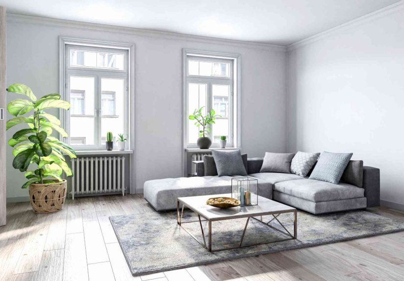
3) A Layout That Leaves a No-Man’s-Land (Too Far Apart or All Hugging the Walls)
An empty-looking living room often has one of two extremes:
everything pushed against the walls (creating a big blank center),
or furniture scattered too far apart (like it’s socially distancing from itself).
Why it reads as empty
People need a reason to gather. If your seating doesn’t form a conversation area, the room feels like a showroom
beautiful, but emotionally unavailable.
Designer fix
- Create a “conversation island.” Pull seating inward and anchor it with a rug.
- Mind the walkways. Keep paths clear so the layout feels natural, not like an obstacle course.
- Add a connector. A coffee table, ottoman, or grouped side tables make seating feel like a set.
4) Bare Wallsor Art That’s Too Small (The “Lonely Frame” Problem)
Nothing makes a room feel unfinished faster than big, blank walls with no visual weight.
The second most common issue? Art that’s technically present… but looks like it’s whispering from across the room.
Why it reads as empty
Walls are a large percentage of what you see. If they’re bare (or under-decorated), the room can feel hollowlike the
furniture is doing all the work while the walls refuse to contribute.
Designer fix
- Think bigger, fewer. One large piece can be more impactful than five tiny ones drifting around.
- Group small art with intention. A gallery wall reads as one larger momentif it’s planned and aligned.
- Hang at human height. Art should relate to the furniture beneath it, not float near the ceiling like it’s trying to escape.
5) Curtains Hung Too Low, Too Narrow, or Too Short
Window treatments are a designer’s secret weapon. But the wrong curtains can visually shrink the room and make windows
look smallerleaving walls feeling oddly bare and proportions feeling off.
Why it reads as empty
When curtains stop mid-wall or hover above the floor, the window looks undersized and the surrounding wall space looks
unresolved. It’s like wearing a great outfit with sleeves that end at a random emotional point.
Designer fix
- Hang them high. Place rods closer to the ceiling to visually lift the room.
- Hang them wide. Extend the rod beyond the window frame so panels can sit mostly off the glass when open.
- Let panels kiss the floor. Not puddling like a Victorian novel, not hovering like a UFOjust a clean “graze.”
6) Only One Light Source (A Single Overhead Light = Flat City)
If your living room lighting is basically “the big light” and vibes, the space can look flat and feel emptyeven with
great furniture. Designers layer lighting because it adds depth, warmth, and intentional glow.
Why it reads as empty
One light source casts harsh shadows or evenly washes everything out. Both can make the room feel unfinished and
visually one-note, like a song with only one instrument.
Designer fix
- Layer three types: ambient (overall), task (reading/doing), and accent (highlighting art or features).
- Add height variety: a floor lamp, table lamps, maybe a sconcedifferent levels create dimension.
- Use dimmers or smart bulbs. Control turns “bright room” into “cozy room” in seconds.
7) No “Middle Layer”: Not Enough Texture, Styling, or Personality
Some rooms have the big pieces (sofa, rug, TV console) but skip the “middle layer” that makes it feel lived-in:
textiles, books, baskets, plants, and a few personal objects that say, “A human with opinions lives here.”
Why it reads as empty
Without varied textures and small-scale details, surfaces look bare, corners look forgotten, and the room can feel
sterilelike it’s waiting for a photographer to arrive before it tries.
Designer fix
- Add soft layers: pillows, a throw, curtains, and a rug with texture (not everything smooth and flat).
- Style with purpose: a tray on the coffee table, a stack of books, a bowl, a candlesmall but deliberate.
- Don’t ignore corners. A plant, a floor lamp, or an accent chair can turn “dead space” into “designed space.”
A Quick Designer Checklist to Make a Living Room Feel Full (Not Crowded)
- Anchor the seating: a properly sized rug + a coffee table/ottoman = instant cohesion.
- Right-size the “hero” pieces: sofa, art, and curtains should match the room’s scale.
- Build a conversation zone: pull furniture inward and keep walkways clear.
- Layer lighting: aim for multiple sources at different heights.
- Add the middle layer: texture + styling + something personal (even if it’s just your weirdly specific book collection).
Experience Notes: What Designers Commonly See (and How Rooms Turn Around Fast)
Since “empty” is usually a relationship problem (between furniture, walls, lighting, and layout), designers often
start with a simple walkthrough: Where does your eye go first? Where does it get bored? Where does it feel confused?
Below are common real-world scenarios designers describeand what typically fixes them.
Scenario 1: The Rug That Shrunk in the Wash (But It Never Went in the Wash)
A classic: the homeowner has a beautiful sofa and decent chairs, but the rug is small enough that only the coffee table
sits on it. Everything else sits off the rug, scattered on the surrounding floor. The room feels oddly unfinished,
like the furniture is hovering around a “sample rug” in a showroom.
The fast fix is almost always the same: swap to a larger rug (or layer a larger natural-fiber rug underneath and keep
the smaller patterned rug on top). Once the front legs of the seating land on the rug, the whole area reads as one
intentional zone. Designers often call this the “snap-to-grid” momentsuddenly the room makes sense without adding
a single new piece of furniture.
Scenario 2: The Wall-Hugger Layout (Everything’s Against the Wall… for “Space”)
Many people push furniture to the perimeter thinking it will make the room feel bigger. Ironically, in a lot of spaces,
that creates an empty center that looks accidentallike you’re saving the middle for indoor roller skating.
Designers typically pull the sofa and chairs inward just enough to form a conversation area, then use a rug to define
the footprint. A console table behind the sofa (if it’s floating) adds function and fills the “why is there a gap?”
feeling. The room ends up feeling larger because it’s organized: pathways are clearer, and the seating zone looks like
it belongs together.
Scenario 3: The Tiny Art / Too-High Art Combo (The Wall Feels Unclaimed)
Another frequent “empty room” culprit is wall decor that doesn’t match the scale of the wall or the furniture beneath it.
You’ll see a large sofa with one small frame centered above it, hung high like a distant thought. The wall still feels
bare because the art doesn’t have enough visual weight.
Designers often fix this by either going bigger (one large piece) or grouping multiple pieces to create a single larger
composition. They also drop the height so the art relates to the sofacreating a visual connection between the vertical
plane (wall) and the horizontal plane (seating). The room immediately feels more complete, even before adding any new
accessories.
Scenario 4: The “One Lamp to Rule Them All” Lighting Plan
A living room can be beautifully furnished and still feel empty if the lighting is flat. Designers frequently walk into
rooms with one overhead fixture and maybe one lonely table lamp. At night, the space feels harsh, shadowy, or bothnone
of which screams “cozy, finished living room.”
The upgrade here is simple but powerful: add a floor lamp near seating, a second table lamp on the opposite side to
balance, and one accent source (a picture light, sconce, or even a small lamp on a shelf). Once the room has multiple
points of light, it gains depthcorners feel intentional, walls look warmer, and the whole space reads as layered rather
than sparse.
Scenario 5: The “Nice Furniture, No Personality” Room
Designers often describe rooms that have all the basicssofa, rug, media unitbut still feel empty because they’re missing
the middle layer: texture, styling, and cues that real life happens here. Coffee tables are bare. Shelves are either empty
or filled with random items that don’t form a story. Corners are unused. Nothing is technically wrong, but nothing feels
intentional.
The fix isn’t clutterit’s curation. A tray with a few objects, a stack of books, a plant with some height, a throw
that adds softness, and one or two personal items that spark a smile. Designers aim for balance: enough detail to feel
welcoming, not so much that every surface becomes a storage unit with aspirations.
In most “empty-looking” living rooms, the transformation happens when you stop treating the space like a collection of
separate items and start treating it like a composition. Anchor the zone, correct the scale, layer the light, and give
the room a few intentional moments. Suddenly it doesn’t look emptyit looks edited, confident, and ready for real life.