Table of Contents >> Show >> Hide
- What You Can Do With Text in Procreate
- How to Add Text in Procreate
- How to Edit Existing Text in Procreate
- How to Change the Font in Procreate
- How to Import Fonts Into Procreate
- How to Resize and Move Text
- How to Change Text Color
- Understanding Text Style Settings
- How to Align Text in Procreate
- How to Add Outline, Underline, or All Caps
- How to Rasterize Text in Procreate
- When Should You Rasterize Text?
- How to Curve Text in Procreate
- How to Make Text Look Hand-Lettered
- How to Add Shadows and Highlights to Text
- How to Use Clipping Masks With Text
- Best Uses for Text in Procreate Artwork
- Common Problems When Using Text in Procreate
- Pro Tips for Better Text Design in Procreate
- My Experience Using Text in Procreate
- Conclusion
Adding text in Procreate is one of those features that sounds simple until you realize how much power is hiding behind one tiny menu. You can type a quote over an illustration, design a sticker sheet, create a digital planner page, add a signature, build a poster, or make a social media graphic without leaving your iPad. No exporting to another app. No awkward screenshot gymnastics. No “why is my text suddenly blurry?” panic spiralwell, not after this guide.
Procreate’s text tool lets you add editable type, change fonts, adjust spacing, import custom fonts, resize text boxes, transform lettering, and rasterize text when you want to paint, smudge, warp, or add effects. The trick is knowing when your text is still editable and when it has become regular pixels. That one detail can save your artwork, your time, and possibly your coffee mug from being dramatically slammed onto the desk.
In this guide, you’ll learn how to use text in Procreate from start to finish: how to add text, edit it, style it, import fonts, curve or distort it, blend it into artwork, troubleshoot common problems, and use it more confidently in real design projects.
What You Can Do With Text in Procreate
Procreate is best known as a drawing and painting app, but its text feature makes it surprisingly useful for design work too. You can add clean typed words to hand-drawn artwork, combine typography with illustration, create greeting cards, design printable wall art, make thumbnails, add labels to diagrams, and personalize client mockups.
The text tool is especially helpful because Procreate initially treats text as editable vector-style text. That means you can change the wording, font, size, alignment, and spacing before turning it into a regular raster layer. Once you rasterize it, the text behaves like paint or any other pixel-based artwork. That opens the door to effects such as texture, clipping masks, Gaussian blur, Liquify, layer masks, shadows, glows, and hand-drawn embellishments.
How to Add Text in Procreate
Adding text starts in the Actions menu. Open your artwork in Procreate, then follow these steps:
- Tap the wrench icon in the top-left corner.
- Tap the Add tab.
- Select Add Text.
- A text box will appear on your canvas with placeholder text.
- Start typing with the on-screen keyboard, a connected keyboard, or Apple Pencil Scribble.
By default, Procreate places the text on its own layer. This is great because you can move, edit, duplicate, hide, lock, or delete the text without damaging your artwork underneath. Think of it like putting a sticky note on top of a painting, except the sticky note has fonts, style controls, and fewer crumbs.
Quick Example
Let’s say you are creating a cozy coffee illustration and want to add the phrase “But First, Coffee.” Add your text, type the phrase, then move the text box over the steam area or below the cup. From there, you can adjust the font, color, spacing, and size until it looks intentional instead of “I typed this during a power outage.”
How to Edit Existing Text in Procreate
To edit text you already added, open the Layers panel and tap the text layer. Text layers usually show an “A” icon or display the text content as the layer name. Once the correct layer is selected, tap the text on the canvas or tap the layer again to open layer options. Choose Edit Text.
Now you can change the words, highlight certain letters, select different fonts, adjust alignment, or change spacing. This is one reason it is wise to keep a backup copy of your editable text layer before rasterizing. Editable text is flexible. Rasterized text is committed. It is the difference between pencil and permanent marker.
How to Change the Font in Procreate
After adding text, double-tap the text box or choose Edit Text. Then tap the font name or the Edit Style option. This opens the style panel, where you can browse available fonts and select different font styles.
Procreate includes default fonts and can also access many fonts available through iPadOS. You can choose serif fonts for a classic look, sans-serif fonts for modern designs, script fonts for elegant lettering, and bold display fonts for posters or thumbnails. The right font should match the mood of your artwork. A spooky haunted-house illustration probably does not need a cheerful bubble fontunless your ghosts run a daycare.
Tips for Choosing Fonts
Use bold, readable fonts for small graphics such as social media thumbnails. Use script fonts sparingly, especially when readability matters. Combine no more than two or three fonts in one artwork unless you are intentionally creating a chaotic ransom-note aesthetic. For polished design, pair a decorative headline font with a simple supporting font.
How to Import Fonts Into Procreate
Custom fonts can make your art feel more personal and professional. Procreate supports common font formats such as OTF and TTF. To import a font:
- Download the font file to your iPad.
- If it is in a ZIP folder, unzip it in the Files app.
- Open your Procreate artwork.
- Tap Actions > Add > Add Text.
- Open the Edit Style panel.
- Tap Import Font.
- Find the font file in the Files app and select it.
Once imported, the font should appear in your Procreate font list. Before using downloaded fonts in commercial projects, always check the license. “Free font” does not always mean “free for logos, merch, client work, or that sticker shop you are totally going to launch after one more cup of coffee.”
How to Resize and Move Text
To move text, select the text layer and use the Transform tool, which looks like an arrow. Drag the text to a new position on your canvas. You can resize it by pulling the corner handles of the bounding box.
For clean resizing, use Uniform mode. This keeps the proportions intact so your letters do not accidentally become stretched like taffy. Freeform mode can be useful for creative distortion, but it may make text look uneven if you are aiming for a professional layout.
Text Box vs. Text Size
There is a difference between resizing the text box and changing the actual font size. Dragging the text box can change how lines wrap, while changing the font size in the style panel changes the size of the letters themselves. If your words are breaking strangely, adjust the text box width before blaming the font. The font has feelings too.
How to Change Text Color
To change text color, select the text you want to recolor, then tap the color circle in the top-right corner of the screen. Choose a new color from the color wheel, palette, classic color picker, or value panel.
If you want only one word or letter to be a different color, highlight that specific part of the text before changing the color. This is useful for emphasis, logos, stickers, and quote art. For example, in the phrase “Create Every Day,” you might make “Create” a warm orange and keep the rest in dark navy for contrast.
Understanding Text Style Settings
Procreate gives you several typography controls inside the Edit Style panel. These settings can make your text look polished instead of plopped onto the canvas like an afterthought.
Font Size
Font size controls how large the letters appear. Increase it for titles, posters, and quote art. Decrease it for small labels, captions, and subtle signatures.
Kerning
Kerning adjusts the space between specific pairs of letters. This is useful when two letters look awkwardly close or far apart. For example, letter pairs like “A” and “V” often need careful spacing in large headings.
Tracking
Tracking changes the spacing across a whole word, line, or block of text. Wider tracking can create a clean editorial look. Tight tracking can make text feel bold and compact, but too much tightness makes letters fight each other like shoppers on Black Friday.
Leading
Leading controls the vertical space between lines of text. Increase leading for readability in multi-line quotes. Decrease it when you want a tight, poster-like layout.
Baseline
Baseline shifts selected text up or down. This is handy for creative layouts, small caps effects, or positioning certain characters more precisely.
Opacity
Opacity controls how transparent the text is. Lowering opacity can help text blend softly into a background, especially for watermarks, subtle labels, or atmospheric artwork.
How to Align Text in Procreate
Alignment controls how your text sits inside the text box. Procreate offers common options such as left, center, right, and justified alignment. Center alignment works well for quote art, invitations, and symmetrical designs. Left alignment is often best for paragraphs or readable blocks of text. Right alignment can be stylish for editorial layouts, but use it carefully because it can be harder to read.
If your text is not lining up the way you expect, check both the text alignment and the text box size. A centered phrase inside a tiny text box may not look centered on the full canvas. The text may be behaving perfectly; it just has a very small apartment.
How to Add Outline, Underline, or All Caps
Inside the Edit Style panel, Procreate includes attributes such as underline, outline, and capitalization. These are excellent for creating stronger headlines or decorative lettering.
Underline adds a line beneath the selected text. Outline changes solid text into outlined text, depending on the font and style. All caps turns selected text into capital letters without requiring you to retype it. These tools are useful for poster titles, sticker designs, comic-style emphasis, and bold digital notes.
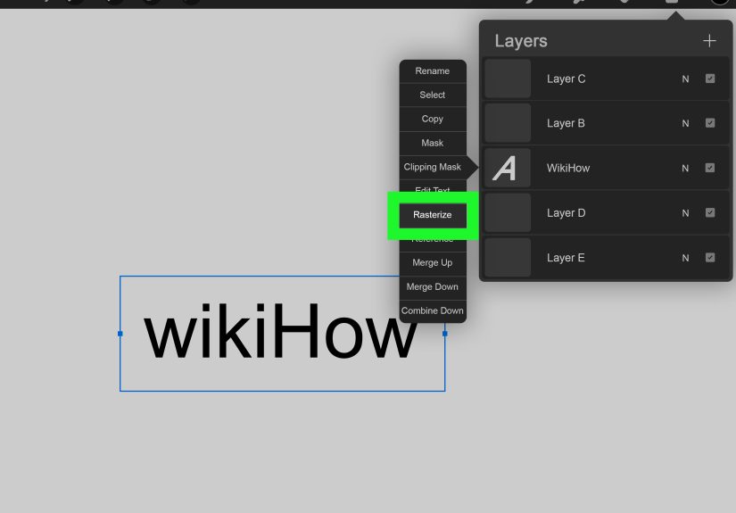
How to Rasterize Text in Procreate
Rasterizing text converts it from editable text into a normal pixel layer. To rasterize text:
- Open the Layers panel.
- Tap the text layer.
- Select Rasterize.
Once rasterized, you can paint on the text, erase parts of it, smudge it, blur it, use Liquify, apply adjustments, merge it with other layers, or distort it more freely. However, you cannot edit the words as live text anymore. Before rasterizing, duplicate the text layer and hide the original. That hidden backup layer is your “future me will thank me” insurance policy.
When Should You Rasterize Text?
Rasterize text when you are ready to treat it like artwork. For example, rasterizing is useful when you want to:
- Add texture with brushes
- Create a shadow or glow effect
- Use clipping masks
- Erase parts of letters
- Warp or distort text dramatically
- Merge text with an illustration
- Apply blur, noise, liquify, or color adjustments
Do not rasterize too early if you are still choosing fonts, fixing spelling, changing wording, or adjusting paragraph layout. Nothing hurts quite like rasterizing a beautiful design and then noticing you spelled “definitely” as “definately.”
How to Curve Text in Procreate
Procreate does not have a one-click “curve text” button like some design apps, but you can still create curved text manually. The cleanest method is to type your word, duplicate your text layer, rasterize a copy, and then use Transform tools such as Warp or Distort to bend the text into shape.
For more control, place a curved guideline on a separate layer. Lower its opacity, then position or redraw letters along the curve. This works especially well if you are combining typed text with hand lettering. You can also use the Liquify tool carefully after rasterizing, but use a light touch. Liquify is powerful, and it does not care about your typography dreams.
How to Make Text Look Hand-Lettered
Typed text can sometimes look too perfect beside organic artwork. To make it feel more handmade, choose a font with natural variation, rasterize a duplicate, then lightly roughen the edges with a textured brush or eraser. You can also draw over the text on a new layer, using it as a guide for hand lettering.
Another method is to reduce opacity on the text layer, create a new layer above it, and trace the letters manually. This gives you the structure of a font but the charm of hand-drawn lettering. It is like using training wheels, but the stylish kind.
How to Add Shadows and Highlights to Text
Shadows and highlights help text stand out from busy backgrounds. A simple shadow can be made by duplicating the text layer, placing the duplicate underneath, changing it to a darker color, and moving it slightly down and to the side. Lower the opacity for a softer look.
For a glow effect, duplicate the text, rasterize the lower copy, apply Gaussian Blur, and adjust opacity. For highlights, create a clipping mask above the rasterized text and paint lighter strokes along the top edges of the letters. These small effects can make text feel integrated rather than pasted on.
How to Use Clipping Masks With Text
Clipping masks are fantastic for adding texture, gradients, patterns, or illustrations inside text. First, create your text. Then duplicate it and rasterize the copy if needed. Add a new layer above the text layer and choose Clipping Mask. Anything you paint on the clipped layer will only appear inside the shape of the letters.
This is perfect for watercolor text, glitter lettering, marble effects, galaxy words, floral fills, and other decorative styles. For example, type “Summer,” rasterize it, add a clipping mask, and paint sunset colors across the letters. Suddenly your word looks like it owns a beach house.
Best Uses for Text in Procreate Artwork
Text in Procreate works beautifully for many creative projects. You can use it for quote illustrations, digital stickers, printable planners, educational diagrams, recipe cards, social media posts, thumbnails, wedding signs, greeting cards, comic panels, product mockups, and personal signatures.
For professional-looking results, think about hierarchy. The most important text should be largest or boldest. Supporting text should be smaller and simpler. Leave enough space around your words so the design can breathe. Good typography is not just about choosing a pretty font; it is about guiding the viewer’s eye.
Common Problems When Using Text in Procreate
My Text Looks Blurry
Text may look blurry if it has been resized too much after rasterizing or if the canvas resolution is low. Keep text editable as long as possible, use a larger canvas when needed, and avoid scaling rasterized text upward dramatically.
I Cannot Edit My Text Anymore
If you cannot edit the wording, the text may have been rasterized. Check your layers. If the text layer no longer behaves like editable type, you will need to use a backup layer or retype the text.
My Font Is Not Showing Up
Make sure the font file is in a supported format such as OTF or TTF. If it came in a ZIP file, unzip it first in the Files app. Then import it through the Edit Style panel.
The Text Is Hard to Read
Increase contrast between the text and background. Add a shadow, outline, translucent box, or simple highlight behind the words. Also check font choice. A delicate script font over a detailed floral background may look pretty for three seconds, then become a decoding challenge.
Pro Tips for Better Text Design in Procreate
Start with a rough layout before committing to a final design. Use guides or drawing assist if you need alignment. Keep separate layers for text, shadows, highlights, and textures. Duplicate important text before rasterizing. Use fewer fonts than you think you need. Increase letter spacing for elegance, but not so much that your word looks like it is trying to social distance.
Most importantly, view your artwork at the size people will actually see it. A poster design may look great zoomed in, but if it becomes unreadable as a phone thumbnail, it needs adjustment. Readability matters, especially for web graphics, stickers, and social media posts.
My Experience Using Text in Procreate
After using text in Procreate for different kinds of digital artwork, I have learned that the feature is most powerful when treated as part of the illustration process, not as a final decoration slapped on at the end. Text works best when you plan for it early. If I know a quote, label, title, or signature will be part of the artwork, I leave space for it in the sketch. This prevents the classic problem of finishing a beautiful illustration and then realizing the words have nowhere to live except awkwardly across someone’s forehead.
One practical habit that helps a lot is creating a “text safety copy.” Before rasterizing any text, I duplicate the layer and hide the original. The visible copy becomes the experimental layer, while the hidden copy stays editable. This has saved many projects. Spelling changes, client revisions, font swaps, and last-minute layout tweaks are much easier when there is still an editable text layer hiding quietly in the Layers panel like a responsible adult.
I also find that Procreate text looks better when it interacts with the artwork. For example, instead of placing white text flat on top of an illustration, I might add a soft shadow underneath, lower the opacity slightly, or use a clipping mask to fill the letters with a texture from the scene. If the artwork has a grainy pencil texture, I may rasterize the text and lightly erase the edges with a textured brush so it does not look too digitally perfect. This tiny imperfection often makes the final piece feel warmer and more intentional.
For social media graphics, readability becomes the boss. A beautiful thin script font may look amazing at full canvas size, but once Instagram or Pinterest shrinks it, the words can become decorative spaghetti. For those projects, I usually choose a bold font, increase contrast, and test the design zoomed out. If I cannot read it quickly, I simplify it. The internet scrolls fast; your text has to wave its arms politely but confidently.
When making printable artwork, I pay close attention to canvas size and resolution. Text that is rasterized too early and then enlarged can become soft or pixelated. Keeping text editable until the final stages helps preserve crisp edges. I also avoid using too many type styles in one piece. A headline font, a simple supporting font, and maybe one decorative accent are usually enough. More than that can make the design feel like a font menu escaped and started a parade.
Another useful experience is tracing typed text to create custom lettering. I will add text in a font that has the right general structure, lower the opacity, then draw over it on a new layer. This gives me the balance and spacing of typography but the personality of hand lettering. It is especially helpful for stickers, greeting cards, and quote art where handmade charm matters.
Overall, the best way to use text in Procreate is to stay flexible. Add text early, edit it carefully, duplicate before rasterizing, and use artistic effects only when the wording and layout are final. Once you understand the difference between editable text and rasterized text, the whole process becomes much less mysterious. Text stops feeling like a stiff add-on and starts becoming another creative tool in your digital art kit.
Conclusion
Learning how to use text in Procreate gives you more creative control over your digital art. You can add clean typography, customize fonts, import typefaces, adjust spacing, align text, change colors, create effects, and blend words beautifully into illustrations. The most important rule is simple: keep text editable until you are sure the wording, font, and layout are final. Then rasterize a copy when you are ready to add painterly effects, textures, masks, shadows, or distortions.
Whether you are making quote art, stickers, posters, planner pages, social graphics, or illustrated lettering, Procreate’s text tools can help your work feel more complete and professional. And once you get comfortable with the workflow, adding text becomes less like wrestling with a tiny keyboard and more like giving your artwork its own voice.