Table of Contents >> Show >> Hide
- Why Vintage Portraits Feel Effortlessly “Put Together”
- Where to Find Vintage Portraits (Without Taking Out a Loan)
- Pick the Right Portrait for the Room (Mood Matters)
- Three Foolproof Styling Formulas
- Framing and Matting: The “Expensive” Look Is in the Details
- Hanging Like You Mean It: Layout Tips That Prevent Regret
- Protecting Real Vintage Photos and Works on Paper
- Common Mistakes That Make Vintage Portraits Look Unintentional
- Conclusion: The Secret Ingredient Is Story
- Experiences That Prove Vintage Portraits Actually Work (500+ Words)
Casual elegance is one of those decorating goals that sounds simple until you actually try to do it. You want your home to feel polished, not precious. Collected, not cluttered. Like you have taste… but also hobbies… and maybe a life outside of aligning throw pillows with a ruler.
Enter: vintage portraits. Not the intimidating, haunted-mansion kind (unless that’s your vibeno judgment, just maybe keep the lights on). The right vintage portraitoil, charcoal, sepia photo, cameo silhouetteadds instant “this room has a story” energy. It makes a space feel layered and lived-in, the way the best homes do. And the magic is that it works in almost any style: modern, traditional, farmhouse, eclectic, even minimalist (yes, really).
In this guide, you’ll learn why vintage portraits read as effortlessly elegant, how to source them without overspending, and exactly how to style, frame, and protect them so they look intentionalnever random, never spooky, and definitely never like you decorated by closing your eyes and clicking “add to cart.”
Why Vintage Portraits Feel Effortlessly “Put Together”
They add humanity (literally) without adding chaos
A portrait is inherently personal. Even when you don’t know the subject, the piece creates a sense of presencelike the room has memory. That human element softens modern interiors and adds warmth to traditional ones. It’s the opposite of sterile, but it’s not messy either.
They bring built-in patina and a calmer color palette
Many older portraits and photographs naturally lean toward muted neutralswarm browns, soft blacks, parchment whites, smoky grays. That gentle palette plays nicely with almost any room color, which is why a single thrifted portrait can look like it “belongs” even when everything else is new.
They create contrast that reads as “designer”
Designers love tension: old with new, sleek with textured, glossy with matte. A vintage portrait against a clean-lined sofa or beside a modern lamp creates that contrast instantly. The room feels curated instead of decorated.
Where to Find Vintage Portraits (Without Taking Out a Loan)
Thrift stores and charity shops
This is the lowest-stakes hunting ground. Look for framed portraits, old studio photographs, and “grandma’s attic” art. The best finds often hide behind obvious misses. Check the frame quality, the mat condition, and whether the art looks like a print, a photograph, or an original drawing/painting.
- Tip: Shop often. Inventory changes constantly, and the treasure-to-oddity ratio is a moving target.
- Tip: Don’t ignore damaged framessometimes the frame is the prize, and the art can be swapped later.
Estate sales, flea markets, and antique malls
Estate sales are portrait gold mines, especially for family photographs and framed pieces that were displayed for decades. Flea markets are great for negotiating and building a small collection at once. Antique malls often cost more, but you can find higher-quality originals and better framing.
Online marketplaces (with a reality check)
Online shopping expands your options, but photos can hide flaws (and sometimes hide that the “vintage oil portrait” is actually a modern print with a filter and a dream). Zoom in on corners, check for rippling paper, and ask for close-ups of signatures, backing, and frame joints.
Your own family archives
The most meaningful portraits are often the ones you already havewedding photos, graduation portraits, military photos, studio pictures from older relatives. If you want elegance with emotional punch, this is it. Just be sure to display originals carefully (we’ll cover preservation soon).
Pick the Right Portrait for the Room (Mood Matters)
Living room: “conversation starter,” not “conversation stopper”
The living room is a social space, so aim for portraits that feel intriguing rather than severe. Softer expressions, lighter backgrounds, or smaller-scale pieces tend to feel welcoming. If you choose a dramatic, dark portrait, balance it with lighter surroundingsthink airy walls, a pale rug, or a bright lamp nearby.
Bedroom: calm faces, gentle tones, cozy scale
Bedrooms benefit from quieter energy. Vintage photographyespecially sepia or black-and-whiteoften looks serene. Hang portraits where they feel like art, not like someone is watching you sleep. (That’s a real decorating rule. It’s just… unspoken.)
Hallways and staircases: perfect for a “collected” gallery
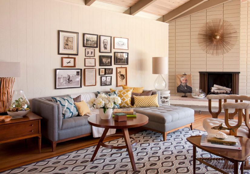
Transitional spaces are made for series and clusters. A run of smaller vintage portraits in coordinating frames can make a hallway feel intentional and elevated, like your home has chapters, not just rooms.
Dining room: instant old-world charm
A vintage portrait in the dining room adds a subtle formality that still feels relaxedespecially when paired with modern chairs or a simple table. It’s the design version of wearing jeans with a blazer.
Three Foolproof Styling Formulas
1) The “One Great Portrait” moment
If you want maximum elegance with minimum effort, pick one strong piece and treat it like a star. Place it above a console, mantel, or sideboard, then keep the styling underneath simple: a lamp, a small stack of books, maybe one sculptural object. The portrait does the heavy lifting.
- Best for: modern rooms that need warmth, small apartments, minimalist-ish homes
- Keep it casual: don’t center it too perfectlyslightly off-center can feel more lived-in
2) The “Trio” that always looks intentional
Group three portraits of varying sizes (small/medium/medium, or medium/large/small). Use a unifying elementsimilar frame tones, matching mat color, or a consistent black-and-white palette. Hang them close enough that they read as a set, not as three separate “oops” moments.
3) The vintage-portrait gallery wall (the collected look)
Gallery walls look best when they feel built over time. Mix portraits with a few supporting players: landscapes, small sketches, a mirror, or even a tiny textile piece. Variety adds texture; repetition adds cohesion. Aim for a balance of shapes, sizes, and materials so the wall feels curated, not chaotic.
- Unifying tricks: repeat 2–3 frame finishes, keep mats mostly consistent, or stick to a tight color palette
- Modern twist: include one surprisingly contemporary piece (abstract line art works beautifully)
Framing and Matting: The “Expensive” Look Is in the Details
Choose frames like you’re styling an outfit
Frames are the accessories. A thin black frame is like a crisp watchclean and classic. Ornate gilt is the statement earring. Warm wood reads relaxed. Mixing frames can look great, but avoid a total free-for-all. Repeat a finish (brass, walnut, black) to keep the wall from feeling scattered.
Mats are quiet, but they’re powerful
A mat creates breathing room around the image. It also helps vintage portraits look more “art” and less “random photo in a frame.” White or warm ivory is timeless, but soft gray or muted taupe can look especially elegant with black-and-white portraits.
Consider glare and UV protection
If you’re framing originalsespecially older photographsglazing choices matter. Higher-quality glazing can reduce reflections and help protect images from light exposure. If you’re displaying something irreplaceable, it’s worth asking about UV-filtering options.
Hanging Like You Mean It: Layout Tips That Prevent Regret
Use an eye-level anchor
A reliable starting point is to place the center of the main piece around eye level. Many decorators use a center point near 57 inches from the floor as a general guide, then adjust for ceiling height and furniture placement.
Ground portraits with furniture
Portraits feel more intentional when they relate to something below themsofa, console, bed, sideboard. Floating a lone portrait on a big wall can make it feel accidental (or like you’re creating a tiny museum exhibit for one very serious person).
Mock it up first
Before you put holes in the wall, plan the layout. You can arrange frames on the floor to test spacing, or use paper templates taped to the wall to preview the composition. This one step is the difference between “effortless” and “why does this feel… nervous?”
Protecting Real Vintage Photos and Works on Paper
If you’re decorating with authentic old photographs or delicate paper portraits, treat them like the small historic artifacts they are. You don’t need a museum lab, but you do need smart basics.
Limit light exposure
Light is one of the biggest threats to photographs and works on paper. Hang them away from direct sunlight and harsh light sources. If the piece matters to you, choose display spots that won’t bake it every afternoon.
Use photo-safe materials
When storing or framing photographs, choose materials designed for photographic preservation. Photo-safe enclosures and boards help protect items from dust, handling, and damaging chemical reactions. Avoid adhesives touching the image whenever possible, and prefer corners or mounts that don’t stick directly to the print.
Keep the art from touching the glass
For documents and photographs, it’s generally safer when the item doesn’t press directly against glazing. Matting or proper spacing helps reduce the risk of sticking, condensation-related damage, and surface abrasion.
Aim for stable temperature and humidity
Extremes and swings are rough on paper and photos. A stable indoor environment is friendlier than attics, garages, or damp basements. If you’re storing a collection, prioritize consistency over perfection.
Watch out for “helpful” air cleaners
Some air-cleaning devices can generate ozone, which can degrade certain photographic materials over time. If you’re keeping important photographs, store and display them away from ozone sources.
Common Mistakes That Make Vintage Portraits Look Unintentional
- Hanging everything too high: If your portraits are hovering near the ceiling, the room will feel disconnected.
- Mixing every frame finish you own: Eclectic is charming; visual noise is exhausting. Repeat a few finishes.
- Ignoring scale: Tiny portraits on huge walls need companionseither more frames or a piece of furniture beneath.
- Over-theming the room: One or two vintage portraits = elegant. Twenty = you may have opened a time portal.
- Not editing: The most “expensive” rooms are the ones where someone said no to a few things.
Conclusion: The Secret Ingredient Is Story
Vintage portraits make rooms feel casually elegant because they bring what new décor often struggles to fake: history, texture, and a sense of life. Whether you hang one striking piece above a console or build a gallery wall that grows over time, portraits add depth without demanding perfection. They’re a shortcut to that collected, confident looklike your home knows exactly who it is, even if you’re still figuring out what to do with that one weird corner.
Experiences That Prove Vintage Portraits Actually Work (500+ Words)
People who try vintage portraits for the first time usually start with a “safe” purchase: a small sepia photograph in a thrifted frame, maybe $8, maybe $18 if the frame is charming and the thrift store has discovered the concept of “boutique pricing.” The funny part is how quickly that one piece changes the room’s vibe. Suddenly, the space feels less like a showroom and more like a home with a backstory. Even visitors who aren’t “art people” tend to comment, because a portrait feels different than a generic print. It’s not just decorationit’s a presence.
One of the most common experiences is the “accidental focal point” effect. A living room that felt fine (pleasant, clean, maybe a little bland) becomes noticeably more interesting after a single portrait goes up. The reason is contrast: the portrait adds a human face, a sense of time, and often a softer, moodier color palette than modern décor. People will say things like, “Where did you get that?” andthis is importantyou get to answer with something more interesting than “the internet suggested it to me at 2 a.m.” The hunt becomes part of the charm. It’s like your home starts developing inside jokes.
Another real-life lesson: you don’t need “perfect” art for it to look good. In fact, slightly imperfect portraits often look better in casual spaces. A little wear on the frame, a slightly faded photograph, a minor scuff that proves it has lived through at least one decade of questionable fashion trends those details keep the room from feeling too precious. Casual elegance is not about museum-level seriousness; it’s about relaxed confidence. And confidence rarely looks brand-new.
People also discover how portraits help solve awkward wall problems. That empty space above a narrow console in the entryway? A portrait fixes it. The too-long hallway that feels like an airport corridor? A series of small portraits creates rhythm and makes the walk feel intentional. Even bedrooms benefit, especially when the portrait’s tones are calm and the frame finish repeats something else in the room (a brass lamp, a wood nightstand, black hardware). The portrait becomes a quiet anchorlike a design “pause button” that helps the room settle down.
The biggest learning curve is usually the gallery wall. People start out wanting everything symmetrical, then realize the wall looks stifflike it’s trying too hard. The breakthrough moment is when they loosen up: mixing sizes, letting spacing vary slightly, adding one unexpected element (a small mirror, a tiny landscape, a little sketch). Suddenly the wall feels collected rather than arranged. The best gallery walls tend to evolve. Someone adds a portrait they found on vacation, swaps one frame to match a new paint color, or replaces a piece that no longer feels right. Over time, the wall becomes a visual diary.
Finally, there’s the “portrait personality” experiencewhen you realize the subject affects the room’s mood. A stern Victorian gentleman can feel formal in a kitchen, while a softer, lighter portrait might feel charming. People learn to choose expressions and tones that match the space: calm for bedrooms, lively for dining rooms, intriguing for living rooms, playful for hallways. And yes, sometimes people move a portrait because it feels like it’s judging them. That’s not irrational. That’s interior design intuition.
The takeaway from all these experiences is simple: vintage portraits don’t just fill walls. They give rooms character. They make spaces feel personal without being messy, elegant without being stiff, and stylish without screaming for attention. That’s the whole secret of casual eleganceand portraits deliver it with a wink.